Tuesday 25 September 2007

(54)

ISA GENZKEN


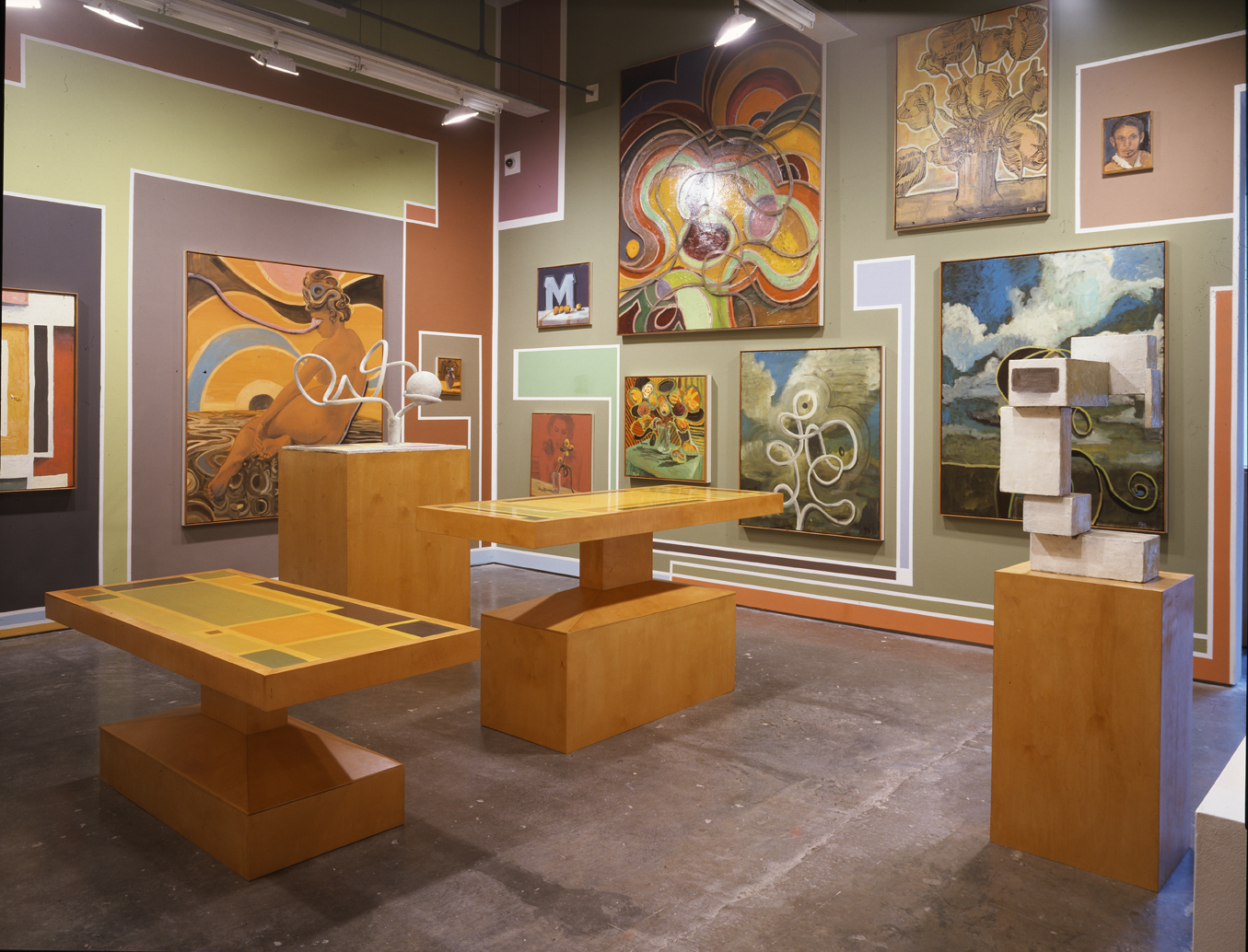
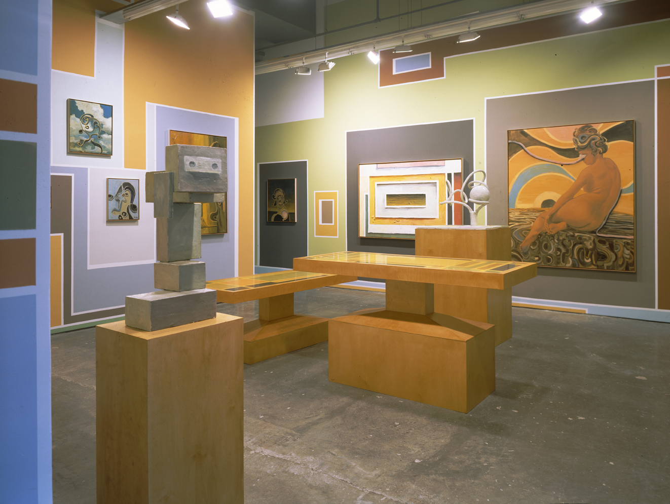
Isa Genzken is a German artist for whom recognition has come slowly, whose work, particularly her sculptures, deal with issues of novel materials, their civic use and representation. These have strong roots in 20th century German art (see also Post 8). Genzken is regularly included in international surveys, such as this year’s Munster Sculpture Project (07) and while not to the fore in matters of fabrication, installation or digital documentation, nevertheless produces work that consistently deals in the redirection of social functions for objects and materials, rather than traditional concerns with volume or native perception of solids and their isolated formal properties.

Genzken’s work has included the ready-made and readily-made (see also Posts 25, 36 and 49), documentation (see also Posts 4 and 17) and installation and usually entails elaborate sociological and personal research. Her method is mainly concerned with displaying connections between design, often seemingly decorative elements and more underlying functions and aims. At the same time, finding the means to demonstrate these links in itself often brings surprising contrasts and comparisons.

As with much recent art concerned with underlying social and economic forces, Genzken looks to architecture for a grander design. Works from the late 80s such as Wabe (honeycomb) (1988) and Kirche (1989) offer simple models, yet crucially, materials defy scale and their placement upon a high, narrow, four-legged stand, invites considerations of the height and actual extent of the work. Each structure relies upon a contrasting structure to display it, is soon contrasted firstly with its stand as much as notions of honeycomb (Wabe]) or church (Kirche). The work accents materials including ready-made objects in this way, their use as models or reference that is in some respects literal, in others symbolic. The line between presentation and representation falters. The sense is of a playful ‘rebuilding’ of reference in this way. Fenster (1990) also echoes the crude model with its ‘framing’ stand, offers perhaps a suitable height and dimensions for a window, but then begs questions of further purpose – and material. The theme is taken up in an installation – Everyone Needs at least One Window (1992) at The Renaissance Society, Chicago, where Genzken provided large ‘free-standing’ frames in industrial materials and casual construction, this time geared to the scale of the exhibition space. Notably the installation also includes photographs of city streets and x-rays (of the artist) – linking windows here to pictures and surrounding society, allowing the architectural requirement physiological, psychological and sociological extension.

Other works from this time, such as the More Light Research paintings, spray lacquer through fabric templates and fixtures, produce pictures that again maintain a literal, 1:1 scale, yet now give design a pictorial dimension, part print, part abstraction. Amongst Genzken’s best known works is the massive Rose (1994) a rare foray into fabrication; here scale and materials (painted steel) take on an architectural scale, at odds with location and content, select and redirect what is represented.

Her concern with industrial materials, if not always finish, is sometimes reflected back onto architecture, in playful ways, but increasingly, Genzken has used greater modification and mixing to her materials and models, as in Flugzeugfenster (2003) with its vigorous yet somewhat cursory painting, indicating décor and window to the curved airliner wall panels. Again there is the window/picture motif, but as importantly, painting is not just of windows or interior, supporting panels are a model or reference in shape and scale, but not in others. The play is again between materials and their selective use as reference.

Painting and pictorial elements of course, presume reference and Genzken’s flicks and drips never quite escape art history or summon a non-pictorial application here, at best figure as knowing decoration. They are augmented in following works by various adhesive tapes and ribbons that suggest wrapping, perhaps repair even to polished metal surfaces, and where combined with photographs, recall earlier assemblage, particularly the work of Rauschenberg, although with less emphasis upon dilapidation and recycling. Here the wrapping is now part of the ‘gift’.

Many of Genzken’s more recent works approach the figure, especially the vulnerable or dependent, either through metaphor of dolls, or sometimes reading lamps that stand for heads (and ideas!) or metonym of furniture, clothing, implements or prosthetics. Where architectural works stress the compartmentalising and collectivising to civic design, her figurative works similarly imply a definition of the person from available materials. Heights, lengths and mobilities are gauged, waterproofing, shading and warmth recommended. Colours co-ordinate or integrate, startle or warn. There are still spills of coloured fluid, in prescribed doses or diets, attractive or unfortunate as prominent and permanent stains. And there are misplacements and misuses, essential to human endeavour, humane engagement.

(53)

LARI PITTMAN


(First published 19th September 2007)


Pattern and print are paired with particular persuasion and piquancy in the pivotal paintings of Lari Pittman. Pittman mines a rich seam of ornamental and iconic motifs drawn from common graphics, tunnels within abstraction for figuration; lodes layouts to further fields. His current show at Regen Projects, LA advances his concern with tone and volume; deepens his objects with situation and other embellishment.

Pittman emerged in the mid 80s, when his work offered sharp contrast to prevailing trends; a fading Neo-Expressionism (see also Post 40), the strict geometries of Neo-Geo, (see also Post 24) the historicism and pastiche of appropriation (see also Post 37). Yet Pittman retained a keen interest in allegory and symbolism, offered an intriguing amalgam of biomorphic and geometric abstraction, drew on classical as well as folk and contemporary motifs. As well, he initially embraced the painterly or gestural together with the regularities of print or stencil.

Yet the works are not compromises or half measures and what Pittman demonstrates is how the contrasts can be ordered in a radically widened project. Pittman arrived at the formula gradually, an early work such as Alptraume (Nightmares) (1981) reveals a Neo-Expressionist taste in drawing, but already a discrete ‘boxing’ or layout of parts (see also Post 2). With Venom to Serum (1982) divisions become more pronounced, a relativity or continuity between opposites is stressed, while imagery elsewhere grows more intricate, less Expressionist. Following works such as An American Place (1986) and Where The Soul Intact will Shed its Scabs (8264 AD) (1987-88) juggle an even more diverse range of motifs and techniques, revel in symmetry and pattern even as they spread to asymmetry and more figurative motifs. The work also begins to shed gestural elements and to layer or superimpose intricate webs of imagery.

The work is firstly about this generosity or accommodation, an acceptance of the organic and mechanical, symbolic and literal, unified and eccentric. The titles direct this to a state of the nation, a stage to the spiritual or personal. It is at once an adventure or voyage, a plea for tolerance or patience, an appreciation of a greater, if fainter design. And the mood is appropriately a mixture of whimsy and trepidation. The theme develops with works like The Sounds of Belief to an Atheist are Very Touching (1988) and This Expedition, Beloved, Despised, Continues Regardless (1989) where figures take on greater prominence (even as just eyes or silhouettes) while layers acquire a new delicacy or transparency, as Pittman adds airbrushing and possibly computer graphics to his repertory of techniques.

Pittman’s work at this time introduces an explicit homoeroticism, in works such as This Wholesomeness, Beloved and Despised, Continues Regardless (1990). But this too comes decorated in a range of permutations and conventions, a teetering of symmetries and pattern that gives the tolerance of picture a more acute object. Throughout the 90s the theme and means become more elaborate, the work excels in hackneyed signage or typefaces, in deft transparency, inversions, reversals and variation on scale for a given motif. Actually they can make the work seem hardly like a painting at all. The work tends to hard edges and flat colours, adding to the sense of a print source, although now exploited to private or obscure ends, or vice versa (see also Post 13).

Yet the latitude granted variation tends to undermine even as it underlines theme. Latitude carries through to sexuality, physical endurance or distress, natural transformation or cycles. The organic is channelled, plumbed, cultivated and regulated; the pictorial is framed in a layout or chart, combined and captioned. Yet the seed or theme grows smaller for it, more indistinct for all the ornament and incident. Where frills and decoration initially constructed an underlying theme, their proliferation increasingly threatens to diminish it. This anxiety soon figures as the underlying sentiment. Throughout the 90s the work increasingly fills or evens out its layout of pictures. The sense is of a dispersal of urgency to all parts, arriving at a field of frantic icons.

With the turn of the century the dispersal abates. The work drops text, simplifies layers somewhat; draws toward the more figurative and architectural. Tone and modelling now prompt other continuities and while Pittman is hardly about to surrender his layouts or filigree, the work acquires more spatial depth and cohesion, tone now urges a brooding rather than shrill disquiet. He still deals in a surging or rampant biomorphism, a metaphorical virus perhaps, at once elegant and sweeping while intricate and chaotic. Colour and line continue to be subtle and surprising. But the excitement remains in how far he can stretch realism, invite abstraction, permit painting.

(52)

JULES OLITSKI (1922 – 2007)


(First published 11th September 2007)


The paintings of Jules Olitski belong to a branch of Minimalism called Lyrical Abstraction. The label is unhelpful since much abstract painting is variously lyrical throughout the 20th century, but Olitski’s work takes up key issues of Minimalism, in shedding rigorous geometry or drawing for distinctive qualities of pigment and novel application, for the definition or discernment of colour, its size, shape and constitution. Minimalism is sometimes divided between Process and System in the emphasis given to materials or design. Olitski remained true to these concerns throughout his career, although they ceased to hold wide interest by the 80s.

The course of Minimalism is also discussed in Posts 24, 32, 33 and 47. Where Stella measures stripes and strict symmetry against industrial paints and brushing on an imposing scale, for Olitski it is firstly the more erratic pouring and staining to a support that measure shape and relations within a painting, as in Potsy (1960). The playful sexuality is unusual for Olitski, but the complementary flowing shapes, perhaps cellular in subdivision, even their placement, off-centre to a diagonal axis, nevertheless prompt consideration of affinities and proximal symmetries. The relaxation to technique negotiates a looser organisation of shapes and colours and so celebrates organic shapes and a more fluent approach to painting. Similarly, an Untitled Sketch (1963) indicates these elementary placings within the frame, as conditions for bolder applications by paint.

Yet to pour or stain as painting then invites questions of scale, support, pigment and solution, and with advocates such as Helen Frankenthaler and Morris Louis commanding the technique, not surprisingly Olitski soon turns to other means to structure colour and design. He turns to industrial spray guns by the mid 60s, to their vaporous forms, radically thinned pigment yet brilliant colour, as in Shoot (1965) or Untitled – 3975 (1968). Here transitions from one colour to another become especially subtle, soon beg questions of colour definition and shape, of proportions to the frame, as a measure. And again the sense is of a release or dilation of all within the frame or edge, a delicate balance in scale between colour and design taken to the edge, and edge brought to bear on these matters, as measure enough.

So, one set of freedoms come at a price of greater reliance or prominence for another constraint. As a metaphor, the pictures take on a contemplative acceptance of this balance and that between particulars of accident and overall design. Olitski is more severe or Minimal, than similar sentiments in Mark Rothko, Barnett Newman, Frankenthaler or Louis, essentially pits colour fields (see also Post 18) against edge, or matches drawing to edge.

Next Olitski is drawn to more spattered spraying, by reduced pressure to the gun, modified solution to the pigment, as in Something Else (1967-8) or Orange and Grey (1970) where edge or frame is now accentuated by line, while colour definition and intensity assume sublime nuance. In the 70s Olitski introduces more textured surfaces or supports to his spraying; combines impasto gesture with sprayed colour, but the two only beg other combinations, ultimately look mannered for their preference.

Olitski has no interest in pursuing his support to architecture or installation, as in a Daniel Buren or The Surface and Support Group for example, has no interest in allowing more elaborate pattern, including depth and concrete motif, as in firstly Frank Stella, then The Pattern and Decoration Group, say. So by the 80s Olitski’s project is more circumscribed by technique, more conservative for materials. He can vary and integrate extravagant textures and gestures with his spray clouds of colour, as in See Didache (1982) but the results only look more familiar, even traditional, recall his training in Paris and the high pastes and impastos of Jean Fautrier or Philippe Hosiasson. Later efforts such as Shira (1990) and Once in Segovia (1999) render the chemistry of textures and sprayed colour as a tortured, even kitsch equation.

He then returns to more gestural colour, more integrated line as in Embraced Black Ambid (2005) or Wandering Bilbao (2004) but while works no longer flourish the gulf between rugged surface and sprayed colour, shape and frame, they then leave design and pattern precious, idle. In a work such as Elegy (2002) he returns to the circular forms that recall Potsy (1960), now stripped of the erotic, further dispersed across the picture (even while frame remains carefully registered) and variously accommodated by shifting tone and shape to a ground that offers so many variations, it scarcely serves as a ground. The work is sober rather than serene, terse rather than transcendent, captures a grudging conclusion to a Minimalist conviction.


(51)

PETER DOIG


(First published 5th September 2007)


Peter Doig’s paintings are widely admired but often seem baffling or tangential to wider trends. In recent years he has gradually departed from the themes and techniques that brought him notice in the 90s, has looked less certain, more remote. This post traces his brief development.

Initially the work deals in schematic or decorative landscapes, casual drawing and facture restraining more concrete depiction, maintaining a strict frontality to planes, in White Canoe (1990) the lake’s reflections add to the symmetry and design, in Grasshopper (1990) the lateral divisions are taken either as fence palings in the extreme foreground, framing the houses in the centre background, or distant and foreground waters. At this stage the pictures are remarkable only for simplified drawing and distinctive treatments assigned to planes. The works struggle or toy with a coherent level of stylisation and this is geared to the contrasting painterly treatments for parts.

The mosaic-like planes can recall Klimt or Schiele, an orientalism stripped of arabesque, but Doig’s technique is more diverse, his content less straightforward. As Doig accommodates more precise objects, the balance between design and content begins to resonate in a new and striking way. In works such as The Architect’s Home in the Ravine (1991) and Concrete Cabin West Side (1994) the play between foreground and background, abstraction and the concrete amplifies each. Paradoxically, it gives the places a peculiar accuracy, gives the stylised surrounding a sweeping indifference or ambiguity. We glimpse a resort or holiday homes, places visited, perhaps photographed or recorded but hardly known as more than a temporary address. And in this sense the paintings reflect something of photography’s personal uses, although hardly its means.

The paintings are about a certain kind of photograph and their occasions and for this reason critics were quick to bracket Doig with contemporary photo-based painting that similarly transcends Photo-realism, such as Gerhard Richter or Luc Tuymans. But even where such works are literally based on photographs, this does not explain Doig’s treatment. It is the genre of picture that is foremost (see also Posts 5, 6, 11 and 16) the vaguely known but fondly remembered picture, the holiday or special occasion snapshot, that Doig’s elaborate foregrounds frame or veil to filter for just this quality.

Doig’s interest in spatters, pourings, staining, pooling and drips all find service in delaying or concealing these times and places; are light, shadow, snow, water, forest or gravel at their most allusive and elusive. Winter forests are rendered in blunt and broken lines; make no attempt at more than a schematic cue. Where a Photo-realist or traditional kind might copy such photographs, the emphasis falls elsewhere. It is either about the properties of the print or the event irrespective of picture, but not, as in Doig, about using pictures for such events. Doig effectively stakes out a contemporary sublime, a landscape that is strange or remote, not so much for being uninhabited, but as exotic or glamorous for being merely transitory, known strictly on a recreational basis. Works like Night Fishing (1993) all but dissolve the central figures in a canoe, not into an impressionistic summer night, but a veil of technical vacillation, an obscurity to purpose or fuller engagement.

Doig’s best known works are the skiing milieu series from 1994-97. The snow-covered landscapes and elaborately costumed (essentially disguised) figures are in many ways his ideal subject. The landscape ‘whites out’ much of its features, meets Doig’s novel treatments and candy colours. Indeed the treatment of the brilliance of snow through pastel tints (perhaps inspired by ski goggles) or wishy washes provides another acute metaphor for the remembrance of things only half taken in.

Following works such as Buffalo Station I and II (1997) and Rainbow Wheel (1998-9) adopt a similar approach to colour, also rely upon brittle outline that recalls tracing and tends to invoke a photographic source (see also Post 13). But with the turn of the century Doig’s drawing and vigorous layers begin to relax. The buildings are less severe in presentation, less guarded, his line is broader, heavier, grows more remote from tracing or photograph. It is not clear what kind of places the artist now tours, how he pictures them, although in work such as 100 Years (Carrera) (2001) one senses the focus has begun to shift to the figure, as stereotype or stock role, drawn from the movies, art history or religion. While it would seem an inviting project, so far it is not served by Doig’s line, design or more conventional painting.

(50)

SALLY MANN


(First published 28th August 2007)


A post on photographer Sally Mann occurs here strictly for balance or variety. No current shows could be found to link, but there are many examples of her work on-line and her approach offers interesting contrast with other photographers so far included.

Mann’s work emerged in the mid 80s and is noted for portraiture of children and striking tonal and print qualities, often derived from antique or irregular camera and printing techniques. While Mann is hardly typical of the 80s, there are key aspects to her approach that connect with general trends for the time. Her photography shares in the move away from social reportage to more symbolic and abstract realms, as well as to resources beyond the studio-based tableau and standard formats there.

Photography has always experimented with its processes and equipment of course, from lenses and filters, to apertures and chambers, film stocks, printing projections, chemicals and surfaces. On a radical scale these result in full abstractions, but with photographers such as Mann, their use is returned to more concrete subjects. Her interest is not with a strict formalism (as arises in the work of Wolfgang Tillmans, for example) but turns to 19th century methods such as aristotypes (gelatino or collodio chloride prints) in order to render images from her surroundings in ways unavailable to standard means.

The prints have a fine grain, extended tonality; that is often manipulated to heighten the focus on a figure, to isolate features in ways that usually need studio staging. The work also acquires a certain distance or reserve. It looks like an antique, even pastiche, and Mann’s work is sometimes compared with the Victorian pioneer Julia Margaret Cameron. This revival of historical means has much in common with 80’s concerns with publication formats for photography, with so-called appropriation and originality (see also Posts 12 and 29).

But Mann’s work does more than revisit Victorian attitudes toward childhood and innocence. Her work subtly registers contemporary differences, in details to interiors, children’s clothing and hairstyles. Even the native and innocent five-year old is never quite the same as her 19th century counterpart. Naked, outdoors and alone, her pose nonetheless acquires a knowing, late 20th century poise. One concludes there is no pose to be discovered ‘unposed’, nothing natural that does not then reflect the givens to picture and taker. In this, Mann’s work uses children as a symbol for a more complex reflection on photography, history and nature.

Mann’s models are mostly her own children and throughout the late 80s and early 90s she steadily documents their growth, self-consciousness and independence. The theme is not necessarily a mother’s concerns, but rather the child as vulnerable, initial explorer, ourselves in tenderest extension. An early work such as Untitled – Seith (1984) demonstrates Mann’s initial more conventional approach to the portrayal of youth, but a slightly later work, Damaged Child (1984) properly signals her signature. The work is usually accompanied by an explanation of the accidental cause but again the child is not quite ageless in matters of fashion, if photography. More importantly, the focus is upon the severity of the injury to the very young, the impact, literal and metaphorical, the world makes upon their identity.

Indeed works such as Jessie Bites (1985) and Fallen Child (1989) similarly stress the bodily engagement with circumstances, a sensual abandon to play or harm; that acquires a distinctly sexual undertone, as Jessie, a key model, grows older. At a certain point it is not quite a child’s body against the rural outdoors, but rather positioned against an inquisitive photographer. The series draws to an end with this distance, and the gentle acknowledgement of a privacy the children have earned.

Mann subsequently turns to landscapes and here the emphasis upon primitive, less reliable methods results in more abstract, ghostly places. Significantly, Mann chooses sites of Civil War battles, again setting an historical parallel between site and means. But now the difference is not between the careful documents by Matthew B. Brady and associates, with placid, all but unrecognisable contemporary locations, but a more insidious sense of history; that lingers on, concealed in benign neglect, either to photography or landscape. Taken in combination with her works of children, nature takes on a sad, brooding history and whether background to innocent frolics or the overgrown and waywardly developed images of forests, the menace lies not in the unknown to the new comer, but more profoundly, in the remembered for the returning. Mann takes photography back to its childhood, gives it new maturity for the experience.

(49)

JEFF KOONS Vs TAKASHI MURAKAMI


(First published 21st August 2007)


Both artists have shown at Gagosian this year, Koons in London in June and July, Murakami in NY in May – June. Both pursue a project that highlights the commission of standard production or manufacturing, albeit of unlikely or extreme products. This style is identified here as the readily-made and is also discussed in Posts 25 and 36. Koons and Murakami, in contrasting ways demonstrate certain limits to the approach, perhaps its exhaustion.

Koons is the elder and a pioneer. His work in the late 70s and early 80s begins as actually ready-mades – standard objects displayed in a way that reveals unexpected aspects, distinct from standard presentation. The ready-made properly arises with Marcel Duchamp, but for Koons both type of object and mode of re-presentation now derive from retail display and its troubling proximity at times to museum and gallery practices. Koons contribution is extended with stainless steel castings such as Rabbit (1986) where the familiar toy gives casting an unusual prominence. The expense and difficulty of casting in a material more usually reserved for industrial and trade applications alerts us to a more general aspect to the process, its autonomous nature, prompt accommodation of the artist’s commission (at a price) and equally the artist’s accommodation of this autonomy, also at a price.

The readily-made does not rest with mere casting of found toys of course. Koons replaces the ready-made object with photographs as sources for later works and commissions more elaborate readily-mades such as the porcelain Michael Jackson and Bubbles (1988). Again the contrast between material and product is pertinent. While merchandising for a pop star might conceivably stretch to small, cheap figurines, a life-size gilded porcelain product is unlikely, to say the least. By the same token while porcelain figures look to popular and traditional iconography, to adopt a contemporary pop star and to work on this scale, is equally unusual. So the work is not so much about merchandising excess or porcelain’s cautious iconography as the awkward if instructive area in between.

This balance largely sets the model for subsequent readily-mades. Such work is often linked to Pop Art, by choosing source objects from mass prints, but where Pop Art is interested in contrasting painting with these as a one-off, or unique object, the readily-made retains no such emphasis upon the single or unique picture. While obviously related to Pop Art, the readily-made constitutes a later style. Indeed, in more recent times, where Koons applies his commissioning power to painting, the result is predictably disappointing because the commissioned design no longer carries a distinctive source and because the mode of painting can offer no compelling parallel to industrial standards of reproduction. As a readily-made, painting is never automatic or ‘ready’ enough, as a commission, never surprising or remote enough.

In the case of Murakami, the readily-made succumbs to a different fate. Murakami follows in the wake of Koons, is similarly drawn to the toys and figures of Japanese cartoons and comics, Anime. The characters’ enormous blue and green eyes and fair hair, while ostensibly ‘international’ – paradoxically, carry a distinctly Japanese and deeply ambiguous meaning, given Japan’s history with the west. Indeed, the round, moist eyes are often all Murakami preserves of his sources, renders figures or persons passive, decorative and yet faintly subversive, mocking an inherent racism and preference, if merely by eye. The subversion is reinforced in works that combine the mushroom cloud of an atomic blast with a mixture of traditional ghost and modern comic strip. The work looks light-hearted and ‘international’, but subtly carries far more national baggage. More recent works, depicting religious figures only compound the unease.

Murakami’s designs are freely applied to paintings, prints, even textiles, and mass produced sculptures of all scales, so that again industrial process is often foremost and the sources still strong enough to allow more leeway to painting. But the weakness now comes through a convergence with market standards. The product can no longer strictly distinguish itself from the material or process, as in Koons. Murakami has his own toys and characters, so that works no longer strictly display or sample the process, but merely instantiate it. Sheer versatility of application and popular acceptance thus rob the work of its vantage point, its potency as reference. The readily-made here is now too readily made, the commission again, no longer surprising or remote enough.

Both artists in a sense are victims of their own success. But it would be wrong to think the readily-made] is exhausted by toys and comic strips. Koons and Murakami remain hostage to these sources, extending commissions to paintings cannot liberate Koons, extending commissions beyond pictures cannot sustain Murakami.

(48)

ANDY GOLDSWORTHY


(First published 14th August 2007)


Andy Goldsworthy’s sculpture derives from a branch of Conceptual Art called Land Art. Land Art was initially concerned with an extended identity for the work, as documentation of an event or duration, its location or place. Goldsworthy emerged in the late 70s and as a latecomer, has tended to consolidate or return identity to a self-contained object, a sculpture; that still draws upon a specific site, sometimes for location, sometimes for materials, but nevertheless surrenders some of the attenuation or phases to its identity as site, event, and record. Goldsworthy’s recent work can be seen at the Yorkshire Sculpture Park, (March 07-January 08).

Goldsworthy maintains these other strands, notably in the lavish books that now follow phases to his career, but much of the interest and impetus to spreading the work across phases, has subsided; strictly departs from Land Art. Conceptual Art has been dealt with in Posts 4, 17 and 39, where performance by the artist is a feature of the work, but with Land Art, other kinds of duration are demonstrated, stressing place above activities. This development begins with gallery-based installations, such as those of Yves Klein and Arman in Paris at the Galerie Iris Clert, stressing the emptying or emphatic filling of the gallery, as a container and place. The practice then moves outdoors, to works like Christo’s Dockside Packages at Cologne (1961) and on to Earthworks, by Claes Oldenburg, Michael Heizer and Dennis Oppenheim. Longer term, larger scale works are labelled Land Art – sometimes Sky Art – and come to stress remoteness of site or viewing perspective over duration, and where works resort to industrial equipment, to create something closer to landscape gardening, as in some works of Robert Smithson or Heizer, Land Art is drawn irresistibly toward the concerns of architecture and engineering. Other Conceptual Art is later pursued in this domain.

Short-term Land Art persists through the 70s; and in particular British artists Richard Long and Hamish Fulton favour more restrained intervention, more seasonal and solitary recordings. But importantly, the work is not to be simply a nominated site, a remote point on a map. The place must also be physically sampled. The artist’s presence or brief activities there alone will not be enough to do this, nor pictures and documents that record these. The task requires an explicit display of phases to the work, to properly work, at least under this interpretation of Conceptual Art.

Goldsworthy is similarly drawn to remote wilderness, essentially a romantic vision of nature as the absence of Man. But the crucial issue is what means are available to exemplify the place as a duration. Merely photographing his presence there leaves the work as just a photograph, which is not enough for Conceptual Art. Nor can the artist’s presence be just any hiker’s activities, for these then will only be about hiking, rather than the place beyond that. The formal constraints upon Conceptual art – and here Land Art – are actually quite severe, contrary to initial impressions. As with Long and Fulton, Goldsworthy looks to sampling soil, stone and vegetation, to temporary arrangements permitted by these materials, that then celebrate the environment, remain distinctive from merely hiker’s or holidaymaker’s debris.

In many cases the simple geometric forms arrived at, marry Modernist abstraction to ancient and traditional building and demarcation (see also Post 42). The work is local, transient, modest, yet ageless, pervasive, necessary. To photograph or otherwise record them, then struggles to avoid prettiness or artiness, to underline its documentary function. As Land Art progresses to more elaborate collecting and displaying, the work often loses its particularity to a site or time, in predictable methods or construction, looks too practised to properly sample place more than artist and preference. In this, we sense the exhaustion of the project, the subsidence of Land Art.

Goldsworthy preserves his primitive materials, stone and wood especially, and construction that needs little beyond gathering and careful combining. But the questions of how durable or permanent, how local or remote such activity can still be, and whether they strictly refer to phases of the work become blurred with more ambitious commissions and installations. Indeed this point is raised in a thoughtful criticism by David Lewinson. Land Art here would seem to end in a rustic Minimalism, a picturesque trophy to the past and virgin lands, by their nature.

(47)

FRANK STELLA


(First published 7th August 2007)


Stella’s rooftop exhibition of sculpture at The Metropolitan Museum of Art, NY follows on from a show at Paul Kasmin (NY) in May-June (the website there currently in transition, regrettably). It measures a steady progression for an artist renowned for restlessness and experiment, but at the same time Stella’s trajectory has increasingly looked wayward by general trends, his goals obscure or trivial, his success, to be frank, less than stellar.

Yet Stella’s path also spans the course of Minimalism, and to understand why his sculpture arrives at such respectable but unexciting backwaters, one must appreciate how his notion of sculpture arises from his painting, and how this is determined by a Minimalist approach to abstraction. This is too much for a short and simple post however, and while Posts 24, 28 and 33 take up the course of Minimalism, here the post settles for Stella’s transition from painting to sculpture. The line admittedly can become very thin and Stella’s use of increasingly complex, shaped canvases and ‘heightened’ stretchers stretches the painted support to more three-dimensional considerations. The turning point occurs around 1972-3 where additional layers to a work exceed mere shaping and deliver a painted wall or bas-relief.

This arises at much the same time that Stella’s stripes are drawn into overlaps or interlacing, introduce a basic depth and non-stripe shapes, take on more complex meaning, allude to traditional textile and basketry motifs, for example. Further depth then prompts more figurative motifs; further stripes then prompt more literal depth and articulation. Either way, the basic patterns that Stella has relied upon as minimal abstraction soon threaten to seep back into the figurative and concrete, and to avoid this he turns to more three-dimensional application. Unfortunately, sculpture embraced on these terms runs into other problems. The rigour established between strict pattern and painting cannot be sustained in three dimensions – three dimensions need more of a pattern than a set of standard curves or planes as painted surfaces. It literally requires another dimension to the governing principles of construction (see also Post 36). Also, much in Minimalist painting and sculpture at this time render Stella’s version of either as decidedly conservative.

The problem is really that Stella is left with a concept of painting as just colour applied to a surface, and sculpture as dedicated surfaces. Meanwhile others had gradually extended minimal pattern to temporary or permanent murals upon various architectural and civic features – from Daniel Buren to Sol LeWitt to Gene Davis (his Franklin’s Footpath 1972) to the site specific works of Claude Viallat, for example. Then again the materials of pigment and application in themselves had challenged basic pattern and support by various staining, pouring, spraying and spattering. Pigments augmented with latex or polyurethane, as in the work of Linda Benglis relax pattern radically; approach sculpture less rigidly. Later work by Jules Olitski and Larry Poons literally rises to the challenge.

But for Stella supporting planes can at best appeal to standard volumes, curves (the French Curves template) and while painting is relieved of pattern by this, colour and application then struggle for purpose or purchase. In the 80s Stella adds glitter and other excitement to his pigments, but the problem is essentially that it is still stuff to be applied to a support and supports are no longer enough for Minimalism, nor mere application of some version of paint. Significantly, Stella returns to his trusty stripes, concedes some basic volumes (and modelling), looks to less direct or more incidental marking and shaping. More convoluted or elaborate planes are introduced; more ingenious pattern is applied to them in formidable combination. But the result is actually a kind of overkill to a weary concept, or kitsch.

Throughout the 90s Stella slowly allows industrial standards and colouring to his ‘sculpted’ planes, yet often works remain ’attached’ to the wall, unwilling to quite abandon painting, uncertain what painting is quite abandoned to, without pattern or sculpture. With the turn of the century Stella eventually finds enough ‘pattern’ in his curling tubes and pipes, industrial finish to his arabesques and geometries, to resist greater ‘painting’. And while the effect lags somewhere behind the more remote designs of a Dennis Oppenheim or Alice Aycock, the conspicuous commissions of a Jeff Koons or even Tony Cragg, this is only fitting for a pioneer of Minimalism. For some, the elaborate flourishes and curlicues his materials now allow, amount to baroque splendour, given the times, rococo might be more apt.

(46)

ANTON HENNING


(First published 31st July 2007)


Henning is a German artist known for the variety of his mediums; even within painting he favours awkward mixes of twentieth century abstraction and more figurative genres. But more recently he is noted for installations built around the paintings, and the play made with additional furniture and décor.

His work is interesting for the way two distinct strands to contemporary art converge here, the first a concern with genres, and implicitly a return to easel painting, even for abstraction, the second, installation that looks to sculptural properties of furniture, the colours and painterly aspects to lighting, shadow, architecture and furnishings. The first strand is dealt with in Posts 5, 11 and 16, the second is exemplified in the work of Andrea Zittel, (she currently has a survey show in Vancouver) Jorge Pardo, Carsten Holler and Franz West, for example, is anticipated in the work Donald Judd, Reinhard Mucha, Bertrand Lavier and others. Also of note, Pardo’s work occasionally offers interesting comparison with Tobias Rehberger (see also Post 8).

But so far Henning has not been drawn to the kind of elaborate fabrication and commission that often follows from this interest in installation. His needs seem satisfied with fairly basic plinths and lighting arrangements, as in Krefeld (2005). But the issues are really what can his painting do for such installation; and what can such installation do for his painting? Firstly there is the project to the mixing of styles and demonstration of genres, such as portrait, the nude, still life, landscape and full abstraction. In this Henning is not drawn to obvious parody or caricature, as in a Currin, or to the documentary sources of a Tuymans. Nor does he preserve consistent features across works, but rather embraces variety or eclecticism. Consequently, works are not strictly devoted to historical or current pictorial genres, nor restricted to sources in painting or printing, but embrace a looser, more homogenous mix.

On the one hand what is displayed or sampled is finally just easel painting, especially in a salon arrangement. But on the other hand easel painting lacks much relevance for being pointed to in just this way. Perhaps for this reason Henning is then attracted to a surrounding context, an adequate framework within which to showcase ‘easel painting’. The result is an elaborate extension to architecture and furniture, in which scale and placement upon the wall, matching décor, lighting and architectural features contrast and harmonise the collection of paintings, in an exaggerated or extreme way.

The paintings now are not so important for their various genres or hybrids, but for the way they punctuate and align the rest of the room. They now ‘work’ far better as generic or no-name versions, for having this larger function. So that for example the ochre tones of the rest of the room now subordinate and assimilate the flesh tones of the nudes, even pornography, in accompanying paintings. The banal curvilinear abstraction to the Tokyo Installation (2007) now serves (only) to off-set the heavy, fortress-like proportions of its gloomy setting.

Pardo, interestingly, seems to share a similar taste in mid-twentieth century abstraction, its biomorphism and stricter geometries, but where others embrace furniture and décor as a more assimilated play between painting and sculpture – an all-encompassing ensemble of function and form, in Henning, pictures mark off and delineate the rest of the room, stress a compartmentalisation that takes its cue from the picture sizes and proportions, colours and contrasts. The portraits, still lives, porn with abstraction all have their place, as paintings, where a sufficiently strict framework throughout the room is in place. This is surely one of the more provocative points to the exercise. This framework assimilates function and form, scale, lighting and so on, much as in the installations of others, but there is an irony in that it now draws on painting, only to be drawn to painting. Pictures maintain a distinct priority and Henning’s versions reduce the free play of installations, uncomfortably to the assimilation of kitsch.

Henning is unlikely to be attracted to the mural-scale projects undertaken by someone like Sarah Morris, for example, in a bid for greater painting to architecture, but nor can his generous array of genres survive on just painting at easel scale. It is a project, that like the re-deployment of fashions in furniture, for the moment seems hostage to a slender history and expansive future.


The artist’s own website, www.antonhenning.com has been especially useful in researching this post.


Sunday 23 September 2007

(45)

MARLENE DUMAS

(First published 24th June 2007)


With an important survey of her work in Tokyo recently, and forthcoming shows at The Metropolitan Museum of Art (NY) and LA MOCA, the work of the South African-born, Dutch-based Dumas continues a steady ascendance. Critical opinion remains divided over whether the work is overrated and sentimental or underrated and subversive and this post shifts the debate to stylistic terms, to issues of influence and invention.

Dumas’ work emerged in the mid 80s, in the wake of Neo-Expressionism and a new concern with the figure, materials and allegory in painting (see also Posts 44, 40 and 26). She was not drawn to extreme or stark versions, but joins the gradual dispersal and divergence to the movement. Just as allegory gives way to anecdote and elsewhere pastiche and parody, Dumas takes up more moderate or intermediate versions, much like Tony Bevan or Kim Dingle, for example. Dumas treats the figure in ways distinct from preceding print models and yet remains peripheral to Neo-Expressionism or later genre sampling.

For the art historian such figures are familiar (Chaim Soutine, Francis Bacon, and Leon Golub are 20th century examples) but a little inconvenient, since their influence is by nature diffuse and works make for especially elusive and ambiguous meaning. In the case of Dumas this meaning centres on a dilation or dilution of sexuality; that begins with the body and nudity, ends with broad and casual painting. Her work is sometimes contrasted with the early work of David Salle and the more anecdotal nudity of Eric Fischl. Dumas rejects the settings and stories of Fischl, the accompanying imagery and accessories of Salle, to instead isolate the figure like a specimen and provocatively link sexuality to infancy, dependence, maturity, medicine and death through teasing hybrids, shifts to proportion, blurring of features (often literally) gestures and painterly abbreviation. If Dumas makes a claim upon broader trends, it is for this deft amalgam.

Dumas occasionally deals in formal groups, even allegory there, but mostly the work is concerned with the single figure presented on a blank background. The work hints at a vaguely scientific genre, but the sweeping drawing and broad brushwork belong to many earlier styles and genre is weakened or too vague by it. Where Salle displays the female nude and often pornographic pose as a kind of remote, ornamental moment and Fischl embeds it in a permissive lifestyle, Dumas absorbs it into a more diffuse scheme. Sex is less explicit but pervasive, even when indeterminate, across race, imperfection and anomaly. It is the baby issue, the body issue, the salutary and sanitary tissue. This elasticity or generosity is expressed in the sweeping line and brushwork, often the literal dispersal of Indian ink to a soaked or ‘bleeding’ surface.

It holds for faces and identity as well. When not full-length figures; her work is often the cropped close-up of a face or impressive suites of them, underlining variation and mutation. Here too she favours the ambiguities between child and adult, male and female, healthy and afflicted, often relies upon just eyes, nostrils and mouth to cue broader, brighter parts, to draw them toward a broader picture, to draw painting to more evanescent identity. And to this it must be said there is little development in the work from the late 80s onward. There are shifts in theme certainly, toward more forthright reference to pornography in the late 90s, to issues of imprisonment and even torture after the turn of the century, but from a technical aspect, she remains committed to her brushy handlings, Indian ink and single figures on blank grounds.

However the issue is not really versatility but effectiveness, not so much the project but its projection. For the advocate of Dumas, her style is rich in its breadth, needs a relaxed technique to accommodate the full array of her content. For the opponent this laxity is the undoing of the style. It has too much to project and projects only half as far, or weakly. When work must rely on more traditional or well-worn drawing or technique, content is similarly handicapped. Just as Dumas may dilute genre by her drawing and nude figures, these in turn are thinned by the exercise, look banal or half-hearted. The links to Fischl or Salle while convenient and crucial, are then tenuous and tentative. In this way, influence or projection does not just matter in terms of history, but like history, seep into the present, the personal and particular. Dumas’ style and the world she refashions promise much, but then must deliver little.

(44)

FRANCESCO CLEMENTE

(First published 17th July 2007)


Clemente’s recent series of portraits (at Mary Boone, in May) struck many as a continued decline in view of earlier work, a feeble compromise or diversion from the artist’s earlier themes of identity and experience. The view has merit in as much as Clemente’s painting has always stressed a dynamic to appearances, an interaction between the bodily and spiritual or cognitive, between the materials of painting and the experience they foster. The portraits in this context surrender to little more than masks and mannerism.

But in his defence, the problem is not really avoidable, either. Clemente emerged in the late 70s, as part of the Italian equivalent to Neo-Expressionism, The Transavantguardia, along with Sandro Chia, Enzo Cucchi and ]Mimmo Paladino. In general the Italians’ use of rugged metaphor is drawn more to ritual than satire (see also post 40) but Clemente’s work is distinctive for its clumsy or ‘bad’ drawing; that resists classification as mere Expressionist revival, signals instead a non-literal or metaphoric reference with peculiar directness, addresses more psychological themes.

Work from this time often isolates the figure against a flat ground and dwells upon a compelling sensory engagement, particularly for the body’s orifices or relations to animals in elemental settings as in Untitled (1981). Yet what is pointed to in this way is perhaps less metaphor than metonym or synecdoche (to borrow a little more from figures of speech). For while pictures isolate and exaggerate the sensate to experience, experience is not strictly remote from the body, in fact is usually regarded as a continuum or duality. So reference, while obviously not quite literal in Clemente, might more usefully be thought of as metonymic, where part stands for whole. For example, ‘the artist’s brush saved his palette’ or ‘the fingertips of a feeling’. As a pictorial function, this allows the artist to remind us of the surprising and sensual as well as alarming aspects to physical engagement and how such experiences interact with our identities and ‘self’ images. Indeed, much of Clemente’s work takes the form of self-portraits for this reason.

It grants the bizarre unions and transformations in much of his work in the 80s, a sort of hyperbole, stretching the literal but asserting a metonymy. In works such as Map of What is Effortless (1978) one’s grasp or feel puts one ‘in touch’ with other animals, enables one to discriminate amongst them, while later, Four Corners (1985) amplifies the idea of our grasp of the world, as the ‘grasp’ itself. While still later in Atlantic Avenue I: Southern Cross (2006) hands again frame a view, and their framing in turn makes something of undifferentiated space or sky, so that hands become part of its furniture.

The trend in Clemente’s work is generally toward these more schematic arrangements, rather than the awkward figures of Abbraccio (1983) or Perseverance (1981) for example. By the 90s figures tend toward a stricter symmetry and elegance, as in Protection of All (1990) and East (1993) while other themes assume a more emblematic, banner-like aspect. Abstraction steadily rivals impulse, so that by the turn of the century facture tends toward a fussier finish, as in Fountain (2004) and I (2004). Even when they retain an frankly erotic aspect, as in Love in Orange and Red (2004) the work loses much of its freshness as non-literal reference by this refinement. Understandably, Clemente turns back to the literal from this and is drawn to portraiture by his themes.

The problem now is that rather than rely upon the ‘bad’ and untidy, Clemente is constrained by the schematic; is now over-stylised rather than under; and struggles to render individuals with much vitality or conviction. It is not that the paintings fail to deliver a likeness, but that likeness is restricted to accents on enormous glassy eyes, frontal stares, and pursed lips – as in Damien Hirst (2006) or Kiki Smith (2006). The work arrives at brittle or superficial differences, and elsewhere pastiche, as in Self-Portrait as a Bengali Woman (2005) - a work that draws heavily upon a traditional Indian painting.

The effect catches a little of a current taste for caricature, shares as much with an economy of means in the work of
Alex Katz for example and both exploit a formality to person and picture. Clemente’s portraits of couples, such as Andy Hall and Christine Hall (2004-5) or Ray Learsy and Melva Bucksbaum (2004-5) underline this self-possession in pose, and where head and body seem now virtually disconnected, the work arrives at the antithesis of earlier work, is witty or poignant when not bored or cynical.


(43)

LUC TUYMANS

(First published 10th July 2007)


Tuymans’ recent show at Zeno-X gallery, Antwerp continued his use of restrained colour and studied brushwork to display various genres, to define painting by its reluctance or rarity in conforming to classes of picture. In this he belongs to a wider trend that emerges in the mid 80s and exchanges Neo-Expressionism and strident metaphor for more literal and elaborate iconography. The shift in a sense returns painting to the maintenance of genres, but genres now are detected across an array of media and paintings are less concerned with print attributes there than with a shared world. See also Posts 5, 6, 11 and 16.

Tuymans’ path is distinctive in that it avoids pastiche and caricature, shuns virtuosity for cursory drawing, broad, usually lateral brushwork. Initial influences are difficult to detect, but in the late 70s he starts from what might be movie stills or historical anecdote (a variant on print sources) and the years 1982-5 were spent working on short films, then to return to painting with a radically schematic approach, possibly influenced by Neo-Expressionism, but on a markedly reduced scale, largely ignoring the figure. Works from 1985-90 do however take up Germanic themes, as in Schwarzheide (1986) Gas Chamber (1986) and Our New Quarters (Thereseinstadt) (1986) and in doing so also claim iconography associated with stills and movies.

Other works maintain the perspective and framing of long lens photography in striped down studies of holiday and tourist venues, (perhaps suggest the influence of Raoul DeKeyser) while works such as Sealed Room (1990) reduce the room to stark tonalities with desultory drawing and brushwork, assemble a kind of generic or impersonal interior – the black window or mirror registering a wall (in the left panel) the desk and bed (in the centre panel) the angles to the top and bottom of the dark shape (in the right panel) keying a door or cupboard ajar. It is not a summary of photographic tonalities that counts here, but painting’s summary use for them in summoning the room – a kind of room before print or painting. The casual, even contemptuous painting clearly carries an attitude toward the genre, but as later work refines tonalities with muted colour, the sense becomes more one of diffidence or detachment.

In the 90s Tuymans underlines this attitude in addressing other genres. The best known and most potent draw upon medical illustration (photographic and otherwise) such as Der diagnostiche Blick IV (1992) which typically preserves little detail to the face, certainly nothing of obvious symptoms, but crucially renders the flesh in pallid browns, models with alacrity the bare minimum to a specimen record under searching frontal lighting. The effect, as often noted, is a sickly or wan picture (and by inference, painting), as much as a picture of the sickly or wan and while framing and title identify a genre, painting draws the symptoms out into an expressive waywardness, stretches the genre beyond illustration.

Medical illustration is further pursued to details of afflictions and again casual modelling and drab ochres abstract the images, signal an indifference or reluctance, as in Lungs (1998). Other stereotypical or generic images, such as Body (1990) A Flemish Intellectual (1996) Yzer Tower (1995) The Heritage (1995) and The Heritage II (1995) all signal familiar icons while retreating to brooding abstraction. With the turn of the century, Tuymans notably tightens drawing and facture, allows high key tone and pasty palette to carry his detachment, so that Portrait (2000) looks to belong to earlier work, while Lumumba (2003) orSecretary of State (2005) now signal their wider media status through distinctive cropping, rely upon a ragged or fumbling brushwork to sample the genre. Whether such work dissipates or refines his style remains moot. This is also true of works that deal in the lighting of flash photography for documenting obscure details, as in Dirt Road (2003)M Pigeons (2001) and Park (2005).

Finally abstraction also arises in works where a distinction between model and object are obscured. Tuymans often uses sculpture, such as Ignatius Loyola (2006) and Untitled (2001) or more ambiguously, toy models such as Mayhem (2003) where scale and other qualities to the object are confused or lost in the painting’s treatment, giving the genre an expressive ambiguity. In shifting to a display of iconographic features or genre, painting hardly surrenders traditional formal questions. On the contrary, since genre is discerned across a range of media, questions of how painting captures or abstracts such genres, are answered on just these formal terms. Tuymans’ contribution has been to demonstrate that these do not necessarily fall into pastiche and eclecticism; that more elusive and fundamental qualities to genres ask as much of painting.

(42)

RICHARD SERRA

(First published 3rd July 2007)


The survey of work by Richard Serra at MOMA NY offers excellent on-line illustration, unfortunately it is in a Flash presentation, making specific links impossible (surely software designers can remedy this). However, other sources allow this post to trace Serra’s career and to settle for just pointing to MOMA’s comprehensive site.

Serra’s career has been devoted to a Minimalist approach to sculpture, emphasising basic qualities to material through minor construction. Minimalism in sculpture properly commences with the work of Donald Judd and Carl Andre, where construction to a work is firstly restricted to symmetrical modules or units and these ostensibly derived from industrial process or standards. The work is about the disengagement of materials from such process, about the difference between them. On the one hand Minimalist sculpture wants materials on industrial terms rather than those of traditional sculpture, on the other it avoids anything more than perfunctory modelling, carving, casting, welding or assembling (see also post 33). The work favours materials often reduced to mere sheets, plates, tiles or bricks, in seeking basic building-blocks for construction, yet restrains construction to no more than manual positioning, strict alignment of units or matching of wall to floor or ceiling.

Later works relax positioning in ‘scatter’ works but essentially the problem remains how to disengage materials from standard or industrial process, without falling back into traditional means, or how to ‘build’ with them without resorting to industrial process (see also Post 36). For Serra, following a little later, the material must display striking or unusual properties through minimal construction. His flung molten lead works offer a novel variation on scatter. So initially, construction is still limited to manual positioning, but materials now favour elasticity, malleability. Early works suspend or fold vulcanized rubber (examples from the MOMA show are found under the Sixth Floor option to the menu). But as Serra looks to other materials for similar give or tension, the issue shifts to one of weight and balance, and while it is not immediately obvious how a single modular sheet of timber or steel might display this, between sundry components Serra engineers precise and precarious balances that underline both mere positioning as well as weight and strength to the material. These comprise Serra’s real contribution to Minimalism.

At this point there is still nothing to dispose Serra to works of steel. Plastics, fibreglass, various common alloys and even glass, especially heavy and hardy kinds, theoretically remain options. But perhaps with an eye to tradition, to contrast with works by Alexander Calder, David Smith, Anthony Caro, Tony Smith, Clement Meadmore or Mark DiSuvero for example, Serra surrenders to steel. Steel becomes his signature and ultimately his sentence.

Following works prop and balance elements against one another, but increasingly, construction reaches out to an adjoining wall or corner for support and this appeal to the environment or surrounding architecture is later to prove fatal to his project. At the same time, where construction takes its cue from a specific site, dimensions to material then suggest themselves to Serra and a third distinctive trait to his work emerges. For the works not only stress weight and strength to material in precarious positioning, but by increasingly appeals to surrounding fixtures, the amount or size of material then expands to fill or squeeze the space on just these terms. Works take on, not just a grand, but bombastic even intimidating scale, impose themselves upon a site and often leave the viewer with only enough room to scurry like mice through a maze (see the second floor walk-through at MOMA’s site).

The works begin as a response to architecture, (indoors or out) a construction that begs the participation of the surroundings, but tragically, Serra’s view of the surroundings overlooks people, is only in terms of the grandest geometries. The controversy over Tilted Arc (1981-9), irrespective of contractual obligations, underlines the resentment to works that place a premium on scale and competition with real estate, in the name of sculpture. Significantly, these later works have long since exchanged manual positioning for more industrial means in order to take advantage of greater scale, so that their Minimalist cache is a hollow one in any case. The works in fact have more in common with later, more elaborate ‘readily-mades’ (see also Posts 8 and 25) but as this they then look too traditional, fail as simply monumental indulgences. Where works consistently list, sag or slump, have trouble staying upright without curling and crowding the visitor, a symbol is suggested; perhaps less person than place.