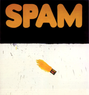
The recent show at Gagosian, Davies Street, London, titled Busted Glass offered depictions of a sheet of broken glass laid over grounds of various colours. The trompe l’oeil, while serviceable; is characteristically shallow as depth, fixing our attention on the shape of the edges, the modulation to the background colour. It is an illusion that paradoxically reminds us of the two-dimensional qualities of the picture; that for all its concreteness or realism entails abstraction. Actually it is a slender variation upon a theme that runs throughout Ruscha’s career, in which depth and depiction are balanced against materials and surface, and more notably, where picture balances against text.
The concern with text is inherited from the artist’s main influence, Jasper Johns, and merits closer inspection. In works such as Tennyson (1958) Johns uses the stencilled word as a template to a variety of paint application for a two-dimensional object – text. (Incidentally, the work is incorrectly dated on the Des Moines Art Center website). Ruscha takes the step of using standard and familiar typefaces and words as a more elaborate form of stencil, against which to measure painting, in a more passive or compliant mood. The step effectively underlines the print source of text, highlights the singularity of painting in certain ways and this emphasis makes it part of the Pop Art movement. It is this shrewd choice of entrenched word and typeface that make the work refer to more than mere signage. Pop Art is better understood as the use of obvious or mundane print sources, rather than strictly popular or preferred ones. Indeed the movement initially was emphatically neither. This of course is to take a much stricter view of the movement than more accepted versions.
Painting gains a new deadpan reserve in this sampling of print, while the reframing and selection of formal elements give even printing’s most prosaic examples a new dignity and rigour. By the same token the printing style reciprocally points to unexpected and potent properties of painting. This arises because even if painting were to do no more than enlarge a print (which it cannot do without begging the question of its context or framing) the enlargement does not preserve all the properties of the print, such as resolution of the inking or the support texture, colour or ageing to paper or inks, much less accident or incident to a given instance, such as misprint, staining or distress. In fact such painting isolates just the lines and colours, (in Lichtenstein’s case, as Benday dots) as a seemingly disembodied design and the absence of these other properties then serves to point to the supporting surface in a special way, emphasising its scale or texture in relation to the immaculate lines, single or flat colours, so that the absence of brushwork for example then figures as a special kind of self-effacement or reticence, a literal flatness to its three-dimensionality or material presence, an expressive or metaphoric wryness.
Ruscha is properly a founder of the movement, along with Andy Warhol, Roy Lichtenstein, James Rosenquist and others and the parameters he allows for painting and print are similarly cool or severe. However, Ruscha can allow typefaces volume, as in the 20th Century Fox logo and extends this to the extreme perspective of Standard Station (1966). A similar concern with perspective and architecture prompts studies of Los Angeles apartment blocks that hover between plan or projection and realised object. This use of volume and depth in turn leads to works such as Quit (1967) and Self (1967) that no longer carry an obvious print source in word or typeface and steadily depart from Pop. Other works from this time use small objects at actual scale, set in a hovering, abstract depth, as in Olive, Screw (1969). Trompe l’oeil here is really a way of granting a concrete object an abstract dimension, much as a word is granted volume and perspective in certain typefaces. Ruscha similarly adds liquid properties to typefaces, drawing them further into depiction, further from Pop.
The artist also pursues the sampling of printing beyond painting and even text to book formats such as Twenty Six Gasoline Stations (1963) consisting of photographs without accompanying text, while later books introduce sequences to the photographs, such as Every Building on Sunset Strip (1966) and even notional events such as The Royal Road Test (1967) and Crackers (1969). Publication is thus sampled for the collection and conformity of photography, for pictures as books or vice versa. Ruscha’s interests here also coincide with or anticipate Conceptual Art, in the use of documentation and recording (see also Posts 17 and 48). Other experiments carry collection and sequence to film, but it is painting as text-only works and qualities sampled against text there that remain central of his project.
Ruscha next adopts phrases, even whole sentences drawn from everyday conversation and applied in silkscreens. In contrast to Johns’ stencils, they print only backgrounds to the clear area of the letters and use unusual pigments including gun powder, Pepto-Bismol, spinach, carrot and onion stalk extracts. Obviously such works now constitute prints, even where text and typeface do not particularly suggest a publication. However eccentricity of message and method align it with painting by this and assert qualities of surface as oblique reflections upon the meaning of the text, much as choice and placement of typefaces do, in earlier works.
This link between text and background, whether as mere surface and pigment, a nominal depth or tone, more elaborate picture and trompe l’oeil, remains throughout his career. By the late 70s the links are structured around charts or diagrams, locating a mood or era, often using sprayed silhouettes as soft-focus or distanced icons or clichés. Text is not automatically foreground; foregrounds are not necessarily text, and blurred silhouettes are sometimes so compelling as a treatment of common objects, they stand alone.
By the 90s Ruscha turns to sharper backgrounds, stylised in other ways and offering equally whimsical metaphors to text. He also introduces clock faces as another kind of diagram and returns to illusionistic effects with wood-grain, vertical ‘film scratches’ and clumps of long grass. Again, the work juxtaposes rather than integrates these elements allows illusion will quickly discover its limitations, their symbolic value. So that shadows for example, also record a time of day, like a clock face, while clumps of grass suggest the unkempt and unobtrusive march of time. Ruscha thus allows a greater flexibility to text in painting, includes other forms of notation, other degrees of depth and depiction.
It is an impressive range. But while Ruscha’s spare rather restrained approach remains widely admired, it is finally, a product of its time as much as place, and while any number of artists from Richard Prince to Graham Gilmore, Monique Prieto, Dana Frankfort and even Jules de Balincourt exploit text in works and as works, Ruscha’s sensitivity to typeface, placement or layout are not shared and are as often under-appreciated. For it arose in the context of abstraction, careful attention to distinctions between two and three dimensions, picture and object, painting and print. His work has helped to transform these issues so that later artists no longer feel the need to stretch meaning across the spectrum, confine painting to such tidy distinctions. Instead they pursue wider, less formal categories, more urgent issues. In this sense Ruscha resists imitation, deflects influence and remains at an alluring distance.
Tuesday 25 December 2007
(67)
Tuesday 18 December 2007
(66)
The photography of Thomas Ruff belongs to The Düsseldorf School, reflects his training at the Academy there under Bernd and Hilla Becher. The Bechers stressed a documentary approach, an awareness of design and history to the most mundane or overlooked artefacts (see also Post 41). For Ruff the pictorial standards for such cataloguing have in turn become the object of his work, so that subjects or topics are often secondary or deliberately distanced. A category of picture, or genre, is revealed in his work by revising typical or expected features in some way, emphasising some, introducing or omitting others. He thus extends documentation to the means of collection, pictorial categories themselves. His contribution is by far the most radical of the school and effectively signals the dissolution of the Bechers’ project, to some extent the limits of traditional photography.
Ruff’s development is usefully contrasted with that of fellow student Andreas Gursky. For Gursky it is the Bechers’ wide angle restraint and frontality that inspire further additions to categories of architecture and civic planning, by retreating to loftier vantage points. Ruff’s approach is quite the opposite. Initially he concerns himself with intimate décor (crucially introduces colour relations) and notably portraiture confined to head and shoulders, against a blank background under flat lighting. It is obviously the format of official identification records, yet since the photographs are taken with a large format camera, allowing high resolution to negative and are printed to roughly life-size, the effect creates a curious jarring to the familiar format.
The pictures are so much more than the little ID of a passport or badge that the format now seems intensely artificial or arbitrary, the sitters, all the more unknown or anonymous, for the greater scrutiny. In fact it is the ID format itself that is now displayed, simply through a shift in scale and resolution, and takes on prominence as a fiercely exclusive, even confrontational genre. Much is made of the sombre expressions of the sitters, but given the dedication to neutrality and facial features, a stony concentration seems only appropriate.
Gursky also quickly adopts colour and then digital manipulation (inspired by Jeff Wall) in furthering his grand and intricate designs. For Ruff the ID format confirms the potential of photographic formats and techniques rather than prompting other brackets of individuals or groups. He is also drawn to digital options, but only as his interest switches to found pictures or established categories that can be manipulated or re-presented through them. In the 90s Ruff adopts infrared or night imaging and applies it to nondescript architecture, sometimes comic garden ornaments to showcase a military or police format and the work echoes the uneasy dedication of the ID format in its narrow focus, its gritty green chiaroscuro. Other works from the time use police ID modelling software to create fictive suspects and elsewhere stereoscopic presentations, while the range of found imagery stretches from studies of the night sky to political montages and modernist architecture. Official records of the stars are presented in greatly enlarged prints and sharpened focus, but as with the portraits, the effect is also of content distanced by the new context, a specific configuration of stars rendered as an abstraction, a rigid range of dots, distant and decorative.
Architectural themes continue throughout Ruff’s career. He turns to public and high rise housing, office blocks and warehouses. But here the ‘distinctive’ features tend to rely upon setting for scale, colour and other circumstance, are less strict in composition, less distinctive as format. Found works dispense with the formality, so to speak, proceed from publication and further function. Ruff tints portions if only to alert us to their altered or revised status, the presence of further print options. A Mies van der Rohe house for example is cleverly sentimentalised, or imbued with advertising hyperbole.
Ruff’s attention thus steadily shifts to digital and printing options. In the new century stock shots of equipment are similarly tinted, disengaged from illustration. In the Substrate series, comics are filtered through Photoshop to pure, but perfunctory abstraction. More recently web sourced imagery ranges from catastrophes to tourist spots and historical episodes, all stretched beyond pixel integrity in printing and rated for popularity and access by this pictorial economising. Lastly there are nudes drawn from porn sites, and these are blurred, somewhat like a Gerhard Richter, but do not quite filter photography from pornography. Ruff’s project has led him to new tools and an impressive range of themes, the work however is in matching them.
Tuesday 11 December 2007
(65)
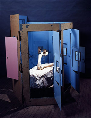
Another retrospective of the work of Louise Bourgeois begins a grand tour of international museums from its current address at The Tate Modern. At 95, it will presumably be the last in the artist’s lifetime. Bourgeois is known mainly for her sculpture, their bodily or biomorphic themes, diverse scale and materials that run to installations, even performance. Her patient development is also remarkable, so gradual in fact that for some time it has seemed to defy stylistic analysis or an adequate historical perspective.
But Bourgeois’ path has become clearer with time and her steady progress from biomorphic totems in the late 40s and through the 50s, in families and groupings, to more ambiguous hybrids of human and other animal, vegetable and mineral in uncertain cultivation, trace a shift in sculpture’s priorities for materials, for the range of content and the routes of such reference. The Surrealist roots are clear enough, just where Bourgeois departs from them, less so.
Earlier biomorphic sculpture stresses integration with material and process, a refinement or abstraction through the felicities of carving and modelling. The artist arrives at transcendent forms, yet native to materials. This approach begins with Constantin Brancusi, Hans Arp, Henry Moore and others, although they vary in degree of purity of form. Advocates in New York, such as Alexander Calder and Isamu Noguchi apply the shapes to new, perhaps precarious construction. Noguchi in particular absorbs furniture and functions, promotes personage to pillars or columns, in a way that invites Bourgeois’ totems. Soon the biomorphic element need hardly be present at all to prompt figurative allusion, strictly no longer belongs to Surrealism but a more abstract expression.
However Bourgeois is not inclined to greater abstraction. Instead her attention turns to more puzzling hybrids of animal and vegetable. The biomorphic now is not defined by dedication to carving or modelling, but to fictive realms of mutation and adaptation. The difference is between reference to remote but concrete realms and remote reference to abstract realms. The difference also carries a new flexibility to materials; and this change in emphasis is a large part of Bourgeois’ contribution, although slow to be recognised. For Bourgeois does not abandon marble and casting, even as plaster, rubber and plastics equally serve. She is not after a literal ‘special-effects’ accuracy to her nodules and bulbs, limbs and bulges, but rather their metaphorical potency, their propagation in diverse materials. It is this more complex relation to materials that give the work its richness and resonance of meaning; that ultimately proves influential. Yet, while she departs from biomorphic orthodoxy in this way, it is not territory that attracts immediate interest.
There is great interest in novel materials at that time, in the work of Claes Oldenburg to Duane Hanson, from Eva Hesse to Lynda Benglis, for example, but it is only as Pop and Minimalist styles tire in the 70s, and as Bourgeois’ scale and ambition grow, that her work coincides with wider interests. The Destruction of the Father (1974) with its mixture of plaster, latex, theatrical lighting, its theme of crumpled profusion, family exhaustion, signals this convergence. Sculpture then looks to less formal construction, feminism looks to more equitable sexuality, while Bourgeois looks to shifts in scale, location and material to drive metaphors. Confrontation (1978) expands a similar tableau into an actual arena, where Bourgeois then staged the performance - A Banquet/A fashion show of body parts - in which performers wore gowns fitted with similar rows of protuberances.
The sexual element to many works is often taken as liberation or frankness, but more accurately sexual differences, roles and growth tend to confirm group or family identity, to be a phase or flowering that pairs elements, parses unity, passes reproduction to representation. Later works use more diverse materials; arrive at installation and more readymade components. Body parts now offer metonyms for the person, within architecture that displays and imprisons. Significantly, such works are often titled Cell, preserving biological and collective metaphor. Occasionally the figure appears by proxy or setting, all but renounces her signature, while novel materials now add a surprisingly sentimental note; rely upon setting for the familiar distance. So the variety of materials brings with it more concrete representation, greater disparity with works.
Later Bourgeois can thus accommodate the figure literally, by parts, at an intimate scale, as well as on the grandest or public scale, in metaphor that makes a spider into the structure of grasp or span, frail and absurd, innocent and reassuring. Sculpture triumphs over the tyranny of materials or technology by such displacements, and Bourgeois’ contribution, while slow has been continual and resolute.
Tuesday 4 December 2007
(64)
The current Whitney Museum survey of Kara Walker’s work signals a sustained accomplishment as well as surprising popularity for work that deals in provocative racial and sexual stereotypes. Walker’s work is also known for its concentration upon silhouettes; these, often black paper pasted or projected directly to the gallery wall, others mounted on canvas, largely for preservational reasons while others find easy service in various print forms.
The preference for silhouettes emerges for Walker in the mid 90s, while she researched slave stereotypes, related caricatures and folk imagery. The attraction is by no means automatic given these sources and some of the impetus is surely due to contemporary currents at that point, to the growing interest in caricature, for example (see also Posts 5 and 11) to other uses for profiles or silhouettes (see also Post 13). Where African American or black themes arise, precedents perhaps incline her work in other ways.
For example the work of Kerry James Marshall, from this time, tends to flatten modelling of figures to a compelling minimum, often leaving only eyes as much more than a silhouette. Often Marshall’s work is un-stretched, and together with heraldic captions, tends to allude to folk or protest banners, a resistance to conventional framing or situation, that gives this relaxation an unmistakeable agenda. The work also features casual over-painting and dribbles, emphasising re-workings, cancellations and adjustments. These effectively stand as metaphors for compromised and ravaged policies for improvement and integration, and again these qualities build a stylistic context within which to place Walker.
The work of Michael Ray Charles from this time also features vigorously distressed or aged surfaces, for imagery that is drawn from black stereotypes used in earlier advertising. Here emphasis upon surface gives the work the quality of a rescued relic, an aura of reverence or complacent chic for what is essentially a demeaning caricature in the service of minor commerce. The battered surface thus takes on a more loaded, ambiguous meaning in the context of a contemporary image of black Americans. It is retrieved, but not without some loss. Both examples thus stress the picture surface in dealing with black stereotypes, in Marshall’s case even while broaching the silhouette. Part of what is distinctive to Walker’s approach is the conspicuous absence of this engagement with surface, indeed with even a definite or lasting surface to the work at all. So the attraction is not just to silhouettes, but a cooler, literally more detached approach to picturing black Americans.
Much of the impact of the silhouettes comes from the incorporation of the standard white walls to an exhibition space, as obvious counterpoint to the black figures. And the figures are not just cast into shadow of course, or lurking ‘in the dark’, but are racially black, are a pun and upon a white world, with black humour as a market or magic in the blackout or blind spot to power, in passing, playful projection. The eloquence of black to silhouette in fact almost overpowers their historical status as genteel amusement or currency in cartoons and children’s illustration since. All become suffused with slave and racial stereotypes, not merely located in a distant ante bellum but the nursery and myths that stalk history.
So effectively does Walker match silhouette to an image of black Americans, that for many the work becomes narrowly doctrinaire, the agenda too didactic, and soon dismissed as monotonous. But this is to miss how much is concealed by her silhouettes. For Walker’s characters are rarely straightforward and their interactions or situations often introduce sexual or violent acts, not just between races, but men, women and children. There is often as much feminism as racism at stake; in other cases the ambiguities to silhouettes cloak deeper myths and metamorphosis.
The distinctive wall tableaux on closer inspection rarely dwell on the tasks of slavery, even at their most mythic, but more often turn to the obscurities or ambiguities afforded by silhouettes. In this sense Walker’s silhouettes transcend slave stereotypes and become less about the roots of black Americans than an arena in which to project profound fears about sexuality and identity, hostility and dependence, superstition and trust. The distance from history is more pointed in a series of prints that take civil war episodes literally as a background. It is not so much that a black presence is otherwise unavailable – and virtually inconceivable - to these scenes, but that Walker’s concerns are so much broader, more comic and mythic. Silhouettes have become the source of a much greater emancipation, black and American, only in outline.

/bourgeoisfilette.jpg)