The installations of Cosima von Bonin deal in familiar, even orthodox concerns. There are surprising combinations of furniture, fittings and architectural features gathered in impressive variety, partitions, platforms, railings, improvised and mobile fixtures, booths, barricades, hangings and upholstery, together with toys, ornaments, luxury and sporting goods, all tidily placed for contrasts and comparisons in shape, colour, texture, scale and function; for neglected or optional codes and connotations. Bonin’s signature is perhaps diverse use of commercial textiles, sometimes mounted and framed as pictures – even paintings – elsewhere applied to unlikely items of furniture and fittings.
The installations display a curious range of standard goods, in a range of curiously non-standard ways. They continue a trend in installation to formidable assembly; prominent adaptation and puzzling content (see also Posts 7 and 8). The effect is a little like the work of a very distracted or confused interior decorator. Bonin is highly regarded in Germany and her recent show at MOCA L.A. (Sept 07 – Jan 08) consolidates her standing. Yet there are reasons why her work should prove attractive in Germany, offer more resistance elsewhere. This post looks at the particular range of goods and materials favoured by the artist and the way they are used.
Her work is not exclusively composed of readymade articles, and the articles are neither exclusively prestigious nor modest. It would be a lazy conclusion to describe the range as between high and low culture, good and bad taste, expensive to cheap. Nor are all the articles devoted to retail or trade display, to domestic or private use, to frivolous or everyday use, indeed some are not easily recognised or have no obvious function. The artist makes some articles, uses her own possessions, sometimes makes works that strongly suggest favourite German artists, such as Rosemarie Trockel and Sigmar Polke and at other times invites friends to contribute. It is this complexity or depth to the range of material that firstly recommends the work, but it is also the thorough-going integration of the private, the eccentric or exotic with the standardised, industrial and commercial that holds a special appeal for German art.
The issue frequently centres on architectural aspects and influence (see also Posts 15, 46 and 54) but in installations, this influence becomes especially pointed. There, the architecture of the gallery itself smoothly engages with the installation’s partitions, racks, lighting schemes, plinths and seating arrangements, provides the opportunity to use the material differently to some extent, to reshuffle categories, reconstrue meaning, while demonstrating the building’s overriding versatility, social purpose. The work is in a sense shared with architecture and a civic plan, the influence teased out to the level of toys and furniture.
Bonin’s work follows in the wake of Reinhard Mucha’s adoption of office furniture in striking arrangements, Thomas Schütte’s attention to décor and fittings, Katharina Fritsch’s table settings and arrays of toy animals, Rosemarie Trockel’s knitted Rorschach and animal patterns, items of clothing in documented photographs and related compositions (this to stress the German strain to Bonin’s work). The artist need do no more than imitate and combine to register a small signature here, extend and invite to provide installation with a powerful impetus to assimilation. And the works are finally about this wealth of resources, her restless navigation of the clutter and options, a skittish, impatient character.
So Bonin’s approach carries greater resonance in Germany, and particularly for her Cologne-based contemporaries, where this more scattered, perhaps promiscuous view of the artist’s role is widely shared. It derives at some distance from Sigmar Polke, more so from Martin Kippenberger and Albert Oehlen with the 80s boom and entrepreneurial turn. It goes almost without saying that Bonin is happy to use works as setting for performance, to direct film or videos, to write or design for others, even to DJ, as further phases to the same expansive engagement. Not surprisingly, elsewhere her involvements look less distinctive or compelling. Outside Germany, the affinities with preceding and adjacent artists, the smooth integration with domestic and industrial products, tend to look like a surrender to commerce rather than a subtle and supple redirection of uses. Similarly, items taken singly from installations, predictably lack the context and friction.
All the same her approach allows greater flexibility than a blanket commitment to commission or the readily-made (see also Posts 25 and 49) and if her variations on the work of others are not especially bold, remain a little too tasteful, they at least provide a point of departure or structure that installations by others so often struggle without.
Tuesday 26 February 2008
(76)
Tuesday 19 February 2008
(75)
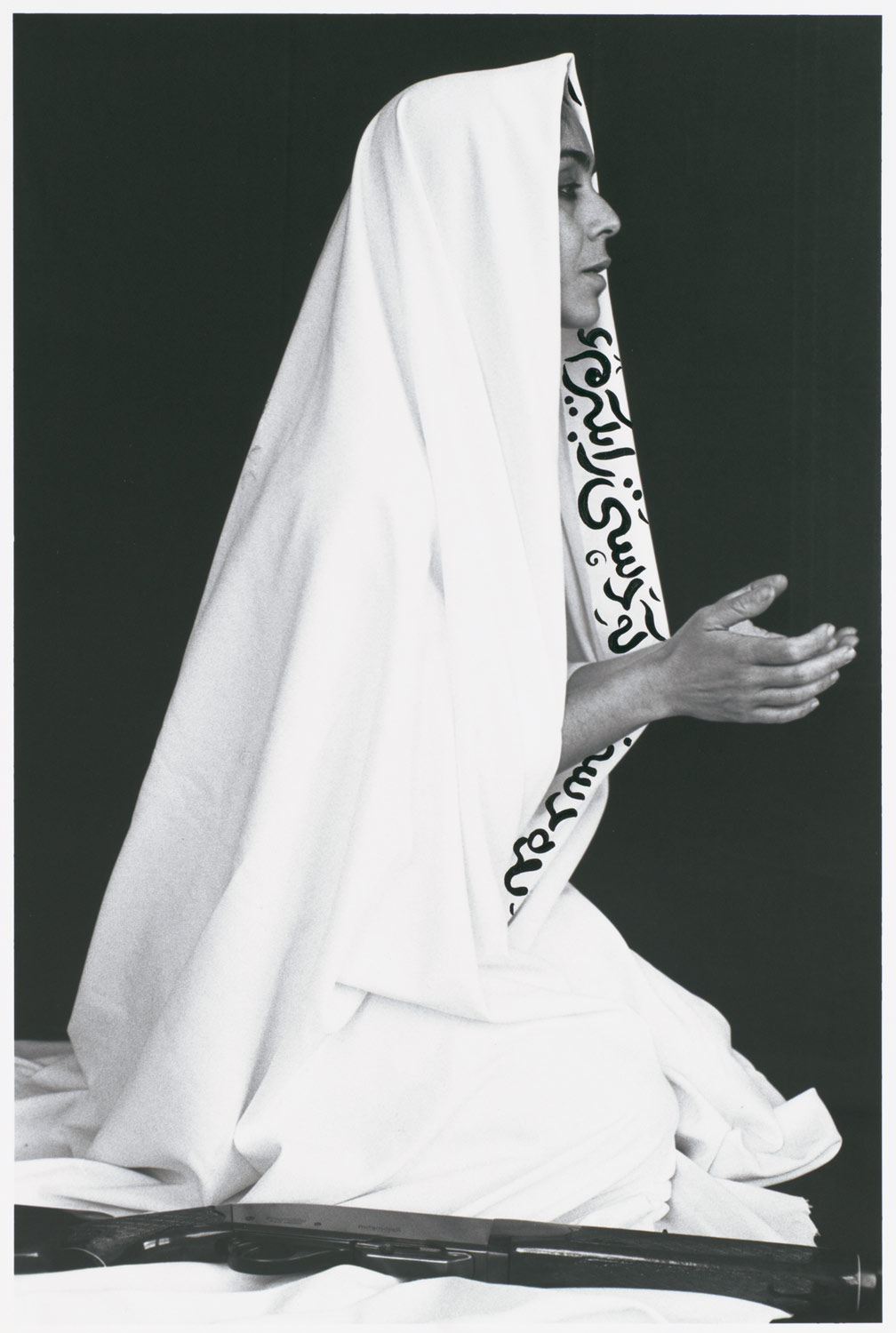
Shirin Neshat continues her installations of video and related stills at Barbara Gladstone NY, again freely adapting stories by fellow Iranian émigré Shahmush Parsipur and expanding upon the theme of cultural identity, that has driven her work from its first appearance in the early 90s. Neshat is interesting both for the way this theme has developed through the move from photography to video, and more generally for the way video then approaches narrative and cinema but retains an art gallery and fine art context.
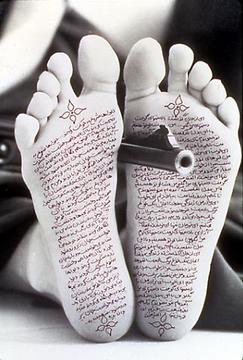
Neshat’s photography commenced as a response to her return to Iran in 1990 after an eleven year absence as an American citizen. The Women of Allah series (1993-7) is notable for the use of Persian or Farsi calligraphy and embellishment, often imposed on the hands of Iranian women (sometimes the artist or child) in traditional chador, militant stances, and stark black and white prints. Neshat’s encounter with contemporary Iran coincided with the wider interest in local and sub-cultural identities in art, in what is sometimes called Identity Art. Her work compounds a string of potent issues in the representation of Middle Eastern, Islamic, fundamentalist women in Iran by a US-based (of all places) émigré. The work confirms western stereotypes of sexual oppression, ruthless enforcement and hostility to depiction, while subtly signalling a profound alienation or rupture with both ideologies.
It is Identity Art surely at its most acute, since identity for women is largely confined to a single shapeless costume, for all adults, occasions, seasons, while culture is essentially reduced to the severest reading of Islamic scriptures. Moreover depiction, even as photography and only where it allows some further distinction, is literally and literarily over-written, reminding us of the grave suspicion ‘graven imagery’ holds under all of the Abrahamic creeds; the power its suppression then extracts, its rivalry to The Word.
The alignment of female identity with text here is ambiguous. For the casual western observer, text presents another teasing veil, concealing a supposed direct or natural encounter. For the Farsi reader, the contemporary poetry is shown surviving under Islamic doctrine, within the narrowest of constraints. Women are then taken as ‘the poetry’ to Iranian culture; poetry’s role as that of women to more masculine Iranian literature. The use of text upon or over figures, the rhyming of the black veil with the black and white of the print and isolation of figures against blank backgrounds; all highlight non-literal or metaphoric reference for the pictures. This more indirect meaning is also co-opted as a feminine domain, a discreet avenue of expression to circumvent restrictions on more explicit statement.
Neshat is soon drawn to motion pictures and opportunities for greater gesture and ritual, set against crucial architecture and locations, in group or collective action, set to music rather than dialogue or commentary – pointedly avoiding the explicit and articulate - and as challenge to predictable sequence or narrative. In themselves, these no more than announce her ambition as a film maker, but tellingly, Iranian cinema has been especially alert to such symbolism over much the same period, in many ways anticipates and answers Neshat’s work. So that in order to decisively stretch this range of expression; she relies upon distinctive screening configurations and a gallery rather than cinema context. She uses screens or channels on opposite walls with overlapping or complementary events pictured, sound often similarly displaced to generate more remote connections, metaphors for a troubled middle ground or combination. But by this, ironically, iconically, reference is firstly to cinematic or television norms, and obviously Iranian motion pictures, then to the artist’s uneasy distance or diffidence. Cultural identity by this route begins to seem somewhat aloof and evasive, the video installation demonstrating her detachment and divided loyalties.
Yet here too Neshat tethers picture and story to literature (Parsipur’s novel Women Without Men) eventually concedes dialogue and stricter narrative, colour and elaborate lighting. But work then looks less effective as installation, less distinctive as motion picture. Later works such as Mahdokht (2004) and Zarin (2005) dispense with dual channels and deal in more nuanced sexual roles, in childhood and adolescence, mystic fertility and a romantic, even clichéd embrace of nature. Inevitably Neshat advances toward a feature film by this series of short studies and the current show adds Munis (2008) and Faezeh (2008) to them. Events remain characteristically bleak (murder, suicide, rape and madness) but Neshat has now moved beyond black and white, Persia or Iran, female or male, discovers myth and deeper identity where history no longer reaches.
Tuesday 12 February 2008
(74)
A comprehensive survey of mainly grey works at the Metropolitan Museum of Art, NY and an accompanying show of works on paper at Matthew Marks, NY once more return this acclaimed artist to the public eye. At 78, Johns’ achievements stretch over half a century, and while his influence rests largely with his work of the 50s, his development has continued along rigorous, if less inspiring lines.
Johns rose to prominence in 1958 with works that use a repertoire of stencilled alphabets, words and numbers, concentric rings - usually called targets - and most famously, the design of the American flag. Such two-dimensional objects are not strictly pictured of course, but merely presented or instantiated and Johns’ emphatic brushwork and heavy encaustic paste allow modulations within a given colour; determine precision to line or edge (see also Post 71). The paintings sometimes use three-dimensional attachments to contrast the two-dimensionality at issue, to set scale and relate surfaces in other ways. The object emerges both transcendent and resilient, absorbing such variations while conversely imposing a level of compliance upon brushwork and colour. The exercise may seem meek in its conformity and narrow variation or daring in its choice of such familiar objects and idle treatment.
His deeply ambivalent attitude owes much to the work of Robert Rauschenberg but it is Johns’ more condensed means that exert the greater influence, especially over American art (see also Posts 13 and 56). The influence is felt firstly in Frank Stella’s black paintings; dispensing with a familiar design for an obvious one, maintaining a similar adherence to ‘straight’ lines, but now stripped of more traction than thinly applied household enamels. More ingeniously, Johns’ influence is re-directed in the work of Andy Warhol, where Warhol initially exchanges stencils or templates for familiar graphics or illustration – crucially focuses design on print source. Edward Ruscha similarly exchanges template lettering for established typefaces and similarly stresses the contrast with print for painting. Bruce Nauman takes up the three-dimensional component to Johns’ work with less obvious templates for body parts, rough cast and neon lettering. Each radically extends the project and tends to point to Johns’ comparative conservatism, promptly assign him an historical niche.
Johns subsequently relaxes the nature and arrangement of such templates and degree of conformity, in works such as Map (1962) and Diver (1962). But means quickly look arbitrary without closer alignment; design and template simply lose traction and identity. Johns turns to simpler geometry, to circles and squares but these carry less detail, do not then exhibit a compelling adherence or lack either. He tries irregular shapes in even distribution, like paving stones, and then parallel lines in small groups of uneven length, or a hatching pattern. Here the ordering is built up from line and makes special demands of painting for distinctive instance. Yet line in short straight parallels of even width only pushes Johns’ painting to more cursory and decorative detachment. Johns varies spacing to lines, adds layers and greater density to off-set this.
By the late 70s he combines hand prints with stencilled text, hatching and paving into more diffuse pattern. Compliance is less an issue than coherence. Pattern is then augmented with more figurative motifs, sharing surprising affinities and then by greater compartmentalisation or layout, in the arrangement of parts. He introduces traced outlines to traditional works, although often veiled in obscurity, together with photo-release or transfers, faux wood-graining and trompe l’oeil supporting nails. Parts vary in how easily they are recognised, what they stand for, by this arrangement and elsewhere. Tellingly, Johns soon adds those familiar ambiguous drawings such as a hag/beauty, two profiles to a vase or the famous duck/rabbit, heavy-handedly signalling his continued ambivalence.
The project begins to look somewhat dry and flat footed in comparison with much that has followed him. Johns started from a devotion to strictly two dimensional objects, not unlike those Picasso and Braque take up around 1912. But where they demonstrated resemblance between such two-dimensionality and various three-dimensional objects, so that text, wall-paper or wood-grain, for example may depict other objects in multiple and overlapping ways, for Johns the opposite view proved equally compelling. Two-dimensionality was never so suggestive or free, was merely adjusted with each painterly instance. Yet as Johns steadily expands his repertoire, it is precisely the allusiveness that fired Picasso and Braque that eventually appeals. His later work reflects this, but there is now no need to vigorously ground them in paint, this would be counter to their purpose, but equally, no way to properly engage with such drawing, once line is schooled in only the strictest and most reassuring of outlines. Johns settles for tracing too obscure to easily register, design too diffuse to properly trace or depict.
Tuesday 5 February 2008
(73)
By the artist’s standards, Runts is a modest series, presently showing at Pace Wildenstein, NY. They continue the restrained photo-montages the 82 year-old has favoured of late. Subdued or de-saturated colour, subtle cropping of edges to the photographs, and with greater prominence, a play with spatial continuity, all gently restate longstanding concerns. Composition in the photographs themselves; with their emphasis on frontality, strong graphic or two-dimensional elements, text and depiction in graffiti and folk art, are familiar Modernist concerns. All distil the artist’s taste for ambiguity and disparity, his much quoted “gap between art and life” where he remains comfortable with hybrids, misfits and half measures.
Rauschenberg’s interest in blending photography with painting reached a turning point with his illustrations to Dante’s Inferno in 1959. There, the technique of photo-release allowed close integration with pencil and watercolour. The text is storyboarded from top to bottom, left to right, with images from the popular press serving as metaphors. The layout linked images to the text but also contrasted them with each other; drew abstract or formal qualities between them into the interpretation. Temporal and spatial continuities are juggled with stylistic ones and soon suggested a more general project.
In 1962 the artist turned to photo-silkscreens combined with painting on a grander scale and by engaging with printing more directly, coincides with Pop Art (see also Posts 16 and 61). But while his choice of photographs overlaps with Andy Warhol in the use of topical figures, such as President Kennedy (while Warhol adopts Jackie) sporting events, the Statue of Liberty and reproductions of the old masters, Rauschenberg also included photographs of technical diagrams, ornithological charts, the NASA space programme, military craft, close-ups of a mosquito, heavy seas, a glass of milk and his own photographs of the urban landscape. His layouts share with Warhol the repeated silkscreen, overlaps, changes of colour to a given screen and irregular inking, but also use colour separations, segments and objects to a photograph carefully or roughly painted around and over in same or other colours. Warhol samples icons of detachment, of glamour or gloom, Rauschenberg the range in between. His pictures balance the abstract and figurative, print and painting; are always more and less than Pop.
Figures and objects hover between literal depiction and more symbolic roles and placement; are fragmentary, obscure, only glimpsed. The feeling is variously of tremendous freedom or disengagement, versatility or indifference, confusion or contempt, doubt or disdain. The richness to the work of the early 60s remains a pinnacle in his career. Rauschenberg melodramatically dispensed with photo-silkscreens upon receiving The Grand Prize at the 1964 Venice Biennale and eventually returned to photo-release, applied now to fine fabrics (see also Post 71). Painting has almost no role here and layouts trade in formal links between photographs, in repetitions, rotations and approximate symmetry. The work is pointedly restrained, strives for a lighter, slighter note.
Later, other techniques allow photographic printing to metallic surfaces and extravagant if decorative painterly gesture. The tracing and cropping of edges or parts of the photograph return, enriching the layouts, but tracing seems as far as Rauschenberg allows drawing. The ground upon which the photographs are placed increasingly shapes as a puzzling, even disturbing void. He continues more ambitious works throughout the 90s, now using greater resources to colour printing and more exotic, international content. The work to some extent recaptures some of the scope and vigour of the early 60s, but the greater technical finesse also distances. Moreover, the project by this time seems remote by other trends. The print paradigm for painting has long since dissipated, the interest in intermediates, in formal diversity within a picture, has given way to more and stricter categories, to degrees of abstraction (see Posts 24 and 53) rather than a grand spectrum.
Runts reflects this shift. The photographs now cluster squarely around a location or landscape, where in earlier times they would have been at pains to remain open to more categories. The photographs do not provide compelling continuity, yet differences often hinge on the familiarity or identity of objects, so for example, in Little Egypt (2007) where the sky stops at an immense white wall or lack of picture, while the lawn continues, aligned with the edge between details of a mural to the left, the top of which then appears upon ‘the white wall’. Similarly, Lighthouse Wall (2007) offers perhaps two levels of car park as well as two pictures, and the equipment to the foreground shares perspective with the figures behind. The famous gap now confined to no more than a matter of continuity against contiguity.
