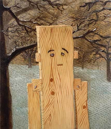
Both artists have a peculiarly fragmented body of work; present troubling inconsistencies of style. Both artists resort to text in painting and comic content. Both flirt with various contemporary styles only to reveal their own weaknesses. By the same token, each is victim of the stylistic momentum of rivals that undercuts their own impact. For all that, the difference between them is between an artist adept at pictorial forms, but bereft of an ambition to harness them, and one convinced of ambition, but ultimately prepared to compromise it for the sake of pictorial forms.
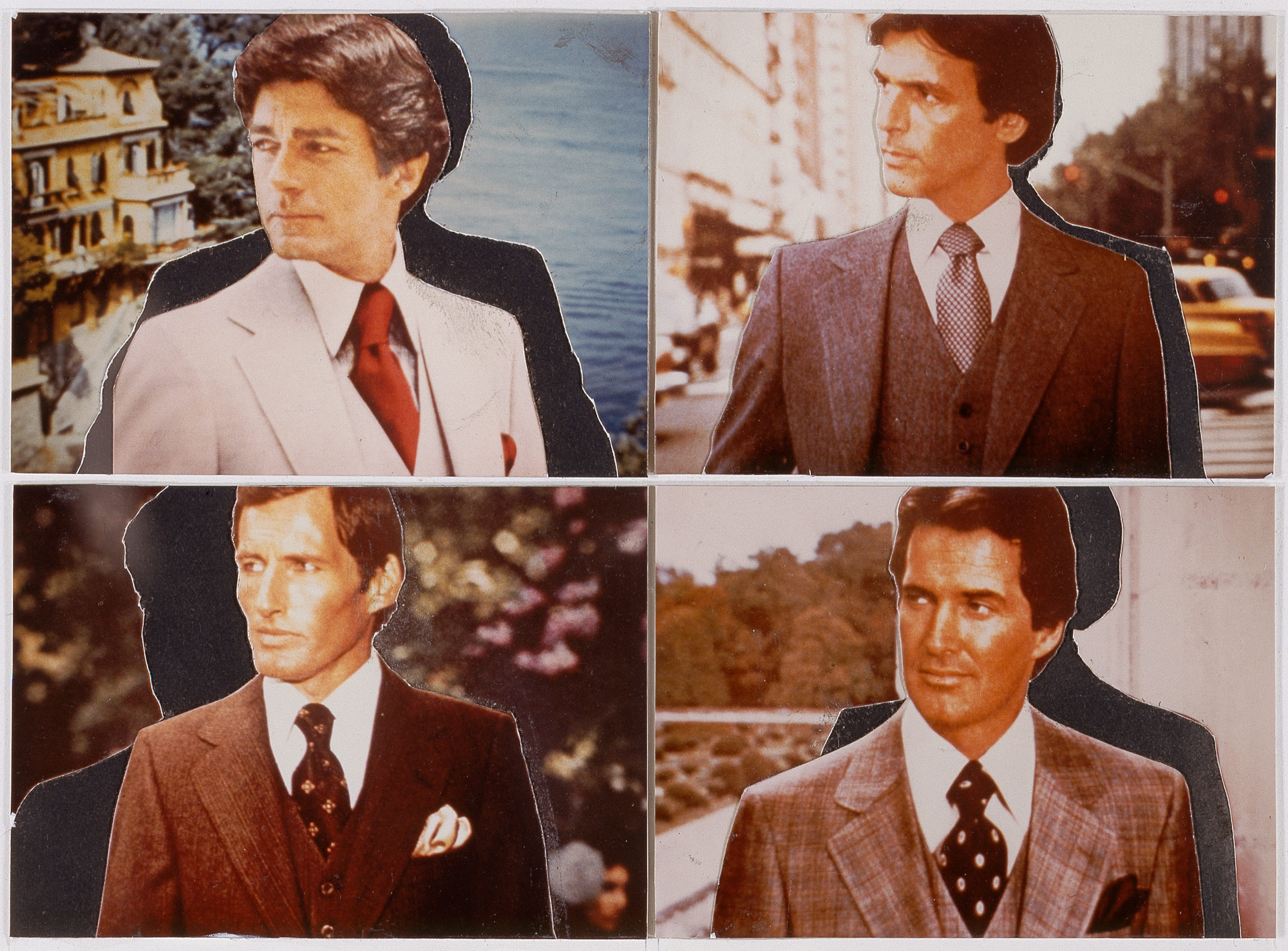
Prince (b. 1949) is the older and more circumspect. His career was launched in the late 70s with cropped and re-photographed details of advertisements, highlighting settings for luxury goods. The work is firstly about commercial iconography; secondly, the camera’s closer framing gives them a slightly different meaning from simply cropping the originals, accentuates qualities of print and links these to the re-framed composition. Formal qualities to the composition are perhaps debased or obscured by attention to print surface, alternatively, commercial print qualities are elevated by the comparison with entrenched formal qualities. Either way, re-photographing stresses differences between camera and print properties, announces a project of iconography, albeit detached by such differences.
Unfortunately, re-photographing photographs at that time is swept up with notions of ‘Appropriation’ and ‘Simulacra’ and on those terms Prince’s work looks somewhat cautious. Throughout the 80s he takes up the theme of cowboys and the open range, used as a setting for Marlboro ads. He later switches to less polished sources for the frank, perhaps folksy sexism of biker’s girls and similar pairings of women with heavy vehicles in specialist journals. Here photography is deliberately casual and re-photographing can do little more than coarsen print characteristics, often given the work a Warhol-like tonality. While modesty of technical resources here work against the iconography, up to a point, re-framing the composition can do little and around this time Prince begins to look to other avenues. He turns to silk-screened cartoons and jokes that carry much the same sexual attitudes.
Yet graphic and text sources require other kinds of re-framing to properly identify such features, and their placement upon vast canvases quickly immerses them in acute stylistic problems, that again traduce Prince’s project. The works lack Ruscha’s graphic expertise, for example, (see also Post 67) or Warhol’s bolder approach to silk-screening, finally feel like late and lame Pop Art. Prince can labour the surface, but only to the cost of typeface and layout and the project steadily loses focus. He soon alternates between his own (direct) photography, Neo-Expressionism, other remote print-sourced work, sculpture and installations. Each only confirms his limited engagement, dissipation of concerns. Iconography divorced from photography, it seems, soon finds Prince out of picture, but anxious to paint.
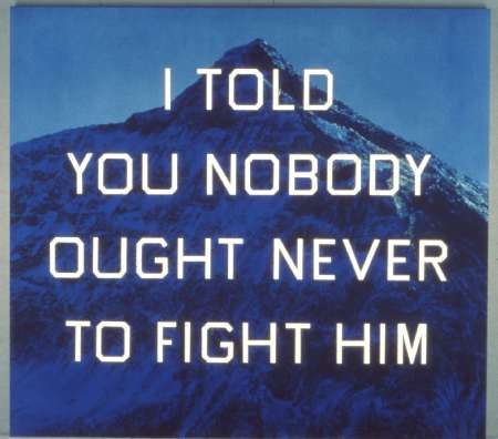
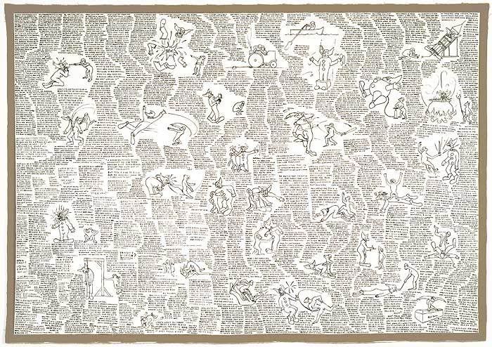
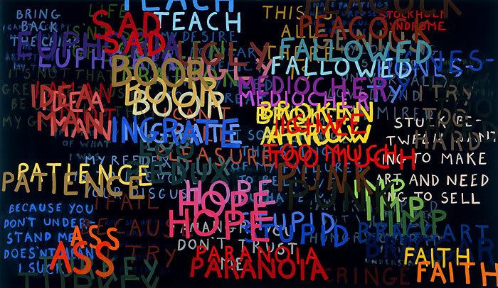
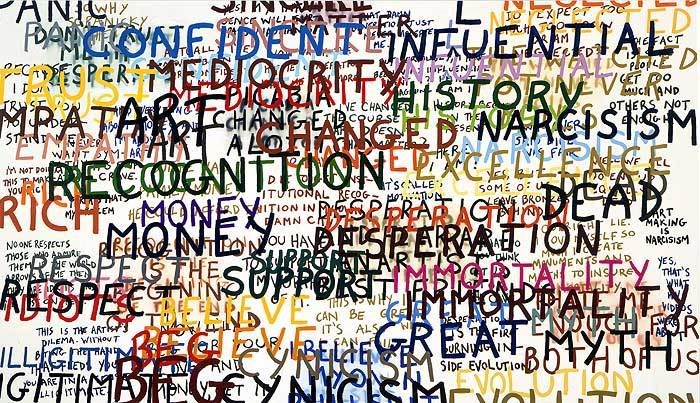
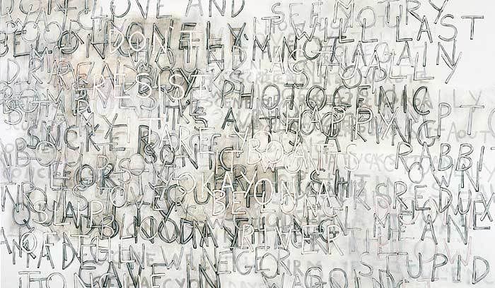
By contrast, Landers’ (b.1962) first allegiance is to Conceptual Art, to performance and installation and his interest in text proceeds from documentation. Text is applied to painting presumably from dissatisfaction with the scope and impact it has had on such events. Landers uses painting to extend his utterances in this sense, augmenting performance, to give them a graphic or pictorial dimension rather than gauge norms of print or publication. The work is hardly a foray into calligraphy or script though, and content is largely satirical and self-deprecating. The artist ‘writes’ paintings, or paints ‘writings’, but the results initially are somewhat crabbed and turgid, notably mostly for the arrangement of text into loose blocks or shapes.
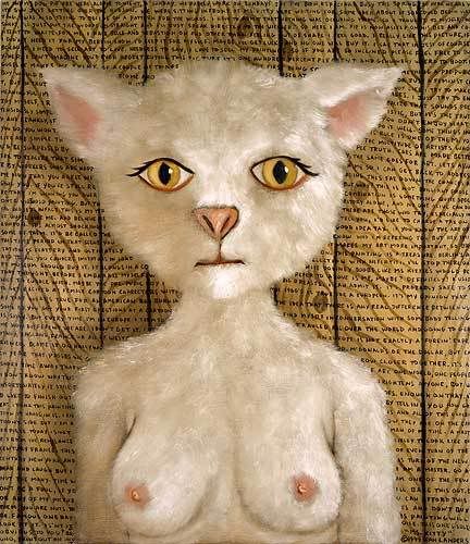
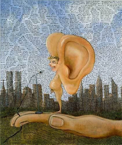
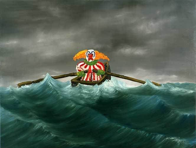
As Landers seeks greater pictorial resources, relations between text and imagery take more concrete form, and gradually image rivals text. The artist’s comic discourse finds equivalents or suggests a more exclusive approach. But Landers is never quite able to make the comic picture funny enough, or his own. Not because he lacks expertise, since competence is often part of the joke, not because so much of the silly imagery and treatment reveal the overwhelming influence of his associate, John Currin, and not even because Landers persists with more elaborate parody and pastiche, only to reveal surprising ambition; but because Landers’ commitment is firstly to the verbal and so a temporal rather than spatial domain. Pictures, in this respect, strictly exceed Lander’s needs.
Significantly, Landers returns to texts, at least intermittently, giving greater emphasis to overlaying and intersecting comment; uses colour rather than shape to particular comments and enlarges lettering, in a step toward more concerted calligraphy. The works grow in depth, visually, jettison much anecdote, verbally. The artist can now write paintings with more fluency, paint writing with less flippancy, but not before disclosing severe shortcomings to the project.
Tuesday, 25 March 2008
(80)
Tuesday, 18 March 2008
(79)
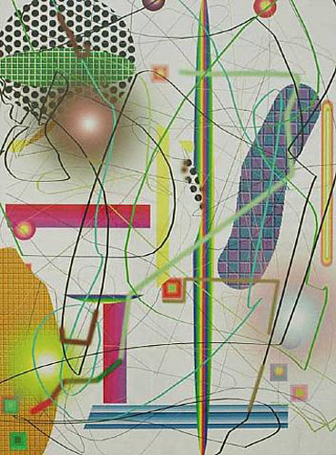
A show at Thomas Dane, London offers the artist’s now familiar combination of computer generated imagery printed onto canvas or panel, reworked with paint into layers of gesture, variously translucent and opaque, biomorphic or geometric, linear or tonal, abstract or figurative. The new work is restrained by the artist’s standards and gives new prominence to text, but the easy inclusiveness and disparity of elements continue to press the issue of abstraction for pictures, the resources of painting. For many, Oehlen’s ‘maximal’ compositions amount to a surrender to the arbitrary, to just ‘anything goes’ and a dead end for abstraction. This post looks at how Oehlen arrives at this style, at what ordering it retains.
Significantly, Oehlen began as a Neo-Expressionist, concerned firstly with figuration. His approach there is distinct from the ragged allegory of exponents in Cologne, the satirical revival by counterparts in Berlin. Oehlen is less concerned with print sources for pictures, than his Hamburg colleague Martin Kippenberger (even though Oehlen studied with Sigmar Polke). Oehlen’s Neo-Expressionism is noted for its heavier, more fluent facture, attention to literal objects (with tone and depth) albeit treated in an abrupt or peremptory way. Satire or ridicule arise through unlikely or eccentric subjects, scarcely recognisable through brutal treatment, or in traditional subjects, dealt with severely, as in Rotten Renaissance Rita (1984).
However, toward the end of the 80s Oehlen seems to have drifted to more schematic or stylized subjects, and by the 90s these in turn give way to greater abstraction, pairing hard edge, biomorphic forms with greater geometry or gesture. In many respects this is a timely move (see also Posts 10 and 18). But Oehlen takes up the issue indifferent to Minimalist concerns with process and extended materials, to Pattern and Decoration and the repeating motif (see also Posts 24 and 53). As a consequence his work can seem conservative where materials and technique are concerned, flaccid where composition or structure is concerned. There are examples where he includes patterned fabric, obviously recalling Polke, and wooden surfaces acknowledging extended materials, but generally he concentrates on a range of shapes or motifs across degrees of the organic or geometric, transparent or flat, linear or tonal. If there is a pattern, it is so diffuse as to encompass all in any configuration, if there is a native form or ideal for painting, it is so versatile as to allow myriad variations.
Oehlen maximises the options, in much the same spirit that he baulked at the figurative or more concrete depiction. And the effect is actually the inverse. Where his Neo-Expressionism never quite got close to the subject, his abstraction never quite escapes it. The organic, mechanical, translucent or runny all run to concrete reference when set in generous variation. When stretched wide enough, differences in abstraction turn some more concrete or figurative. In effect, there is never enough pattern to completely abstract the picture, never enough picture to quite do without pattern. Evasion, or the deliberate scattering of commitment, now shapes as a central theme.
The dismay felt by some toward this dissolution of structure then, is real enough, in so far as any purity of abstraction is maintained, but abstraction need not be exclusive or absolute here. While Oehlen allows a surprising range of elements and versions, especially through the 90s, it quickly becomes clear that there is no way to include all kinds of abstraction, in any number of versions, and that some ranges hold more excitement than others. His work duly alternates between the more figurative and less, the more stylish or fashionable and less. In the mid 90s, experiments with basic Photoshop tools applied to commissioned murals and mosaics lead to inkjet printing onto panel for painting and inevitably to the introduction of photography by the same route. Understandably, this becomes the preferred method, for painting and ‘collage’. The artist is able to exploit not only a greater precision to linear and colour grading through the computer, but more standard depiction. Where these set the key for further painting, Oehlen is able to derive stricter variations and differences, notably in the restriction to colour or upon stable grounds. Even where little of the print remains visible, volume and spatial orientations tend to anchor the composition, inspire looser orders, related objects and qualities.
In more recent work this construction has tightened even more and the diversity to printed elements, or collage, is almost the work in itself, leaving to painting mostly just the scantest blurring of colour or outline. Interestingly, these blurs often align with the figure or body, contrast pointedly with text or language and give the abstraction a deeply visual, corporeal value. Oehlen’s work, while elusive on so many traditional and favoured levels, is never far from a point.
Tuesday, 11 March 2008
(78)
A distinctive technique, attractive colour sense and often surprising compositions continue to draw admirers to the abstract paintings of Juan Uslé. This confirmed by both his current show at Cheim and Read, NY (ending 15th March) and recent survey at the Centre for Contemporary Art, Malaga. The work is so easy on the eye the artist is equally celebrated and censured for flaunted facility. Unfortunately the web offers too few examples of the artist’s early work to trace the development of his style. But since his work displays remarkable consistency over the past 18 years at least, this post looks instead at where Uslé fits in with abstraction currently, at why his work should draw this divided response.
The course of recent abstraction has been touched upon in earlier Posts (see 32, 10 and 14), as has the drift to lesser levels of abstraction (see Posts 24, 53 and 57). Here the interest is in how the formal elements allowed by Minimalism, or full abstraction, are teased into further variety. For, even to sustain the principles of Minimalism is to cautiously increase the options, to concede new variations and steadily ‘maximise’ formal elements. The strictest ordering or pattern soon paves the way for more relaxed, complex or elusive versions; for pattern detected across preceding patterns, along successive elements. By the 80s, traditional Pattern and Decoration have been assimilated, are extended by novel materials and technique or else compounded in more elusive relations between motifs.
If there is a single influence or relevant comparison for Uslé in New York (where he moves in 1987) it is probably the work of Jonathan Lasker, a pivotal figure for his dedication to just these relations. Lasker similarly favours linear formulations, overlapping motifs and often intriguing technique (and now also shows with Cheim and Read). However, for Lasker relations between parts are not just a deft play on the diversity of line, its role in shape and colour. They shrewdly make multiple connections from one kind of line or shape to others. The pattern may be diffuse, but the threads are fine and many. With Uslé, the diversity of parts, never quite display this complexity. At times he can seem very like Lasker, in the schematic arrangement of motifs and linear engineering, but the variation lacks the resonance and ingenuity of a Lasker. They are too diverse, in too few ways.
At other times Uslé’s lines or brushstrokes broach more figurative or stylised depiction, but these are rarely pressed or sustained. Then again when Uslé reins in the whimsical variation, retreats to just stripes or segments thereof, for example, the variation can seem not enough, too tame or traditional. Greater emphasis then falls upon the artist’s distinctive technique, in which a diluted or dispersed pigment is variously dragged or raked across the canvas, delivering a curious texture or distribution to colour, a somewhat mechanical feel to line, not unlike the work of Bernard Frize. Colour duly acquires a translucence or thinness that recalls fine fabrics, a sheer coating that inspires clothing, after a fashion. These are perhaps the artist’s most frank expressions of attitude. Line is more patterned for the unusual tool, but the patterns severely constrained, or again, combined with so much else that the effect is no more than mannerism.
Yet it is surely the lightness and directness to Uslé’s compositions that given them much of their appeal. If the price to be paid for that is a looseness to structure, an excess of variation, the reward is in some part surprise and insouciance. Critics have found his work dominated by technique and elegance, superficial or showy but this may be to mistake content for form. Are differences with Lasker simply differences in character or attitude? Put another way, is the artist entitled to a more diffuse structure for the greater emphasis on technique? There are other standards available. Unfortunately Uslé falls short of precedent and peers there as well. To compare Uslé with Albert Oehlen or Fiona Rae, for example, shows how much further diversity of technique may be carried, how cautious Uslé looks by comparison. Equally, to compare the work with more concrete diagram or chart, such as some works by Jules de Balincourt or Thomas Scheibitz reveals Uslé’s reluctance or indifference in that direction.
On one scale he is too reckless; on another not bold enough, on another too aloof. To see him as a compromise, or the best of all three, is to place a premium on moderation. Uslé stakes out a territory clearly enough, but it is for those who have little at stake.
Tuesday, 4 March 2008
(77)
A retrospective of the sculptures of Juan Muñoz (1953-2001) at the Tate Modern, London, traces a surprising return to the figure from what were initially site specific or architectural concerns, and with the figure to old issues of materials and stylisation. London held a special place for Muñoz as a student and site for later work. The survey capitalises on both and illuminates a brief career in the closing decades of the 20th century.
As a student in the 70s, Muñoz absorbed developments in sculpture on both sides of the Atlantic. As Minimalism dissipated, construction relaxed, (see also Post 36) attention to location and site specific work gradually turned to use of architectural features. In the US, Conceptual Art’s foray into Land Art as either real estate or landscape gardening (see also Post 48) gives way to sculpture of architectural structures, in the work of Dan Graham or Alice Aycock, for example. Industrial architecture is the initial inspiration and related elements arise in the work of artists such as Dennis Oppenheim, Siah Armajani and Vito Acconci. For Muñoz, his initial tower structures reflect this interest, but do not share the emphasis upon pre-fabricated components or industrial standards, actually are at pains to avoid them. Instead his work concentrates on the status of models, scale and context of their use.
Location has a way of redefining use and even extent in such work, of making adjacent materials models as well. This happens in early work like Minaret for Otto Kurz (1985) where a small frail tower is placed upon a Persian carpet, the carpet then suggesting a scale map and setting for the tower. Scale models can also suggest distance in some settings, or confirm attendant visual cues, as in the patterned floor to The Wasteland (1987). The figure, as in some works by Giacometti, seems to exude distance as much as diminution, even when we approach.
From the start, Muñoz includes token figures to his architectural structures and registers more vernacular (and Spanish) features with his famous balconies and remote railings. Again, the scale and placement of these fixtures promptly orientates gallery walls and spectators to respective distance, to the way these participate in the work to some extent, while uses are made remote or decorative. Railing or balcony is recognised, despite their impracticality, the location by implication is all the more unwelcoming for this attenuation of fixtures, the sacrifice to display. The work places the spectator on a delicate footing, the feeling often of caution.
The artist is soon drawn to issues of proportion as well as scale for the figure, and in the late 80s favours the male dwarf. Scale of figure to additional fixtures then takes on further complexity, again spreads the extent of the work to furniture and qualities of furnishing. In later work, mirrors are sometimes used as ways of highlighting this interaction. The measure of the dwarf, like railings or balconies re-orientates the gallery. Bodily proportions in turn invite the artist to considerations of dress or costume for figures, and these to levels of stylisation or abstraction. Muñoz’s series of ballerinas reduce the figure to a schematic head and torso, rotating on a rounded base. Their seeming flexibility of movement and balance nevertheless reinforces their fixity of situation, similar dependence on supporting furniture.
Muñoz’s installations are distinct from the elaborate settings and props provided to figures in the installations of Edward and Nancy Kienholz, or George Segal, the intricate detail and methods of commercial model making (see also Post 20). His approach is remarkable for the redirection of traditional materials like bronze and wood and issues of abstraction, to later concerns with installation and heightened context.
Inevitably Muñoz progresses to multiple figures, their interaction and the drama this gives to settings. Yet while groups (now mostly life-size and of normal proportions) often call attention to aspects of surrounding architecture, their silence and stillness tend to be accentuated. The spectator moves amongst them as if in a freeze frame. A work such as Two Seated on a Wall (2000) adopts the metaphor of a string of tiny figures between the mouth of the speaker and ear of the listener to represent speech and reinforce its exclusion, the strictly visual engagement available. In other ways, gesture and poses call for or exploit theatrical lighting and ominous mood to institutional architecture. Double Bind (2001) in the Turbine Hall of the Tate Modern was particularly melodramatic (for a detailed review, see James Hall).
While the artist elsewhere demonstrates a talent for drama, his contribution is not so much in the lively gestures of his Conversation Pieces, but sensitivity to how and where to stage them.

(0).jpg)
,+Untitled+1989,+oil+on+canvas.jpg)