Both artists specialise in installations, in temporary, site-specific works and commissioned fabrication or ‘readily-mades’ (see also Posts 25 and 49). Both artists prominently exploit architectural features, recent technology or engineering, and arrive at a calculated, theatrical presentation. Yet Eliasson favours an increasingly grand scale, samples a site or buildings against a radical redistribution of lighting, temperature, moisture, vapour or vegetation – is intent upon engineering nature as much as the nature of engineering. Pardo, by contrast, proceeds from details of interior design, from by-gone fashions, nostalgic motifs, colour schemes and accessories; freely revises and repositions wallpaper, furniture, lighting, doors and fittings, to highlight the layers of ornament to functions, the layers of function to ornament. One is immediately severe and profound, the other slight and scattered, perhaps slightly scattered, even frivolous. Yet both are committed to the plastic potential of design, to greater variations establishing a firmer underlying theme or nature. And both find that greater variation involves an environmental scale, an inclusion of the observer that then involves a literal disorientation or loss. This post traces an overlooked but persistent trait to recent installation, takes their work as actually two sides of the same coin. Eliasson’s use of light to generate colours for interiors is usually seen as inheriting the Minimalist colour environments of Robert Irwin and James Turrell (as the Los Angeles-based Light and Space movement, of the late 60s). The difference is Eliasson’s indifference to surfaces as a field of unusual intensity for a given colour, a disinterest in contrasts or harmonies or accompanying optical constraints. Instead he foregrounds the necessary equipment, cables, stands, their invitation to shadows and silhouettes of participants, their integration with surrounding architecture. Eliasson uses colour to set a level of visibility and mood for all elements to a site, rather than to construct a static and exclusively pictorial spectacle. His installations are predominantly temporary and changing, allow little of the permanence or ‘purity’ of Irwin or Turrell. In other respects Eliasson’s work echoes familiar developments throughout the 20th century, with its modular assemblies and symmetrical structures recalling Minimalism (see also Posts 42 and 96), the emphasis upon technology and engineering recalling the long and deep ties with industry and design (see also Post 8). Infact Eliasson can seem more kitsch or superficial than Pardo in his tastes. However the artist’s shiny materials, unlike most earlier uses, are dedicated to environmental interaction, reflect landscape and climate, population and resources and demonstrate a steady symbiosis between building and surrounds, that is usually understood as an embrace with nature. Yet the work is often experienced as somewhat bleak or aloof, no matter how crowded or dynamic. For all their inclusion in the work, the participant or observer has no function beyond idle presence, can admire the engagement with nature, provided others do not get in the way. The desired participation in such generous work ultimately herds people, reflects a dubious conception of involvement or environment. And equally, the artist’s hand or eye quickly retreats into so much co-operation or collaboration, leaves the observer with that much less to observe, more to suspect. Like the recurring use of ‘your’ in titles, there is the telling motif of the mirror, variously resisting closer inspection or penetration of surface with compelling reflection or deflection, briefly holding subjects spellbound by their own presence, prostrate before the work. As a symbol for involvement or artist, it firmly establishes a one-way relation. As noted, Pardo’s concerns remain more rooted in interiors, are less subject to gradual developments, the influence of atmosphere or climate, although not exclusively. Initial concerns would seem to lie with identifying style to routine lighting fixtures, such as Raymond Hill Lamp (1990) exhibiting a functioning lamp so that it brackets a style of fixture with a quality of light, this in turn reflected by placement and setting. Other early work co-ordinates sculptural elements with gallery surroundings, as in the installation Hawaii (1995), where various rectangular panels, spread across the floor, share shape and colour relations with the abutting yellow wall and filing panel to the reception desk. The work is thus slyly dispersed; its ‘properties’ detected according to architectural considerations; these further distinguishing differences and alignments amongst floor panels. This approach is common throughout the 90s (see also Posts 46, 76 and 93). But Pardo is particularly interested in the blurring of function and ornament or style. He has continued to use lamps, striking both for their extravagant or stylish fittings and unexpected placements. The nature of a lamp is thus contrasted with an emphatic flourish of culture or style. Again, it is as much the quality of light that then inflects setting, invokes other qualities to space and furniture, as whimsical design or nostalgia. The artist has similarly applied extreme design to clocks and doors (and here briefly, Pardo and Eliasson’s interests coincide, in a group show at Petzel, NY in 2007). These allow various degrees of function, of separation from the strictly decorative. The loosening of function, the dispersal of the work into surrounding architecture also has a pictorial or 2-D extension. Pardo’s customised wallpapers for example, exploit computer graphics, introduce complex combinations of pictures that defy standard function as wallpaper, yet refuse any single framing between wall and picture. Elsewhere paintings are devoted to familiar decorative motifs or are predictably adorned with additional paraphernalia, underlining the integration with a wider and widening work. Typically a Pardo installation looks to amplify affinities or links between an array of modest, domestic elements. Often geometric or biomorphic motifs are echoed or coincide with setting or shadows. Functions to objects are relaxed or resisted, so that one can equally regard a dining table and chairs for amusing and sensual rhythm or crystalline modules as a model for illumination or refraction. The work accommodates all, in part, and yet functions undercut by style and situation at some point immobilize the immersed observer. Where nothing is quite used or useable and style is never settled, the work engulfs its surroundings, blurs its boundaries and includes the observer, only to exclude a vantage point. We regard more stylistically there, but only by retreating from any familiar function, in the end style too dissolves under the withdrawal. For all the whimsy and reverie to Pardo’s work, like Eliasson’s, it carries a subtle and uneasy view of the implied person, for the smoothly expanding installation, where the observer is given so much to look at, but always when in the way of something else.
Tuesday 12 August 2008
(100)
Tuesday 5 August 2008
(99)
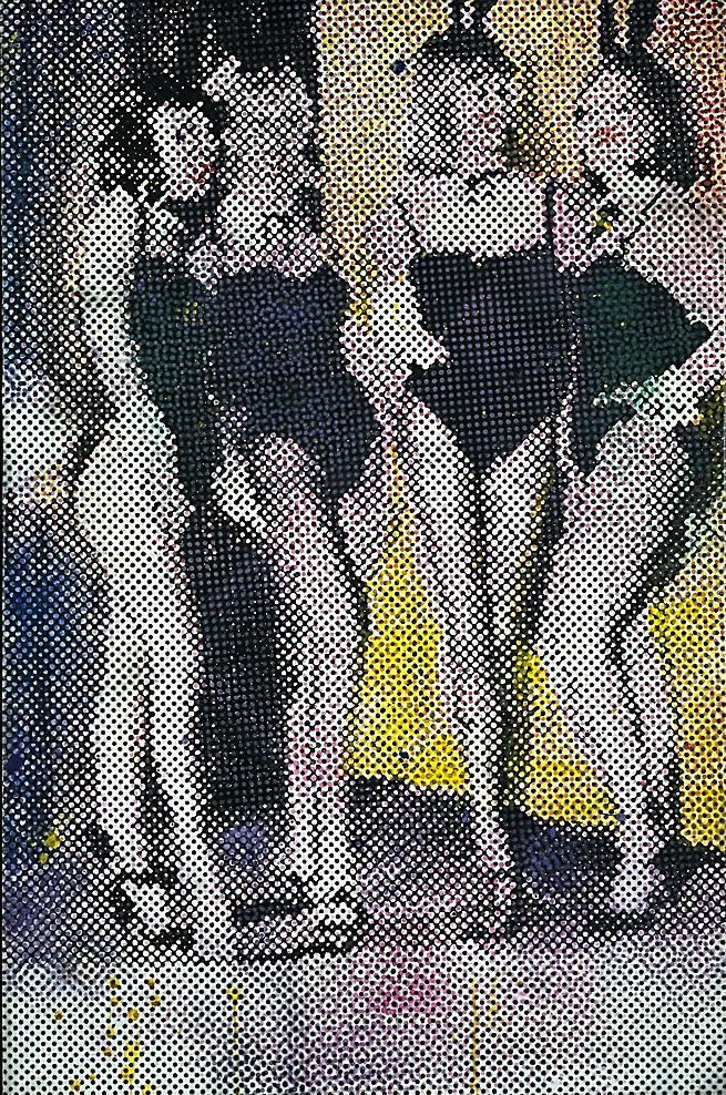
Polke’s stylistic lineage is obvious and yet puzzling. Like colleague Gerhard Richter, Polke’s career benefits from the success of a younger generation of German painters in the late 70s and early 80s, the Neue Wilden or Neo-Expressionists. Interest in immediate precedents then recognises Polke’s steady drift from Pop Art, his broadening sources, provocative themes, layers of imagery transferred as metaphors, perhaps allegory (see also Posts 26, 40 and 97). But in as much as he exerts an influence, it is only on artists like Albert Oehlen and Martin Kippenberger, initially based in Hamburg, where Polke was employed as a teacher. However his interests encompass as much abstraction and process as impulsive expression, and while this scope (also shared by Richter) surely influences later Cologne-based artists (see also Posts 76 and 82) it is curious, given how little impact Minimalism or Pattern and Decoration have upon German painting directly, how much of it Polke converts.
Polke finally remains loyal to a print sampling model for painting (again, like Richter) that no longer exerts influence, looks decidedly nostalgic by digital and multimedia standards; seems rather to encapsulate a by-gone era. Through it, he sums up many of the concerns of the late 20th century, not least the ambition of a grand synthesis of the abstract and figurative, the painterly and print-sourced, pattern and permutation, 2-D and 3-D. But for Polke, these strands are there almost from the start, in the early 60s. One of the reasons his work seemingly lacks the consistency of Richter, is because his options quickly multiply. If he lacks the commitment to be more than peripheral to Pop Art, it is because Pop Art is quickly peripheral to his commitment.
Polke’s development lies along three lines. The first expands upon print sources for painting, begins with commercial illustration and half-tone screens from common sources, usually, but not always photographic, to gradually include stencils and tracing identified as such by familiar sources, eventually to traditional woodcuts or etchings, these in turn subject to tone screens, more recently, even pixels, and transcribed with varying diligence. The second expands upon print content, begins with obvious and mundane print subjects (see also Posts 16, 61 and 89) then moves to content associated with other kinds of print or stencil, to traditional and historical themes. The third deals with print accuracy or efficiency of process and begins with the ‘dot gain’ to greatly enlarged details of tone screens, accenting distortion or loss of content. Polke then, surprisingly, adopts printed fabrics as supports, contrasting the strictness or accuracy of print, as well as regularity of pattern, with additional painting. Painting’s role as foil or errant instance of print or pattern is then highlighted by its abrupt interruption to the supporting surface. It is this deft alignment of painted canvas with printed fabric that smoothly assimilates pattern and abstraction, exploits figurative motifs as well as more abstract pattern.
Polke can then contrast geometric printed fabrics with clichéd stencils, with vigorous or casual treatment, tracing or more idle depiction, or use more figurative printed fabrics for additional and irregular figuration, further stencils of varying accuracy or recognition, multiple layers. Indeed, a key trait is system or pattern extended or contrasted with unexpected fragments, faltering technique. Polke can mock ‘the rules’ for formal composition, the banality of painting’s abstraction, or the rigour of its enforcement, but ultimately there are sources projected, ‘authorities’, no matter how diminished or distant. This testing or stretching of order or authority, is carried through to content, reflected in political and sexual themes, exotic and historical settings.
Printed fabrics subsequently invite sheer or transparent supports that appeal directly to the stretcher braces as structure or pattern, insist upon an explicit three-dimensional element to the flimsiest of two-dimensional content. And again, this formal feature has its counterpart in the themes, in quaint custom, ritual and formalities. His later interest in freer gesture or application, in spills and delayed chemical reactions for pigment, do not so much deny regularity or compliance with print instance or norm as invoke more occult or mystic powers, ‘higher’ but less reliable authorities, are echoed in the choice of folk tales and maxims, more diffuse imprinting. Polke ‘obeys’ them all, to the extent that they disrupt and obscure one another, to the extent that one marvels at the options, notes the hollow, degraded and eccentric instance, once set against others.
A Polke dot is never a polka dot, is always an enigma plot or a stigma halter, the spots for pics point to optical tricks, for the poked pried loose of the poker.
