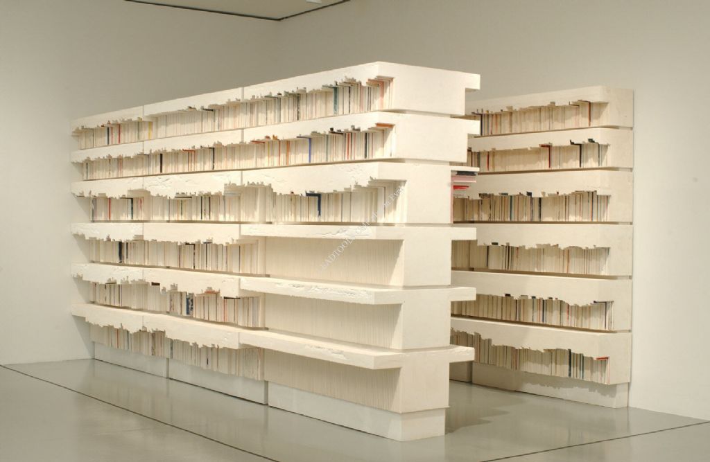
Whiteread’s signature is casts of architectural features, furniture and fixtures, various common containers from cardboard boxes or packaging to hot-water bottles and baths, in modest materials including plaster, resin, concrete and rubber. The work is instantly recognisable yet strangely detached, anonymous. Casts invert solids into space or voids; detach volumes from context or practical function, assume a symbolic role as container or imprint of fluid yet final practices. They fill and fulfil, measure repleteness or occupation against sealed and standard space. Whiteread’s work often evokes a sense of loss, of being sealed off, somehow excluded. Her most famous work is the monument to Holocaust victims in Judenplatz, Vienna, adding to the sense of interment.
Her work emerged in the early 90s and while the artist acknowledges the influence of Bruce Nauman’s A Cast of the Space under My Chair (1965–68) the interest in turn reflects two strands to British sculpture at the time. The first is the use of domestic furniture as material, not strictly as a ready-made, but rather extension to the Minimalist’s strict modules, to be assembled in some serial or convenient manner (see also Post 36) or combined with other materials, as in the work of Bill Woodrow. Whiteread’s early work paces these concerns; later efforts similarly appeal to modular assembly.
The second is the striking use of architecture as means to reconsider aspects of volume, proportion, light, function, etc. A close precedent is the work of Richard Wilson, with installations such as 20:50 (1987-96) in which a gallery (originally Matt’s Gallery, London) is filled waist high with used engine oil within a steel-plated lining that carefully traces the contours of the room. In such work, Wilson contrasted an interior with unwelcome fluid, invokes a sealed volume with an enclosed or confined one.
Whiteread’s castings of architecture, such as House (1993) and Apartment (2001) similarly highlight a sealed quality to walls and rooms, similarly record a fluid content. However her concern is not really with event or installation, but something more permanent. In theory, she could sample voids by filling them with any number of solid elements of potent association, in manner ranging from Arman to David Mach, and fix them there, but casting announces a fluid presence and its pouring, spraying and coating shape the meaning in certain ways.
Casting is associated with duplication as well as recording, with reinforcing and repair on persons. While many critics seize upon the latter in granting her works a bodily extension, a sense of personal space preserved or defended, there is a more directly sculptural sense in which casting enables duplication or reproduction; points to industry and conformity. The two senses are not mutually exclusive of course, but they do give the work more nuance than is generally allowed in commentary on her work. Casts invert solid and void, encase or simplify volumes, accent containment in smaller works, sheer capacity in larger ones. But the expression or metaphor is equally of a severely compartmentalised engagement as well as an undifferentiated filling, a literal pouring into place or holder. On the one hand, we apprehend familiar objects on terms of novel volume, on the other they are pointedly isolated, all the more remote for maintaining scale and surface detail.
The ambivalence is especially acute where the choice of object involves some prestige or authority. In works based upon display plinths and bookshelves, casting the surrounding space takes on a more provocative or ‘negative space’. Plinths anticipate or respect sculpture for example, but inspire only their inverse in shape, display merely a substitution of materials, the urge to supply only an equivalent volume. With bookshelves, it is the treatment of collections as simply a single volume that seems both amusing (a pun on her surname) and uneasy. There is no distinction by author or subject – at most schematic colour. Rather, they are a measure of décor, a token repository, again possessed on strict yet empty terms.
In the Holocaust memorial this allegiance extends to ‘The People of The Book.’ Yet her choice of the local name tellingly broadens the identity. It is hard to think of a major faith that does not place a premium on scriptures. It would be misleading to think librarians and bibliophiles were chief among the victims. Whiteread is devoted to the cause in the same way that her work adheres to surroundings, opportunities to reside and possess at a gut level. All are occasions to pour herself into situation, to parcel the experience simply in terms of bulk; in the case of libraries, by volume of volumes.
Tuesday, 15 July 2008
(96)


Tuesday, 8 July 2008
(95)
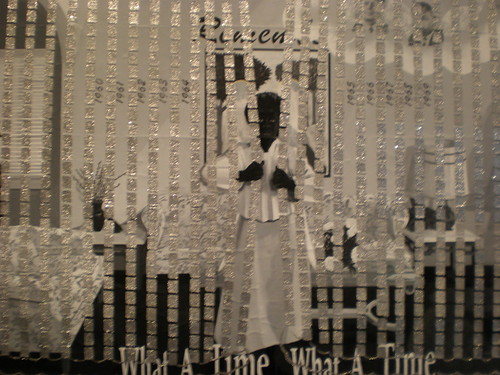
At Jack Shainman, NY, the artist presents a series of symbolic portraits of the black artist shielded by enormous palettes or perhaps supporting greatly increased means of painting. Other works provide idyllic scenes of seaside retreat, where figures feature the Afro hairstyle and fashions of the 60s, give the ideals of Black Power a mocking sentimentality or remoteness, much as some recent works hint at a desperate escapism there.
Marshall’s work is noted for its Black or Afro-American themes, a dedication to their roles and standing and the compelling means by which he assimilates these to contemporary painting. The concern with schematic or symbolic arrangements of pictorial space (see also Posts 53 and 57) is foremost and traits drawn from folk and commercial depiction (print and not) reinforce the status of common content as genre, through more concerted or accentuated painting (see also Posts 5, 11, 16 and 43).
The work achieved wider recognition in the early 90s, developing from a Neo-Expressionism with African roots, toward more complex themes; more refined drawing. Figures are now resolutely black, given little or no modelling and approach silhouettes (see also Post 13). They take on an elegant, if anonymous or generic quality, recall commercial illustration, while scrolled captions and large, un-stretched canvas supports recall public banners. The artist also includes stencilled floral motifs, often clogged or dripping with vigorous application, photo-collage or imagery denoting a coarse print source, sentimental and decorative motifs alternated with bold, graffiti-like or abstract gestures that further stretch the array of treatments, compound layout and dense surface.
This ‘maximising’ of techniques also has potent resonance in abstract painting at the time (see Posts 10 and 79) and for Marshall forges a crucial integrity not only across painting and print sources, symbolic and literal settings, but positions ‘black’ figures between a racial identity and a wider, pictorial one. In this, he anticipates the work of Kara Walker, but where Walker anchors her milieu in the ante bellum, in vivid folk and children’s tales, Marshall’s genre is more diffuse, contemporary. His figures are also ‘blacked out’ pictorially, but signal a deeply formal, self-conscious presence, occasionally giving sexual episodes a touching, comic aspect; frequently accompanying scenes of loss or neglect. The ‘black’ figure stares back, out of the picture, wary or resigned with childhood or civic ideals, with the gestures and roles available, the sentiments and tokens expected. The ‘black’ figure is as much a blank figure, the role denied or ignored, supplied for the sake of custom, obscured by a welter of formality.
There is often a wistful, elegiac tone, sometimes explicitly historical, but initially loss or departure is also through the accretion of embellishment or correction, the steady corruption of picture and person, often symbolised by the abuse of floral motifs. These tend to pale colours or white, granting the picture deeper symbolic meaning as it obscures or confines figures, amplifies the sense of lack to ‘black’.
Marshall has been prolific and his work subsequently includes more abstract forays, photography, installation, text-only prints and comic strips. The concern with Black Americans has remained, for the most part, but in painting, sources have thinned, technique narrowed. Tone is decidedly lighter. His interest in text in pictures is predictably drawn to comic strips, but the results are somewhat inert, for the injection of ‘black’ content into a stricter form, for the overpowering precedent of Pop Art and his own, more adventurous use of text and picture in earlier work. The shift gives his Black Power slogans a more nostalgic, wry quality, the stern font recalling banal public instruction or faith. As noted, figures featuring the Afro hairstyle also associated with the era, now take on greater modelling, a more rounded, if slighter picture, when not simply comic for conviction or fashions. The lighter tone and iconography seem almost in counterpoint to Walker’s mythic slavery. The ideals of the 60s now deflated proportionate to her excesses. But Marshall has yet to hit upon a style quite as elegant and provocative as Walkers’. That may lie closer to the work of Chris Ofili.
Similarly, in the series of romantic vignettes included in the current show, the pictures are restricted to a range of greys relieved only by saccharine valentines. Again the illustrational style cannot bring the same weight or wealth of meaning to romance or ‘black’ lovers. Marshall’s figures have become more rounded, more comfortable, less ‘black’ or blank, but are more confined for the maturity.
Tuesday, 1 July 2008
(94)
Christopher Brown (b.1951) so far has little international reputation, is mainly a West Coast presence. With a long exhibition record and steady following, his work enjoys a certain level of support, but no further. It is tempting to suppose his work does not win wider recognition for the same reason that it holds a firm place at a lesser level – that his charm is at the same time his flaw. This post looks at the work of an artist who is in many ways peripheral to the stylistic influences traced throughout painting in this blog, at advantages and disadvantages to such a position.
Brown’s paintings reveal a tentative, essentially conservative outlook. Examples from the 80s (these only the earliest available on the web – the artist by this time in his early 30s) show a range of interests, from an Expressionist portrait and close study (perhaps ‘appropriation’) after Thomas Eakins, to a stylised or schematic view of Mao swimming within buoys or hats and a bustling but fragmented crowd scene,with a precise historical source in the title November 19, 1863 (1989). Taken together, what would seem to attract the artist are figures placed in public, if not public figures, their spatial situation given some additional emblematic or deeper meaning and vigorous brushwork that further distances them and literal situation. Subsequent works such as Winter’s Blue Cold (1991) and Forty Flakes (1991) give figures a more even distribution or pattern and costume, use a steeper spatial projection and a blurring to figures and shadows that encourages a photographic reference - to long lens views and again a marked ‘distance’. In this, Brown is drawn to photographic genres (see also Posts 30 and 51) and inevitably recalls the work of Gerhard Richter.
But rather than proceed to similar resources, such as surveillance footage and other discreet public documentation, Brown turns to sources with more historical and significant roles for figures, to their identification by period fashions and customs. These are clearly less generic, more specific as pictures and their painterly treatment struggles to distance them from print source, to do more than echo Pop art or Photo-realism, while preserving period detail. Consequently the works are a little academic and sentimental. The figures underline Brown’s need for distant but distinct roles. The artist occasionally ventures into studies of the single figure in the 90s and to more schematic treatments of historical sources, but perhaps sensing the difficulty of bringing adequate pictorial structure to less guarded figures, or maintaining such structures without figures, increasingly turns to schemes or layouts dealing in native birds and their habitats.
These allow the artist a more relaxed approach to drawing, greater scope for abstraction, while using birds as a suitably distant metaphor for human community, adaptation and permutation. They soon inspire similar schemes with related environmental themes, a greater confidence in metaphor and structure and perhaps suggest a reversal in the approach to the figure. Rather than a stark structure derived from actual or literal incident, the structure now determines the appearance and tasks of figures. Works tellingly transfer habitat to house, abstract its sides and space, propose a diagram of property and propriety.
This concern with stylisation or a degree of abstraction is shared across much more acclaimed painting with the turn of the century and Brown’s interests to some extent are echoed in the work of a younger generation (see also Posts 34, 57 and 70). What separates him is firstly how much more tentative and scattered the work looks for seesawing between the linear and painterly, schema and figure across the length of a career. Secondly, the difference is in the weight that the local, regional and recreational acquire as Brown dispenses with the historical and distanced. Now he never quite engages the figures beyond home maintenance – literally in painting – and the sense is unmistakeably of disengagement or retreat, beyond other than home or heartland, a lack of method or rigour to content beyond that.
This is amplified in the most recent work where the artist returns to figures in winter recreation, although can now boldly equate them with home and even painting in the more ambitious works, can more confidently reshuffle space and scale , the painterly and abstract with the linear and figurative. Yet for all the formal freedom, Brown does not stray far from home. Nor can he be at home with more than a house, without gauging points of egress, mapping his options. For the work is happiest at departure and play, dipping into matters or skiing over them, as season allows, taken with appearances closer to home, toying with them, further a field. For the artist’s advocates, these are his virtues, for a wider constituency, as yet they are vices.
Tuesday, 24 June 2008
(93)
The present show at Regen Projects, LA - Energetic Accumulators and Token Exchanges – continues to adapt furniture to precise tasks of day to day living; in this case mainly desk spaces for stacking small, miscellaneous items, in satisfying arrangements. Of course, the artist’s tasks seem mainly the adaptation of her day to day surroundings, giving the project a certain circular logic, but her concerns are really hypothetical rather than practical.
Zittel’s work is often comic, exaggerating the reductive functions supposed by domestic design, the life confined to such minimal terms, simple needs and rigid organisation. An intense conformity is partly the point. The absurd dictates of ‘form follows function’ or ‘a machine for living’ results only in life becoming more formalised, more machine-like. But beyond her demonstrations of simple (self) construction from inexpensive materials, there is also a strangely alienated, behaviouristic view of life, a need to define activities so concretely, in terms of objects to hand, for lack of any larger – especially interactive or interpersonal – ambit. It is design that fusses over the details to domestic order to allay more central concerns; that plays at a self-containment and isolation there rather than work at more testing circumstances. It is design for the person without purpose.
Alternatively, the work allows such items to be taken on sculptural or formal terms, as an arrangement of materials, irrespective of function, and to demonstrate underlying links between fine and applied art, to urge a broader definition of ‘function’. Zittel is one of a number of artists, including Carsten Höller, Jorge Pardo, Tobias Rehberger (see also Post 8) and Franz West, that use furniture, fixtures and architectural features to broaden sculpture thus, to anchor installation to explicit design issues.
Such work relies less upon judicious display of found items – the ‘ready-made’ – than on commissioned fabrication – as the ‘readily-made’ and in this participates in a wider trend (see also Posts 25 and 49). However for Zittel, fabrication is mostly concerned with simplified and D-I-Y steps, modest and common materials, so this aspect is less pronounced than for example in a Koons or Rehberger. Furthermore, the design is sometimes so general that its realisation takes on more of a collaboration with particular builders, whom Zittel duly credits. This gives the work a less certain trajectory, undercuts the crucial distinction between design and function and means that it is not always clear in what sense the work stands as a model – how literal or hypothetical its application might be.
Her early work presented schemes for mating pigeons, as both elegant wooden abstraction – in particular recalling the Minimalist modules of Donald Judd – and practical models for avian breeding. The stark contrast between dedicated function and formal beauty is part of a steady challenge to formal properties in sculpture, following Minimalism. ‘Materials’ then gradually include uses and methods – ‘maximise’ properties – while abstraction subtly inherits connotations of authority and control. But it is when Zittel exchanges birds for humans, switches from breeding to isolating specimens, that her work gains greater complexity. As noted, the concentration on the individual and the isolation of (usually) her needs, takes on a whimsical quality as activities are arbitrarily assigned cubicles, costumes, localities and furnishings. Zittel’s work ranges from painting and prints to sculptures, installations, with lighting fixtures, storage units, carpet and shelving, demonstrating the phases to planning, promotion and merchandising, inevitably including a website.
The emphasis upon self-containment reaches its peak in Prototype for a Pocket Property (1999) literally a small island built for one, from concrete, apparently free-floating and located somewhere off the coast of Denmark. Typically the model is, in some respects, literally a small island, in others no more than a pretence or metaphor for profound withdrawal or abandon. A later project in the high desert of California provides a permanent location for equally remote or far-fetched abodes. It too has a website.
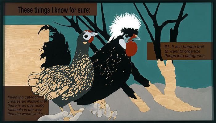
But increasingly, Zittel’s attention seems to lie with the association or combination of possessions, with fundamental questions of affinities and categories. Her Prototype for a Billboard (2005) confidently announces their crucial yet illusory role. Significantly, the billboard features a pair of birds, held in disembodied hands, beside barren bushes, the lower portions of which are left unpainted, along with a square – presumably for text – to the left of the birds. The unpainted timber may be part of the design, may simply be that for which the artist as yet can find no plan or category, may be illusion or ‘the way the world works’ in spite of all plans. Either way, the artist finally does not hold with certainty of function.
Tuesday, 17 June 2008
(92)
A series of paintings, mainly of outdoor sculpture, saw the artist vary his usual concern with architecture and surrounding garden in a recent show at Thomas Dane, London. Kürten has for some time contrasted and stylised differences between man’s design and nature, sometimes extending this to pictorial structures that assert or deny perspective, elsewhere displaying uncanny echoes and expressive aspects to both. The work is unassuming yet deceptively complex and Kürten’s love of linear precision tends to give the work a patient, cautious quality. The pictures of sculpture extend these concerns with appearance and function and where the sculptures are figurative introduce a new, more directly human note. Sadly, the Dane gallery’s web pages for the show are now reduced to installation views. However other web resources allow illustration of underlying elements to his style.
Kürten’s choice of architecture sometimes coincides with that of Peter Doig and the comparison is instructive. Doig also stylises surrounding nature in ways that highlight architectural and spatial qualities, often excludes figures and emphasises a linear rhythm even tracing. But Doig’s sources are casual or private, snapshots of places in passing, where detachment or estrangement are paramount. In Kürten line rarely signals tracing and subjects recall standard domestic models, the genre of home and garden, the carefully planned and preserved abode. Kürten’s attention to detail and pattern often compound the viewing angle with linear and planar aspects to the architecture, sometimes colour and light, so that what is pictured and how it is pictured are fused, present an array from flat pattern elements, either in foreground or background, to perspective and complex volumes. The feeling is of a profound but reluctant, almost furtive attachment across the spectrum.
The emphasis upon architecture in recent German painting is pervasive, quite distinct from mere urban landscape, the work of Christian Hellmich, Martin Kobe, Susanne Kühn, Ulf Puder, Neo Rauch, Thomas Scheibitz, David Schnell, Dirk Skreber and Matthias Weischer, for example, all feature building as a crucial building-block for depiction. It is tempting to suppose this reflects older Bauhaus teachings (see also Post 8) but space here prevents closer analysis.
Kürten’s training at the Düsseldorf Academy surely inclines him to studies in architecture, but while the influence of Bernd and Hilla Becher and their students such as Thomas Struth (see also Post 41) Thomas Ruff (see also Post 66) and Andreas Gursky all concentrate on documentary standards for photography and unusual classes of architecture, painting frames architecture somewhat differently. In any case Kürten has no interest in grand symmetries or panoramas, in imposing scale or wider civic design. Nevertheless he arrives at just as much abstraction. He is interested in looking through surroundings to the architecture, at how these modify or inflect the integrity of planes, such as walls or windows, roofs or paving, at how they build other, larger designs from the state of gardens, the layers of posts, fences, railings, lattices etc.
This glimpsed unity is underscored in the continuous, if somewhat faltering outline, that allows in-filled or coloured areas, especially skies or shadow, foliage or greenery, greater latitude, further flattening the picture, reinforcing the linear cohesion. These are qualities that build upon photographic composition, particularly in attention to precise tonalities, yet when transferred to outline and freer colouring, point to more fundamental issues – to perspective’s preference for architecture, its dependence upon framing in perceiving additional and unexpected aspects.
Occasionally the artist dispenses with a coherent perspective to build from collage-like fragments that hover between pattern and picture. He sometimes uses metallic paints as grounds to further animate outlined areas, so that they reflect differently depending upon light and position of spectator. At other times this in-filling takes the form of roughly repeating motifs, depending upon intensity or complexity of colour and this deft shift from outline to pattern – from continuous line to short, broken ones – is prominent in the treatment of greenery, goes toward a stylistic distinction between nature and culture. The technique also allows a further level of pattern – usually circular shapes of varying colour that appear to float before the scenes, as if an optical distraction. In all three ways, Kürten carries architectural and pictorial qualities through to painting and samples not only a genre of depicted domestic architecture, but expresses an attitude, in the quiet meeting of chance and design, nature and culture.
The paintings of outdoor sculpture also stress placement in parks and gardens, and in more figurative cases, signal a similar approach to person, as circumspect and circumstantial, as architecture or place.