The recent show at Gagosian, Davies Street, London, titled Busted Glass offered depictions of a sheet of broken glass laid over grounds of various colours. The trompe l’oeil, while serviceable; is characteristically shallow as depth, fixing our attention on the shape of the edges, the modulation to the background colour. It is an illusion that paradoxically reminds us of the two-dimensional qualities of the picture; that for all its concreteness or realism entails abstraction. Actually it is a slender variation upon a theme that runs throughout Ruscha’s career, in which depth and depiction are balanced against materials and surface, and more notably, where picture balances against text.
The concern with text is inherited from the artist’s main influence, Jasper Johns, and merits closer inspection. In works such as Tennyson (1958) Johns uses the stencilled word as a template to a variety of paint application for a two-dimensional object – text. (Incidentally, the work is incorrectly dated on the Des Moines Art Center website). Ruscha takes the step of using standard and familiar typefaces and words as a more elaborate form of stencil, against which to measure painting, in a more passive or compliant mood. The step effectively underlines the print source of text, highlights the singularity of painting in certain ways and this emphasis makes it part of the Pop Art movement. It is this shrewd choice of entrenched word and typeface that make the work refer to more than mere signage. Pop Art is better understood as the use of obvious or mundane print sources, rather than strictly popular or preferred ones. Indeed the movement initially was emphatically neither. This of course is to take a much stricter view of the movement than more accepted versions.
Painting gains a new deadpan reserve in this sampling of print, while the reframing and selection of formal elements give even printing’s most prosaic examples a new dignity and rigour. By the same token the printing style reciprocally points to unexpected and potent properties of painting. This arises because even if painting were to do no more than enlarge a print (which it cannot do without begging the question of its context or framing) the enlargement does not preserve all the properties of the print, such as resolution of the inking or the support texture, colour or ageing to paper or inks, much less accident or incident to a given instance, such as misprint, staining or distress. In fact such painting isolates just the lines and colours, (in Lichtenstein’s case, as Benday dots) as a seemingly disembodied design and the absence of these other properties then serves to point to the supporting surface in a special way, emphasising its scale or texture in relation to the immaculate lines, single or flat colours, so that the absence of brushwork for example then figures as a special kind of self-effacement or reticence, a literal flatness to its three-dimensionality or material presence, an expressive or metaphoric wryness.
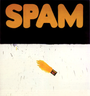
Ruscha is properly a founder of the movement, along with Andy Warhol, Roy Lichtenstein, James Rosenquist and others and the parameters he allows for painting and print are similarly cool or severe. However, Ruscha can allow typefaces volume, as in the 20th Century Fox logo and extends this to the extreme perspective of Standard Station (1966). A similar concern with perspective and architecture prompts studies of Los Angeles apartment blocks that hover between plan or projection and realised object. This use of volume and depth in turn leads to works such as Quit (1967) and Self (1967) that no longer carry an obvious print source in word or typeface and steadily depart from Pop. Other works from this time use small objects at actual scale, set in a hovering, abstract depth, as in Olive, Screw (1969). Trompe l’oeil here is really a way of granting a concrete object an abstract dimension, much as a word is granted volume and perspective in certain typefaces. Ruscha similarly adds liquid properties to typefaces, drawing them further into depiction, further from Pop.
The artist also pursues the sampling of printing beyond painting and even text to book formats such as Twenty Six Gasoline Stations (1963) consisting of photographs without accompanying text, while later books introduce sequences to the photographs, such as Every Building on Sunset Strip (1966) and even notional events such as The Royal Road Test (1967) and Crackers (1969). Publication is thus sampled for the collection and conformity of photography, for pictures as books or vice versa. Ruscha’s interests here also coincide with or anticipate Conceptual Art, in the use of documentation and recording (see also Posts 17 and 48). Other experiments carry collection and sequence to film, but it is painting as text-only works and qualities sampled against text there that remain central of his project.
Ruscha next adopts phrases, even whole sentences drawn from everyday conversation and applied in silkscreens. In contrast to Johns’ stencils, they print only backgrounds to the clear area of the letters and use unusual pigments including gun powder, Pepto-Bismol, spinach, carrot and onion stalk extracts. Obviously such works now constitute prints, even where text and typeface do not particularly suggest a publication. However eccentricity of message and method align it with painting by this and assert qualities of surface as oblique reflections upon the meaning of the text, much as choice and placement of typefaces do, in earlier works.
This link between text and background, whether as mere surface and pigment, a nominal depth or tone, more elaborate picture and trompe l’oeil, remains throughout his career. By the late 70s the links are structured around charts or diagrams, locating a mood or era, often using sprayed silhouettes as soft-focus or distanced icons or clichés. Text is not automatically foreground; foregrounds are not necessarily text, and blurred silhouettes are sometimes so compelling as a treatment of common objects, they stand alone.
By the 90s Ruscha turns to sharper backgrounds, stylised in other ways and offering equally whimsical metaphors to text. He also introduces clock faces as another kind of diagram and returns to illusionistic effects with wood-grain, vertical ‘film scratches’ and clumps of long grass. Again, the work juxtaposes rather than integrates these elements allows illusion will quickly discover its limitations, their symbolic value. So that shadows for example, also record a time of day, like a clock face, while clumps of grass suggest the unkempt and unobtrusive march of time. Ruscha thus allows a greater flexibility to text in painting, includes other forms of notation, other degrees of depth and depiction.
It is an impressive range. But while Ruscha’s spare rather restrained approach remains widely admired, it is finally, a product of its time as much as place, and while any number of artists from Richard Prince to Graham Gilmore, Monique Prieto, Dana Frankfort and even Jules de Balincourt exploit text in works and as works, Ruscha’s sensitivity to typeface, placement or layout are not shared and are as often under-appreciated. For it arose in the context of abstraction, careful attention to distinctions between two and three dimensions, picture and object, painting and print. His work has helped to transform these issues so that later artists no longer feel the need to stretch meaning across the spectrum, confine painting to such tidy distinctions. Instead they pursue wider, less formal categories, more urgent issues. In this sense Ruscha resists imitation, deflects influence and remains at an alluring distance.
Tuesday, 25 December 2007
(67)
Subscribe to:
Post Comments (Atom)

1 comment:
Ribbit
Post a Comment