The recent show at Gagosian, Davies Street, London, titled Busted Glass offered depictions of a sheet of broken glass laid over grounds of various colours. The trompe l’oeil, while serviceable; is characteristically shallow as depth, fixing our attention on the shape of the edges, the modulation to the background colour. It is an illusion that paradoxically reminds us of the two-dimensional qualities of the picture; that for all its concreteness or realism entails abstraction. Actually it is a slender variation upon a theme that runs throughout Ruscha’s career, in which depth and depiction are balanced against materials and surface, and more notably, where picture balances against text.
The concern with text is inherited from the artist’s main influence, Jasper Johns, and merits closer inspection. In works such as Tennyson (1958) Johns uses the stencilled word as a template to a variety of paint application for a two-dimensional object – text. (Incidentally, the work is incorrectly dated on the Des Moines Art Center website). Ruscha takes the step of using standard and familiar typefaces and words as a more elaborate form of stencil, against which to measure painting, in a more passive or compliant mood. The step effectively underlines the print source of text, highlights the singularity of painting in certain ways and this emphasis makes it part of the Pop Art movement. It is this shrewd choice of entrenched word and typeface that make the work refer to more than mere signage. Pop Art is better understood as the use of obvious or mundane print sources, rather than strictly popular or preferred ones. Indeed the movement initially was emphatically neither. This of course is to take a much stricter view of the movement than more accepted versions.
Painting gains a new deadpan reserve in this sampling of print, while the reframing and selection of formal elements give even printing’s most prosaic examples a new dignity and rigour. By the same token the printing style reciprocally points to unexpected and potent properties of painting. This arises because even if painting were to do no more than enlarge a print (which it cannot do without begging the question of its context or framing) the enlargement does not preserve all the properties of the print, such as resolution of the inking or the support texture, colour or ageing to paper or inks, much less accident or incident to a given instance, such as misprint, staining or distress. In fact such painting isolates just the lines and colours, (in Lichtenstein’s case, as Benday dots) as a seemingly disembodied design and the absence of these other properties then serves to point to the supporting surface in a special way, emphasising its scale or texture in relation to the immaculate lines, single or flat colours, so that the absence of brushwork for example then figures as a special kind of self-effacement or reticence, a literal flatness to its three-dimensionality or material presence, an expressive or metaphoric wryness.
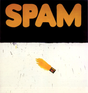
Ruscha is properly a founder of the movement, along with Andy Warhol, Roy Lichtenstein, James Rosenquist and others and the parameters he allows for painting and print are similarly cool or severe. However, Ruscha can allow typefaces volume, as in the 20th Century Fox logo and extends this to the extreme perspective of Standard Station (1966). A similar concern with perspective and architecture prompts studies of Los Angeles apartment blocks that hover between plan or projection and realised object. This use of volume and depth in turn leads to works such as Quit (1967) and Self (1967) that no longer carry an obvious print source in word or typeface and steadily depart from Pop. Other works from this time use small objects at actual scale, set in a hovering, abstract depth, as in Olive, Screw (1969). Trompe l’oeil here is really a way of granting a concrete object an abstract dimension, much as a word is granted volume and perspective in certain typefaces. Ruscha similarly adds liquid properties to typefaces, drawing them further into depiction, further from Pop.
The artist also pursues the sampling of printing beyond painting and even text to book formats such as Twenty Six Gasoline Stations (1963) consisting of photographs without accompanying text, while later books introduce sequences to the photographs, such as Every Building on Sunset Strip (1966) and even notional events such as The Royal Road Test (1967) and Crackers (1969). Publication is thus sampled for the collection and conformity of photography, for pictures as books or vice versa. Ruscha’s interests here also coincide with or anticipate Conceptual Art, in the use of documentation and recording (see also Posts 17 and 48). Other experiments carry collection and sequence to film, but it is painting as text-only works and qualities sampled against text there that remain central of his project.
Ruscha next adopts phrases, even whole sentences drawn from everyday conversation and applied in silkscreens. In contrast to Johns’ stencils, they print only backgrounds to the clear area of the letters and use unusual pigments including gun powder, Pepto-Bismol, spinach, carrot and onion stalk extracts. Obviously such works now constitute prints, even where text and typeface do not particularly suggest a publication. However eccentricity of message and method align it with painting by this and assert qualities of surface as oblique reflections upon the meaning of the text, much as choice and placement of typefaces do, in earlier works.
This link between text and background, whether as mere surface and pigment, a nominal depth or tone, more elaborate picture and trompe l’oeil, remains throughout his career. By the late 70s the links are structured around charts or diagrams, locating a mood or era, often using sprayed silhouettes as soft-focus or distanced icons or clichés. Text is not automatically foreground; foregrounds are not necessarily text, and blurred silhouettes are sometimes so compelling as a treatment of common objects, they stand alone.
By the 90s Ruscha turns to sharper backgrounds, stylised in other ways and offering equally whimsical metaphors to text. He also introduces clock faces as another kind of diagram and returns to illusionistic effects with wood-grain, vertical ‘film scratches’ and clumps of long grass. Again, the work juxtaposes rather than integrates these elements allows illusion will quickly discover its limitations, their symbolic value. So that shadows for example, also record a time of day, like a clock face, while clumps of grass suggest the unkempt and unobtrusive march of time. Ruscha thus allows a greater flexibility to text in painting, includes other forms of notation, other degrees of depth and depiction.
It is an impressive range. But while Ruscha’s spare rather restrained approach remains widely admired, it is finally, a product of its time as much as place, and while any number of artists from Richard Prince to Graham Gilmore, Monique Prieto, Dana Frankfort and even Jules de Balincourt exploit text in works and as works, Ruscha’s sensitivity to typeface, placement or layout are not shared and are as often under-appreciated. For it arose in the context of abstraction, careful attention to distinctions between two and three dimensions, picture and object, painting and print. His work has helped to transform these issues so that later artists no longer feel the need to stretch meaning across the spectrum, confine painting to such tidy distinctions. Instead they pursue wider, less formal categories, more urgent issues. In this sense Ruscha resists imitation, deflects influence and remains at an alluring distance.
Tuesday 25 December 2007
(67)
Tuesday 18 December 2007
(66)
The photography of Thomas Ruff belongs to The Düsseldorf School, reflects his training at the Academy there under Bernd and Hilla Becher. The Bechers stressed a documentary approach, an awareness of design and history to the most mundane or overlooked artefacts (see also Post 41). For Ruff the pictorial standards for such cataloguing have in turn become the object of his work, so that subjects or topics are often secondary or deliberately distanced. A category of picture, or genre, is revealed in his work by revising typical or expected features in some way, emphasising some, introducing or omitting others. He thus extends documentation to the means of collection, pictorial categories themselves. His contribution is by far the most radical of the school and effectively signals the dissolution of the Bechers’ project, to some extent the limits of traditional photography.
Ruff’s development is usefully contrasted with that of fellow student Andreas Gursky. For Gursky it is the Bechers’ wide angle restraint and frontality that inspire further additions to categories of architecture and civic planning, by retreating to loftier vantage points. Ruff’s approach is quite the opposite. Initially he concerns himself with intimate décor (crucially introduces colour relations) and notably portraiture confined to head and shoulders, against a blank background under flat lighting. It is obviously the format of official identification records, yet since the photographs are taken with a large format camera, allowing high resolution to negative and are printed to roughly life-size, the effect creates a curious jarring to the familiar format.
The pictures are so much more than the little ID of a passport or badge that the format now seems intensely artificial or arbitrary, the sitters, all the more unknown or anonymous, for the greater scrutiny. In fact it is the ID format itself that is now displayed, simply through a shift in scale and resolution, and takes on prominence as a fiercely exclusive, even confrontational genre. Much is made of the sombre expressions of the sitters, but given the dedication to neutrality and facial features, a stony concentration seems only appropriate.
Gursky also quickly adopts colour and then digital manipulation (inspired by Jeff Wall) in furthering his grand and intricate designs. For Ruff the ID format confirms the potential of photographic formats and techniques rather than prompting other brackets of individuals or groups. He is also drawn to digital options, but only as his interest switches to found pictures or established categories that can be manipulated or re-presented through them. In the 90s Ruff adopts infrared or night imaging and applies it to nondescript architecture, sometimes comic garden ornaments to showcase a military or police format and the work echoes the uneasy dedication of the ID format in its narrow focus, its gritty green chiaroscuro. Other works from the time use police ID modelling software to create fictive suspects and elsewhere stereoscopic presentations, while the range of found imagery stretches from studies of the night sky to political montages and modernist architecture. Official records of the stars are presented in greatly enlarged prints and sharpened focus, but as with the portraits, the effect is also of content distanced by the new context, a specific configuration of stars rendered as an abstraction, a rigid range of dots, distant and decorative.
Architectural themes continue throughout Ruff’s career. He turns to public and high rise housing, office blocks and warehouses. But here the ‘distinctive’ features tend to rely upon setting for scale, colour and other circumstance, are less strict in composition, less distinctive as format. Found works dispense with the formality, so to speak, proceed from publication and further function. Ruff tints portions if only to alert us to their altered or revised status, the presence of further print options. A Mies van der Rohe house for example is cleverly sentimentalised, or imbued with advertising hyperbole.
Ruff’s attention thus steadily shifts to digital and printing options. In the new century stock shots of equipment are similarly tinted, disengaged from illustration. In the Substrate series, comics are filtered through Photoshop to pure, but perfunctory abstraction. More recently web sourced imagery ranges from catastrophes to tourist spots and historical episodes, all stretched beyond pixel integrity in printing and rated for popularity and access by this pictorial economising. Lastly there are nudes drawn from porn sites, and these are blurred, somewhat like a Gerhard Richter, but do not quite filter photography from pornography. Ruff’s project has led him to new tools and an impressive range of themes, the work however is in matching them.
Tuesday 11 December 2007
(65)
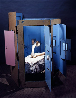
Another retrospective of the work of Louise Bourgeois begins a grand tour of international museums from its current address at The Tate Modern. At 95, it will presumably be the last in the artist’s lifetime. Bourgeois is known mainly for her sculpture, their bodily or biomorphic themes, diverse scale and materials that run to installations, even performance. Her patient development is also remarkable, so gradual in fact that for some time it has seemed to defy stylistic analysis or an adequate historical perspective.
But Bourgeois’ path has become clearer with time and her steady progress from biomorphic totems in the late 40s and through the 50s, in families and groupings, to more ambiguous hybrids of human and other animal, vegetable and mineral in uncertain cultivation, trace a shift in sculpture’s priorities for materials, for the range of content and the routes of such reference. The Surrealist roots are clear enough, just where Bourgeois departs from them, less so.
Earlier biomorphic sculpture stresses integration with material and process, a refinement or abstraction through the felicities of carving and modelling. The artist arrives at transcendent forms, yet native to materials. This approach begins with Constantin Brancusi, Hans Arp, Henry Moore and others, although they vary in degree of purity of form. Advocates in New York, such as Alexander Calder and Isamu Noguchi apply the shapes to new, perhaps precarious construction. Noguchi in particular absorbs furniture and functions, promotes personage to pillars or columns, in a way that invites Bourgeois’ totems. Soon the biomorphic element need hardly be present at all to prompt figurative allusion, strictly no longer belongs to Surrealism but a more abstract expression.
However Bourgeois is not inclined to greater abstraction. Instead her attention turns to more puzzling hybrids of animal and vegetable. The biomorphic now is not defined by dedication to carving or modelling, but to fictive realms of mutation and adaptation. The difference is between reference to remote but concrete realms and remote reference to abstract realms. The difference also carries a new flexibility to materials; and this change in emphasis is a large part of Bourgeois’ contribution, although slow to be recognised. For Bourgeois does not abandon marble and casting, even as plaster, rubber and plastics equally serve. She is not after a literal ‘special-effects’ accuracy to her nodules and bulbs, limbs and bulges, but rather their metaphorical potency, their propagation in diverse materials. It is this more complex relation to materials that give the work its richness and resonance of meaning; that ultimately proves influential. Yet, while she departs from biomorphic orthodoxy in this way, it is not territory that attracts immediate interest.
There is great interest in novel materials at that time, in the work of Claes Oldenburg to Duane Hanson, from Eva Hesse to Lynda Benglis, for example, but it is only as Pop and Minimalist styles tire in the 70s, and as Bourgeois’ scale and ambition grow, that her work coincides with wider interests. The Destruction of the Father (1974) with its mixture of plaster, latex, theatrical lighting, its theme of crumpled profusion, family exhaustion, signals this convergence. Sculpture then looks to less formal construction, feminism looks to more equitable sexuality, while Bourgeois looks to shifts in scale, location and material to drive metaphors. Confrontation (1978) expands a similar tableau into an actual arena, where Bourgeois then staged the performance - A Banquet/A fashion show of body parts - in which performers wore gowns fitted with similar rows of protuberances.
The sexual element to many works is often taken as liberation or frankness, but more accurately sexual differences, roles and growth tend to confirm group or family identity, to be a phase or flowering that pairs elements, parses unity, passes reproduction to representation. Later works use more diverse materials; arrive at installation and more readymade components. Body parts now offer metonyms for the person, within architecture that displays and imprisons. Significantly, such works are often titled Cell, preserving biological and collective metaphor. Occasionally the figure appears by proxy or setting, all but renounces her signature, while novel materials now add a surprisingly sentimental note; rely upon setting for the familiar distance. So the variety of materials brings with it more concrete representation, greater disparity with works.
Later Bourgeois can thus accommodate the figure literally, by parts, at an intimate scale, as well as on the grandest or public scale, in metaphor that makes a spider into the structure of grasp or span, frail and absurd, innocent and reassuring. Sculpture triumphs over the tyranny of materials or technology by such displacements, and Bourgeois’ contribution, while slow has been continual and resolute.
Tuesday 4 December 2007
(64)
The current Whitney Museum survey of Kara Walker’s work signals a sustained accomplishment as well as surprising popularity for work that deals in provocative racial and sexual stereotypes. Walker’s work is also known for its concentration upon silhouettes; these, often black paper pasted or projected directly to the gallery wall, others mounted on canvas, largely for preservational reasons while others find easy service in various print forms.
The preference for silhouettes emerges for Walker in the mid 90s, while she researched slave stereotypes, related caricatures and folk imagery. The attraction is by no means automatic given these sources and some of the impetus is surely due to contemporary currents at that point, to the growing interest in caricature, for example (see also Posts 5 and 11) to other uses for profiles or silhouettes (see also Post 13). Where African American or black themes arise, precedents perhaps incline her work in other ways.
For example the work of Kerry James Marshall, from this time, tends to flatten modelling of figures to a compelling minimum, often leaving only eyes as much more than a silhouette. Often Marshall’s work is un-stretched, and together with heraldic captions, tends to allude to folk or protest banners, a resistance to conventional framing or situation, that gives this relaxation an unmistakeable agenda. The work also features casual over-painting and dribbles, emphasising re-workings, cancellations and adjustments. These effectively stand as metaphors for compromised and ravaged policies for improvement and integration, and again these qualities build a stylistic context within which to place Walker.
The work of Michael Ray Charles from this time also features vigorously distressed or aged surfaces, for imagery that is drawn from black stereotypes used in earlier advertising. Here emphasis upon surface gives the work the quality of a rescued relic, an aura of reverence or complacent chic for what is essentially a demeaning caricature in the service of minor commerce. The battered surface thus takes on a more loaded, ambiguous meaning in the context of a contemporary image of black Americans. It is retrieved, but not without some loss. Both examples thus stress the picture surface in dealing with black stereotypes, in Marshall’s case even while broaching the silhouette. Part of what is distinctive to Walker’s approach is the conspicuous absence of this engagement with surface, indeed with even a definite or lasting surface to the work at all. So the attraction is not just to silhouettes, but a cooler, literally more detached approach to picturing black Americans.
Much of the impact of the silhouettes comes from the incorporation of the standard white walls to an exhibition space, as obvious counterpoint to the black figures. And the figures are not just cast into shadow of course, or lurking ‘in the dark’, but are racially black, are a pun and upon a white world, with black humour as a market or magic in the blackout or blind spot to power, in passing, playful projection. The eloquence of black to silhouette in fact almost overpowers their historical status as genteel amusement or currency in cartoons and children’s illustration since. All become suffused with slave and racial stereotypes, not merely located in a distant ante bellum but the nursery and myths that stalk history.
So effectively does Walker match silhouette to an image of black Americans, that for many the work becomes narrowly doctrinaire, the agenda too didactic, and soon dismissed as monotonous. But this is to miss how much is concealed by her silhouettes. For Walker’s characters are rarely straightforward and their interactions or situations often introduce sexual or violent acts, not just between races, but men, women and children. There is often as much feminism as racism at stake; in other cases the ambiguities to silhouettes cloak deeper myths and metamorphosis.
The distinctive wall tableaux on closer inspection rarely dwell on the tasks of slavery, even at their most mythic, but more often turn to the obscurities or ambiguities afforded by silhouettes. In this sense Walker’s silhouettes transcend slave stereotypes and become less about the roots of black Americans than an arena in which to project profound fears about sexuality and identity, hostility and dependence, superstition and trust. The distance from history is more pointed in a series of prints that take civil war episodes literally as a background. It is not so much that a black presence is otherwise unavailable – and virtually inconceivable - to these scenes, but that Walker’s concerns are so much broader, more comic and mythic. Silhouettes have become the source of a much greater emancipation, black and American, only in outline.
Tuesday 27 November 2007
(63)
Till Gerhard is a young German painter who has achieved some prominence in the last few years with work dealing in counter-cultural or obscure group customs, often outdoor gatherings, retreats to nature, driven by mystic, perhaps sect beliefs. These are treated with a decided distance and mockery, although for the most part respectfully drawn, deftly painted. The territory coincides to some extent with the work of contemporaries such as Jules de Balincourt and Kaye Donachie, but Gerhard is distinctive both for the breadth of activities included and a treatment that literally distances them through painterly obstruction, at times caustic abstraction.
The pictures often have photographic sources but the emphasis is on the mysterious or remote ideals driving the depicted behaviour and how little the pictures can explain or show of this, how obscure the aims or beliefs remain in spite of pictures. The work tends to revel in painterly dissolution at the margins, as well as spots and spatters that sometimes recall lens refractions, elsewhere raindrops. Both give the pictures a casual, hurried quality, the private record of celebration or promotion, rather than a more formal or finished view. Either way events are distanced by foreground incident, obscured by the bubble and fizz of attendant excitement, as in Walden (2004).
The paintings extend photographic qualities in this way and build a genre for group rituals, esoteric practices. In Gebuesch (2004) this applies as much to a geodesic dome of uncertain scale, nestling amongst shrubbery, as to the aftermath of a large gathering at a cemetery in Dawn (2005). But here, distancing is not just by more painterly means at the margins, to the brilliant pink sky and spatter, but by the small magenta flares that mysteriously arise across the scene. In Mistaken (2004) a strange red drapery hovers amid tree trunks bleached out by flash photography, and in White Spirit (2006) the central figure is wrapped in a white confusion. The blend of painterly and photographic qualities thus begins to introduce its own objects, to move from treatment, to things treated and further undermine and alienate the group’s purpose, the picture’s resolve.
In this respect, comparisons with de Balincourt and Donachie are instructive. Where de Balincourt pictures such groups as primitively conformist, schematic stereotypes, Gerhard instead supplies just distance, a dispersed mystique to the picture. Where Donachie looks to peer and group dynamics for a trust and devotion, verging on the religious, Gerhard is content to record their remote locations, their costume and decorations. Donachie is keyed to the blank and vulnerable identity, in dour tones and facture recalling a little, Luc Tuymans. Gerhard is keyed to their fleeting embrace of nature, their inaccessibility even by more flexible technique. Donachie accordingly concentrates on the figure and gesture, de Balincourt on stylisation and design, while Gerhard stretches incident and occasion. All find the breakaway group or cult rich ground for new distinctions in painting and genre.
While Gerhard does not share de Balincourt’s more ideological perspective or Donachie’s psychological and sexual undercurrents, he nevertheless embraces a wider range of examples. The work not only alludes to the 60s and drug culture, but accommodates other costume and roles, even effigies, festivities for houses, social unrest, even weather. All deal in obscure ceremony, pretence or faith in ends beyond the visible and pictured. The pictures not only stress their distance from this conviction but also point to the concealed identities that arise, comic stereotypes they resort to, and further absurd constructions painting might make upon the playfulness.
Avant-garde Backlash (2006) and False Guru (2006) are examples of this aggressive foregrounding or inscription to the picture. Both ridicule not just casual observation or depiction of events, but attempts to abstract or encapsulate underlying beliefs, to get at the motives and purpose of the group. Tellingly, the effect is a mixture of graffiti (the use of spray paint) and more painterly abstraction (the Pollock-like trailed drips). The artist’s condemnation would seem to be balanced by frustration, unable to properly participate nor transcend or depart the scene. The work uncomfortably oscillates between responses, registers a deep ambivalence.
In this sense the artist struggles for a unity within pictures that de Balincourt more comfortably allows between them. De Balincourt settles for a diverse body of work, Gerhard strives for diversity within works. Both carry distinct attitudes. Elsewhere, Gerhard simplifies figures through broad brushstrokes, more conventionally, arrives at a comfortable distance. It remains to be seen how much incident and mystery he is prepared to sacrifice or entertain.
Tuesday 20 November 2007
(62)
The paintings of Bernard Frize use line in abstractions that allow surprising complexity in terms of colour, facture, width and intersection. They stretch the definition of line. For advocates of pure abstraction, Frize’s work is interesting for the way it resists both the trend to expand technique along other avenues as well (see also Post 10) and to compromise on level of abstraction (see also Posts 14, 24 and 53). This approach to line prompts comparison with the work of Brice Marden and Jonathan Lasker, although the Frenchman’s stricter compositions seem cautious by their standards, less compelling as an extension to colour. This is because French Minimalism, largely through the Support/Surface Group, inclines the painter less to the details of repeating or related motifs, as in Lasker, less to auxiliary properties to colour, as in Marden. Instead it concentrates on pattern applied to various supports and conditions; to means that steadily loosen or revise the end, to pattern dispersed by relaxed application.
In this respect, it is easy to see why Frize is attracted to gestural qualities to line, to additional aspects revealed in the task of applying pattern to a given surface. Yet Frize’s development is not quite a smooth progression from Support/Surface tenets. While an early work such as Suite Segond (1980) shows him committed to abstraction, with a distribution of circles resulting in coinciding shapes/colours through overlap and juxtaposition; following works such as Still Life with Delft Vase (1983) abruptly switch to the figurative. This change presumably allows line now as either background or outline, while tone or shape remains distinct from either. In effect, it separates functions for line, aspects to the motif. Still Life with Tureen (1983) narrows the focus to just outline, but crucially allows shifts in intensity of colour, in width and resolution or ‘bleeding’ of line, so that the course or direction of line takes on greater prominence, begins to demonstrate the means of inscription, beyond any consistent outline for tureen.
With this focus upon line in place, Frize returns to abstraction (sadly there are few examples on the web for this period). Works such as Eixen (1992) then concentrate on lines generated by a peculiar device, perhaps only multiple brushes in the hand, allowing parallel lines of various colours to be applied simultaneously. The curves and angles available through this device or technique then reduce or enlarge line widths accordingly, creating an illusion of depth, or of ridges and hollows to the planes. The technique effectively reduces the picture to just lines, strictly parallels, gives each a colour, measures shape and variation by application. The result is ingenious and attractive, but parallels then suggest less certain combinations available to the device, propose other devices or applications.
In Alternante (1999) Frize takes a simpler approach to parallels, a wider variety of colours. The effect is far more Minimalist, although actually each horizontal line has three colours, each colour varies in weight or width and consistency, each intersection combines colours, supplies vertical parallels. The pattern is deceptively complex, and while still only parallel lines; lines gain surprising latitude in other respects. The project progressively supplies these additional qualities to line measured against patterns or structures, where parallel lines are less prominent. In Portable VVX (2000) a kind of interlacing combines multiple colours to a single ‘stroke’ again, together with single colour ‘strokes’, both of varying strengths, sometimes literally overlapping, elsewhere abutting or intersecting. As a result the interlacing all but collapses, as individual strands as colours or ‘strokes’ struggle for consistency. This balance between pattern and additional qualities to line, give the work an odd oscillation between relaxation and rigour, ingenuity and accident.
Increasingly Frize alternates between stricter pattern and more informal or complex versions; can allow line more space or compress it to unitary blocks that then trade mainly on colour variation. In the recent show at Simon Lee, in London four strategies are used. Lines are granted degrees of colour, yet remain strict in width, curve and length, secondly lines are granted intervals of colour that conform to strict pattern, in departing from grey, yet present no consistent colour beyond this. Thirdly Lines are restricted to straight lines, uniform width, are allowed extended intersections with other colours, so that overlap and change of direction are often shared or blurred. Finally there are sprayed lines that blur edges and colours, but these are the slightest variation. Finally, Frize sustains abstraction by this expanded view of line, but is perhaps obscured a little by reliance on familiar pattern.
Tuesday 13 November 2007
(61)
Ronald Brooks Kitaj led a restless, essentially nomadic life and his painting reflects his shifting enthusiasms. He was an American, although best known as a member of the Royal College of Art group of 1960-62, identified with the British version of Pop Art. The group rarely share the close attention to common or mundane print sources, of Lichtenstein or Warhol, instead, often arrange the picture into smaller, discrete pictures, or a layout, that together with text, tend to carry a weaker allusion to print (see also Post 16).
Kitaj’s sources are not contemporary advertising or graphics, but an array of historical and literary publications, often obscure. His project is initially a history painting constructed from layers of such reference. In early works such as The Murder of Rosa Luxemburg (1960) and Reflections on Violence - Gedanken über Gewalttätigkeit (1962) the task is firstly how to assimilate and arrange these sources in a painterly way – to signal iconographic derivation by this. The work struggles to resist mere collage with a kind of sketchiness; that in turn begs art history for clarity. His later collages for photo-silkscreen prints only emphasise how easily print absorbs collage, how little it leaves to painting. But as Kitaj steadily flattens colours and modelling, gives outline a heavier, deliberate abbreviation, the style arrives at something like standard graphics or illustration, and these give works such as The Ohio Gang (1964) and Walter Lippman (1966) literally a keener focus.
Remote sources are now contrasted with ‘graphic’ simplifications, while as painting, such techniques are attenuated by greater size and surface. The effect is curiously detached, even brittle. His technique is dry and thin, literally and emotionally. There is no need to actually trace iconography, even if possible, since strictly the work now becomes about this opacity to heavy outline, flat colours and disparate layout. Graphics are pressed to the point of obscurity; iconography haunts even cursory illustration. There is also Kitaj’s distinctive dry brush or rubbing technique at this time, which recalls the mottled wear and aging to cheap publications, particular the covers of paperbacks, subtly converting a common if overlooked print property to a stylistic one.
So while Kitaj is obviously not Pop in the sense of Warhol or even Peter Blake, print and layout formats are not easily restricted to ‘popular’ iconography. In general the British example urges degrees to Pop Art in this way, provides a porous periphery to the print paradigm for painting.
Kitaj’s work is also notable for the theme of sexual confrontation. Prostitution is sometimes explicit, but often sexual favour or attraction is something negotiated and arranged throughout the work, emerges almost as the culmination of method and mood – at once calculated and crass. In Synchrony with F.B. - General of Hot Desire (1968) a portrait of Francis Bacon as business man or gangster presides over the strangulation of a naked women, her legs spread, her face indifferent amongst the abstraction. In The Autumn of Central Paris (After Walter Benjamin) (1972-4) a bored woman remains the centre of attention for a conspiratorial group. The Henry Kissinger-like figure opposite her, and the unmistakeable caricature below of Richard Nixon as a Red Guard, comically sabotaging the negotiations, surely locate this encounter as the U.S. peace talks with North Vietnam, well after Benjamin and any aura Paris may once have held. The surrounding eavesdroppers and guards recall The Ohio Gang (1964). In both cases a woman is to be persuaded, enlisted; used in some way and one suspects; but briefly.
In later works Kitaj tires of fragmentation and diffidence and looks to a more relaxed and forthright style. Portraits and landscapes then offer more mannered drawing, but struggle to accommodate tone or modelling and he often seems to retreat to pastels as a remedy. In the late 80s his enthusiasm turns to Matisse and a lighter, broken facture. Political and historical themes gradually give way to more whimsical anecdote.
It is tempting to see this loosening as a response to the Neo-Expressionism of the time, but the artist’s interests cease to be of wide concern, in any case. His 1994 retrospective at The Tate met with a savage backlash, for example. Interestingly, a related brand of history painting arises in the work of Neo Rauch not long after. Where Kitaj is never quite comfortable with pictorial continuity or contiguity, Rauch’s more fluent approach, paradoxically provides more grades of disjuncture, re-drawing and fiction. Kitaj’s restlessness never allowed that commitment, ultimately he set more store in literature and history. It turns out even history painting does not always need that much history or literature, that more frivolous efforts often only underline the problem.
Tuesday 6 November 2007
(60)
Both photographers concentrate on 3-D scale modelling, especially of architectural interiors yet differ radically over means and subjects. Demand’s work perhaps commands the greater interest currently, and there are two reasons why this may be. Before considering these, Casebere’s contribution is carefully reviewed.
Casebere began in the mid 70s, making comic studio-based tableau such as Fork in the Refrigerator (1975) in which a gigantic fork penetrates a refrigerator. Such work shares an interest in cartoon imagery and whimsy, with photographers such as Sandy Skoglund, for instance. However Casebere’s interests shift to more public architecture in the 80s and the modelling takes on a more simplified set of volumes, often against a black background, with theatrical or cinematic lighting. From dealing with extreme fantasy the work now emphasises an evocative, fictional setting. However detail, or lack thereof, then treads a thin line. For while the models are clearly not realistic in great detail, this does not necessarily make them greatly fictional. Rather, fantasy here struggles against falsity, so that the model demonstrates certain melodramatic lighting or smoky atmosphere, and yet lacks the detail to pursue these to greater detail or distance.
Model, lighting and angle subtly test the overall impression or evocation to the photograph. Casebere’s use of prison models in the mid 90s exploits both the dramatic heritage and the inherent austerity of such architecture. The mood never ‘escapes’ the model, the model cannot do more than nod to the melodrama of the lighting and angle. Casebere has occasionally built his models for exhibition also, but mostly they remain tools for his photography, and the photography does not just lie in the stagy lighting, but in the ability of the camera lens and focus to direct attention to the details of the modelling, in delivering a coherent depth or perspective. This is something so basic to a camera, as to be often overlooked in assessing photographic qualities.
Casebere’s work subsequently seeks more exotic architecture, less familiar in scale and construction and often introduces a watery motif to foregrounds, as in Yellow Hallway (2001) and Green Staircase (2002). Here the scale of the water ripples again underlines the inconsistency of scale, the failure of fiction, in fact. In others, angle toys with the water, strives for other
theatricality. But this balance to the conviction of the models also underscores the standards of lens and focus brought to bear on both.
Demand’s work arrives around 1994 and his model making restricts materials to paper and card, immediately reducing all surface textures to a smooth, uniform colour, emphasising crisp volumes, subtle colour schemes, often in even or flat lighting. His choice of subjects looks to popular or topical publications, where the factual nature of photography is foremost. His patient reconstructions, as is often noted, tend to strip objects of wear or accident, to give scenes an anonymous, generic character. Perspective and proportions are maintained, but the realism stops at basic volume, flat colours. But notice that the work does not seem exactly false for this, as occurs in Casebere, but rather abstracted. There is no appeal to intangible qualities of mood or atmosphere, so the factual sits more comfortably on Demand.
But again the relation of model to photography is in fact an opportunity to demonstrate how lens and focus channel attention to this austerity of volume, surface and colour. To regard the model itself would be to lose this in consideration of scale, extent and varieties of point of view. It takes photography to filter these out, to ruthlessly measure the model against lens, exposure and focus – against what had become the mechanics of realism in depiction – and to properly register what has been modelled.
Demand has broadened his range of subjects, with exterior and natural settings, notably the spectacular Grotto (2006) and relaxed his model making, allowing the layers of card to appear at the base of the stalagmites in Grotto, and in other works, foregoes local colour to use bare card to the component volumes. In both cases model making is emphasised and the subject further abstracted, but not falsified or fictionalised.
Demand’s models make less demands in a sense than Casebere’s; allow him to be stricter with the terms of modelling, its treatment in photography. It is a more elegant if less ambitious project. But secondly, Demand’s more sociological scope fits comfortably within a broader German approach to art and design (see Posts 8, 15, 41 and 54) so that the project enjoys formidable reinforcement, within and beyond photography.
Tuesday 30 October 2007
(59)
The recent show of paintings by Gary Hume at White Cube, London continued the artist’s interest in flat shapes or silhouettes played across grounds, often the polished aluminium support the artist has favoured since the late 90s. The outlines are characteristically ambiguous, the fill to them occasionally a more modulated field of hatched lines or small strokes of various colours now, introducing a subtle concession to gesture, but essentially maintaining the format.
Hume’s most popular works are probably the portraits, animal and floral motifs that arise in the mid 90s. His work there shares interesting parallels with other ‘trace and fill’ approaches, such as that of Lisa Ruyter. However Hume is much freer with his tracing and the emphasis shifts accordingly. His project has more to do with the distance the bold tracing places on familiar icons. The work abstracts the object, but only so far, toys with a kind of debased or clichéd abstraction; hovers between standard icon and greater abstraction. This interest owes more to the erosion of boundaries between the two that occurs throughout the 80s, in works by artists such as Philip Taaffe and Lari Pittman.
Hume emerged around 1990, with a series of works using the design of a door or double doors, often the kind with inset windows (this example not a painting of course), found in institutions, sometimes with inset panels, recalling a past era. However the salient feature to these works is not the style of the doors but their 1:1 or life scale and high gloss enamel finish in commercial or industrial colours. In size, design, colour and finish works such as Incubus (1991) are actually scrupulously realistic, and yet the absence of volume or tone almost obscures such accuracy. Instead the works are as easily treated as an abstraction – which of course they are – but interestingly now, the choice of commercial pastels and high key tertiaries resist the norms for geometric abstraction as well, so that shapes, proportion and composition then give the painting a peculiar and uneasy scale, the work is door-sized, yet shapes, colour and space also take relations from the picture frame, give the materials and painting a ghostly (even parasitic, as the title suggests) proximity to the object depicted.
Hume’s project then is about abstracting or filtering out various qualities to commercial enamels, standard door design; geometric abstraction in painting. The design is not just for a standard door or abstract painting, the painting is not just a door or design, the door is equal parts abstract and actual. This variable or polyvalent approach to painting straddles abstraction and the more concrete or figurative; floats between the popular and obscure. It gives the work an arch attitude, not quite Pop, not quite purist or formalist, a bemused detachment from more concerted painting, from a closer engagement with icons and their worlds. It is an attitude shared by many of his British contemporaries.
Hume’s work subsequently turns to more figure-based themes, but it is notable that shapes are rarely dogged tracing, that they keep their distance from common icons, maintain a high gloss finish, if only to contrast with the uncertainty of shape or outline. Elsewhere they are transferred to prints, and surrender a little of that insistent finish. Works such as Francis Bacon (1998) or Whistler (1996) can nevertheless deliver an amusing caricature and much of Hume’s popularity lies in his ingenuity in this. However in following works Hume sheds the flat colours to allow mere outlines, stressing the simplification to icons. Bare outlines soon allow superimposed sets or layers of competing versions that again tend to filter out a literal reading, take on a more abstract function, underline a given width, hesitation or brittleness for a given object.
The exercise is hardly novel but it shows how Hume gradually extends outline, continues to balance abstraction against the figure; looks for the simple and familiar from which to build the complex and elusive. More recent work looks to less obvious objects, Pink and Green Smoke (2005) and Regents Park (2005) attenuate the derivation, trace more freely. Other work returns to flat silhouettes, thus distanced. Drawing and colour can still tease the object but they lack the link to décor offered by doors. Works such as American Tan VIII (2006-7) now compound layers, use outline against fill and polished surface and the effect is elegant, but each layer now filters a little less, is stricter for the variation. While superimposition has freed his tracing, it remains to be seen if it can bring a similar liberation to colour and finish.
Tuesday 23 October 2007
(58)
This post coincides with the elaborate installation by the artist now at the Haus der Kunst in Munich. The sculpture of Anish Kapoor is notable for the way it has merged Minimalist abstraction with an older concern for biomorphic imagery, with reliance upon fabrication and industrial process yet an attitude toward materials that often gives work a site-specific and ritualistic accent. Kapoor’s Anglo-Indian heritage perhaps disposes him toward some of this, and much commentary is quick to point to the link, but here his style is traced simply in terms of sculpture in the closing decades of the twentieth century.
Kapoor’s work first gained recognition in the early 80s, along with a wave of British contemporaries such as Bill Woodrow, Tony Cragg and Richard Deacon, yet Kapoor’s work is distinct firstly for its biomorphic imagery, mixing botanical and biological shapes, often with a strong sexual element to protuberances and recesses. This Surrealist strain continued in particular in the work of Louise Bourgeois. Secondly, there is Kapoor’s use of vivid pigments in powder form at this time, the surplus in generous piles, anchoring the work to the floor and a precise location.
The pigments in effect disguise the surface of the materials (variously, polystyrene, cement, earth, acrylic and wood) and identify the shapes by colour and pigment attributes, a single physical location, so that coating and overspill become the sculpture, in more ways than one. The colours condition the perception of volume, even scale, and give the shapes a theatrical aspect – a role or play to surface and volume, that is usually described in terms of spirit or transcendence. The grounding of the work, literally on the floor, also has echoes in Bourgeois’ work in the late 60s and 70s, but the treatment of materials by pigment in this way actually paces a different strand to sculpture.
In the work of Conceptual artists like Richard Long and Andy Goldsworthy from the times, objects and sample materials to a specific location are often arranged in Minimalist forms – circles, squares, piles and lines - either to be documented or removed to exhibition sites. What is sampled from a location – the materials collected – is by necessity given a form in presentation, yet what is sampled and what is sampler in this way, or what is presentation and representation, are not always clear cut. The form necessarily channels its content; the content absorbs some of its form. Like Kapoor’s pigments, we cannot know what such forms would do to other materials on other occasions, so that their true impact or the ‘true shape’ to a material remains conspicuously fugitive in such presentations, ultimately salutes spirit. In this sense Kapoor’s use of pigments owe as much to contemporary developments in sculpture as to Indian customs.
However, while such coatings remain an abiding concern for Kapoor, powdered pigment does not. By the same token while an abstracted, even divine sexuality to recesses, protuberances and uprights continues in his work, the more organic or biomorphic does not. The work becomes more abstract, sexuality is transformed into a planar and spatial interplay.
Later works steadily contrast holes and uprights with their material, surface and volume, as much as colour, so that holes smoothly assume circles, flatten into dishes, lengthen into tubes, take on a topological slipperiness only accentuated by highly polished surfaces, and more recently, mirrored surfaces. Mirrors of course, instantly draw upon their surroundings in perception, so that again work becomes both anchored to site, yet evasive, a surface difficult to catch as plane or volume, evanescent and immaculate. Thus works like Mother as A Mountain (1985) give way to examples such as Mountain (1989-91) or Mother As Void (1989-90) to When I am Pregnant (1992) to Red Circle (1996) to Turning The World Inside Out (1997) to Untitled (2003) to Untitled/Pregnant Square (2004) to S-Curve (2006). Or, for a more masculine accent, works develop from Untitled (1983) to Untitled (1987/8) to Ishis Light (2003) to Spire (2004) to Reverse Perverse (2006).
The gigantic Marsyas (2002) is surely the most extravagant demonstration of this shape shifting, exalted topology. Later works such as Untitled (2006) refine these concerns, faintly echo the sexual metaphor yet surrender more to fabrication and finish. This year’s installation in Munich promises a return to more tactile and frankly, messy surfaces, while Kapoor now embarks upon a kinetic dimension to his work. It is a mark of both the fundamental nature of his interests and his invention, that his themes easily assimilate motion, even amongst the period architecture and décor of the Haus der Kunst.
Tuesday 16 October 2007
(57)
The paintings of Jules de Balincourt are a good example of the way painting now moderates and alternates between abstraction and the more concrete, encounters new demands even as it relaxes old ones. The grand design or shrewd diagram, a revered colour code or proportion to outline, text or ground, all beg questions of perspective and propriety, of the final allegiance for such Olympian detachment. Politics baulks at that, doubts the big picture. By the same token, there is no starting ‘bottom-up’ either, with mere detail or pure means, without appealing to some sub-class or genre. The ambitious painter cannot trust a class or its members, a style or its objects and consequently painting proceeds with a mixture of suspicion and allure.
Balincourt is a relative newcomer, recognised around 2002-3 and noted firstly for his maps in which US nationhood and foreign relations are amusingly shuffled. While the example of Jasper Johns inevitably comes to mind, Balincourt’s concern is closer to the metaphorical mapping schemes of later artists, particularly from the 80s onwards, either in extending the allegory of Neo-Expressionism (see also Posts 26, 40 and 44) or to the charts and layouts that follow from Pattern and Decoration (see also Posts 2, 24 and 53). Balincourt’s touch is lighter, looser for the most part and significantly, he is not content with just the broad sweep of the master plan. From the beginning, other works look to more concrete examples for symptoms of some overall scheme. His work there shares some of the hard edge qualities of commercial illustrative style, but tellingly, Balincourt’s temperament and informality shy from stricter detail, so that the effect is often clumsy or faux-naif.
In works such as Gathering (2003) and Peaceful Protesters (2003) we move from the schematic to generic scene, the ‘naïve’ idealism of a sect or sub-culture, but the mesh of graphics is not quite standard and generic enough, nor more forthrightly naïve, and ultimately lack conviction, cannot project. This unfocussed, technical shortcoming nags at later works, especially with figures, as in Neighbourhood Watch (2004) and New Found Land (2004). Understandably Balincourt shifts the focus to more architectural concerns in Feast of Fools (2004) and The People Who Play and The People Who Pay (2004) and looks more confident devoted to the single comic figure or stereotype such as Youth Nationalism (2004) Poor Vision (2005) and this year’s impressive Holy Arab (2007).
On the other hand, the ‘big picture’ flourishes along themes of transmission or projection, from the modest Media information Center (2003) to Ambitious New Plans (2005) Violent Peace, Violent Healing (2006) Infect You, You Infect Me (2006) and Open for Season (2007). The military agenda that accompanies many of these works climaxes in his recent show at Zach Feuer, NY, with Think Globally, Act Locally (2007) and Unknowing Man’s Nature (2007) where a city grid is target or battery for a bombardment of incomings or outgoings. It is a vision that irresistibly suggests recent American foreign policy, as it ruthlessly extends the metaphor for communication. The works attain an impressive spatial abstraction, but while assuming a lofty ‘strategic’ viewpoint, cannot then quite cede greater latitude to paint, allow more abstraction. Interestingly, works like Boxing Your Subconscious (2005) and Remembering Our Great Dead Heroes (2007) address precisely this heritage to painterly abstraction and mock the organic and gestural against the hard edge and geometric.
Balincourt also returned to his maps this year with We Warned you About China (2007) a less direct cartography now, and the show was also notable for works devoted to landscape, such as I’m Just a Fire in The Night (2007) Untitled-cliffs (2007) Untitled-lake (2007) where attention to atmosphere, stylisation of water or light to crucial panoramas, again are less than compelling, largely because the detail needed cannot be sustained by loose handling. Balincourt wants the particulars but seems undecided on what they are or how to render them.
More successful are smaller, freer subjects, such as Cycles of Morning and Dyeing (2007) – a makeshift rack of coloured rags on a beach, that with eyes, takes on a haunting persona. This intersecting of the abstract and concrete, the more and less stylised, is an issue shared by contemporaries as diverse as Neo Rauch and Dana Schutz. Balincourt’s scope and invention distinguish him, although as yet he perhaps lacks the technical assurance of either. It may be his work will never achieve greater consistency, but lack of rigour is sometimes the price for inspiration.
Tuesday 9 October 2007
(56)
The paintings of Julian Schnabel continue to be well publicised, perhaps less in public galleries than some of his contemporaries. Schnabel will probably remain ‘the broken-plate guy’ in art history, forever associated with his beds of shattered plates; that marked his emergence in the late 70s. These are less in evidence in recent years but his work remains surprisingly consistent in emphasis on materials and techniques. Schnabel, along with David Salle is often regarded as an American exponent of Neo-Expressionism, yet their work remains at some distance from German or Italian versions (see also Posts 40 and 44). This difference is essential to an appreciation of Schnabel.
An early work such as Muchos gracias por las insiables (1975) shows how his work grew out of collage, already favoured broad painterly treatment. In particular the figures on the left are variously outlined and filled by painting, grant the prints a little of the role of templates that variously channel depiction. This aspect in fact is close to a wider trend, identified mostly with Richard Marshall’s New Image Painting exhibition in 1978. The model is really the early work of Jasper Johns, where the use of a design or template orders brushwork and colour, inflects the design through intermittent and approximate compliance. This ambivalence holds an enduring appeal for American artists (see also Posts 13 and 24). Where Warhol then imports standard graphics and silkscreen printing to this end, later artists sometimes look to forge new or less familiar icons within a similar format.
Amongst New Image artists like Neil Jenney and Susan Rothenberg, something akin to John’s short, broad brushwork persists, while the more subdued techniques of Nicholas Africano, Denise Green, Lois Lane and Robert Moscowitz still contrast facture with outline, often with a single or flat colour. Only David True and Joe Zucker extend drawing beyond icon and ground, only Jennifer Bartlett and Michael Hurson use a layout of multiple pictures. Notably, Zucker’s cartoon-like drawing is executed with an extreme facture, adopting cotton swabs and Rhomplex. This comes closest to Schnabel’s use of broken plates.
But Schnabel actually reverses the priority. Facture does not conform to drawing or outline, on the contrary, drawing contends with facture or surface, and drawing is neither especially familiar nor strict. This marks his big break. The work often has the feeling of an explosion or disintegration. In The Patients and Doctors (1978) and Divan (1979) facture is extended to a collage of shattered plates, in some ways reminiscent of the mosaics of Gaudi’s Casa Mila, although fragments are often placed in approximate order to their wholes, stressing derivation and disintegration. It is a determination to include material that literally outweighs drawing, resists depiction at all costs. In short, Schnabel exchanges ambivalence for extravagance. While the plates rarely serve as metaphor for the object depicted, they nevertheless express a fragility or destructiveness to materials, indeed a certain wanton abandon to opportunity or indulgence. It is a recipe that literally labours the picture across a surface. Then again, drawing is adjusted to rugged surface, radical pigment or application, vast scale, weathering or other distress, to duly draw the surface into the picture, if only reluctantly, or ‘badly’.
The key difference between a Schnabel and a Kiefer – between American and German Neo-Expressionism – lies in the relation between materials and picture (and largely explains preferences in subjects). For Kiefer materials demonstrate a revision of uses and a renewal of reference, for Schnabel materials demonstrate a continuation of painting, a persistence of reference. The first embraces the endlessly sayable and restatement, the second an assimilation of the ineffable or inchoate. Both arrive at Neo-Expressionism in drawing, less as a revival than to stress indifference to preceding print or template forms, to standard or literal meaning. Both use text in casual scripts, but for Schnabel their literary value is stretched against graphic relations to other marks and surface.
Schnabel’s expansion of painting is not confined to broken plates. Animal hides, velvet and antlers are recruited; various found surfaces including discarded theatrical backdrops, also serve. Painting takes on a superimposed, graffiti-like role, also suggested in the use of spray cans and scrawled inscriptions. ‘Site-specific’ amendments loom as an obvious progression by the 90s, although subsequently Schnabel devotes more of his career to film making. His painting then oscillates between more conventional – and frankly, disappointing – depiction and looser gestures, tied to text or collage. He maintains a commitment to novel materials and techniques, even as this dilation soon recommends installation (see also Post 3).

/bourgeoisfilette.jpg)
.jpg)