Till Gerhard is a young German painter who has achieved some prominence in the last few years with work dealing in counter-cultural or obscure group customs, often outdoor gatherings, retreats to nature, driven by mystic, perhaps sect beliefs. These are treated with a decided distance and mockery, although for the most part respectfully drawn, deftly painted. The territory coincides to some extent with the work of contemporaries such as Jules de Balincourt and Kaye Donachie, but Gerhard is distinctive both for the breadth of activities included and a treatment that literally distances them through painterly obstruction, at times caustic abstraction.
The pictures often have photographic sources but the emphasis is on the mysterious or remote ideals driving the depicted behaviour and how little the pictures can explain or show of this, how obscure the aims or beliefs remain in spite of pictures. The work tends to revel in painterly dissolution at the margins, as well as spots and spatters that sometimes recall lens refractions, elsewhere raindrops. Both give the pictures a casual, hurried quality, the private record of celebration or promotion, rather than a more formal or finished view. Either way events are distanced by foreground incident, obscured by the bubble and fizz of attendant excitement, as in Walden (2004).
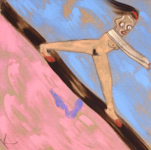
The paintings extend photographic qualities in this way and build a genre for group rituals, esoteric practices. In Gebuesch (2004) this applies as much to a geodesic dome of uncertain scale, nestling amongst shrubbery, as to the aftermath of a large gathering at a cemetery in Dawn (2005). But here, distancing is not just by more painterly means at the margins, to the brilliant pink sky and spatter, but by the small magenta flares that mysteriously arise across the scene. In Mistaken (2004) a strange red drapery hovers amid tree trunks bleached out by flash photography, and in White Spirit (2006) the central figure is wrapped in a white confusion. The blend of painterly and photographic qualities thus begins to introduce its own objects, to move from treatment, to things treated and further undermine and alienate the group’s purpose, the picture’s resolve.
In this respect, comparisons with de Balincourt and Donachie are instructive. Where de Balincourt pictures such groups as primitively conformist, schematic stereotypes, Gerhard instead supplies just distance, a dispersed mystique to the picture. Where Donachie looks to peer and group dynamics for a trust and devotion, verging on the religious, Gerhard is content to record their remote locations, their costume and decorations. Donachie is keyed to the blank and vulnerable identity, in dour tones and facture recalling a little, Luc Tuymans. Gerhard is keyed to their fleeting embrace of nature, their inaccessibility even by more flexible technique. Donachie accordingly concentrates on the figure and gesture, de Balincourt on stylisation and design, while Gerhard stretches incident and occasion. All find the breakaway group or cult rich ground for new distinctions in painting and genre.
While Gerhard does not share de Balincourt’s more ideological perspective or Donachie’s psychological and sexual undercurrents, he nevertheless embraces a wider range of examples. The work not only alludes to the 60s and drug culture, but accommodates other costume and roles, even effigies, festivities for houses, social unrest, even weather. All deal in obscure ceremony, pretence or faith in ends beyond the visible and pictured. The pictures not only stress their distance from this conviction but also point to the concealed identities that arise, comic stereotypes they resort to, and further absurd constructions painting might make upon the playfulness.
Avant-garde Backlash (2006) and False Guru (2006) are examples of this aggressive foregrounding or inscription to the picture. Both ridicule not just casual observation or depiction of events, but attempts to abstract or encapsulate underlying beliefs, to get at the motives and purpose of the group. Tellingly, the effect is a mixture of graffiti (the use of spray paint) and more painterly abstraction (the Pollock-like trailed drips). The artist’s condemnation would seem to be balanced by frustration, unable to properly participate nor transcend or depart the scene. The work uncomfortably oscillates between responses, registers a deep ambivalence.
In this sense the artist struggles for a unity within pictures that de Balincourt more comfortably allows between them. De Balincourt settles for a diverse body of work, Gerhard strives for diversity within works. Both carry distinct attitudes. Elsewhere, Gerhard simplifies figures through broad brushstrokes, more conventionally, arrives at a comfortable distance. It remains to be seen how much incident and mystery he is prepared to sacrifice or entertain.
Tuesday, 27 November 2007
(63)
Tuesday, 20 November 2007
(62)
The paintings of Bernard Frize use line in abstractions that allow surprising complexity in terms of colour, facture, width and intersection. They stretch the definition of line. For advocates of pure abstraction, Frize’s work is interesting for the way it resists both the trend to expand technique along other avenues as well (see also Post 10) and to compromise on level of abstraction (see also Posts 14, 24 and 53). This approach to line prompts comparison with the work of Brice Marden and Jonathan Lasker, although the Frenchman’s stricter compositions seem cautious by their standards, less compelling as an extension to colour. This is because French Minimalism, largely through the Support/Surface Group, inclines the painter less to the details of repeating or related motifs, as in Lasker, less to auxiliary properties to colour, as in Marden. Instead it concentrates on pattern applied to various supports and conditions; to means that steadily loosen or revise the end, to pattern dispersed by relaxed application.
In this respect, it is easy to see why Frize is attracted to gestural qualities to line, to additional aspects revealed in the task of applying pattern to a given surface. Yet Frize’s development is not quite a smooth progression from Support/Surface tenets. While an early work such as Suite Segond (1980) shows him committed to abstraction, with a distribution of circles resulting in coinciding shapes/colours through overlap and juxtaposition; following works such as Still Life with Delft Vase (1983) abruptly switch to the figurative. This change presumably allows line now as either background or outline, while tone or shape remains distinct from either. In effect, it separates functions for line, aspects to the motif. Still Life with Tureen (1983) narrows the focus to just outline, but crucially allows shifts in intensity of colour, in width and resolution or ‘bleeding’ of line, so that the course or direction of line takes on greater prominence, begins to demonstrate the means of inscription, beyond any consistent outline for tureen.
With this focus upon line in place, Frize returns to abstraction (sadly there are few examples on the web for this period). Works such as Eixen (1992) then concentrate on lines generated by a peculiar device, perhaps only multiple brushes in the hand, allowing parallel lines of various colours to be applied simultaneously. The curves and angles available through this device or technique then reduce or enlarge line widths accordingly, creating an illusion of depth, or of ridges and hollows to the planes. The technique effectively reduces the picture to just lines, strictly parallels, gives each a colour, measures shape and variation by application. The result is ingenious and attractive, but parallels then suggest less certain combinations available to the device, propose other devices or applications.
In Alternante (1999) Frize takes a simpler approach to parallels, a wider variety of colours. The effect is far more Minimalist, although actually each horizontal line has three colours, each colour varies in weight or width and consistency, each intersection combines colours, supplies vertical parallels. The pattern is deceptively complex, and while still only parallel lines; lines gain surprising latitude in other respects. The project progressively supplies these additional qualities to line measured against patterns or structures, where parallel lines are less prominent. In Portable VVX (2000) a kind of interlacing combines multiple colours to a single ‘stroke’ again, together with single colour ‘strokes’, both of varying strengths, sometimes literally overlapping, elsewhere abutting or intersecting. As a result the interlacing all but collapses, as individual strands as colours or ‘strokes’ struggle for consistency. This balance between pattern and additional qualities to line, give the work an odd oscillation between relaxation and rigour, ingenuity and accident.
Increasingly Frize alternates between stricter pattern and more informal or complex versions; can allow line more space or compress it to unitary blocks that then trade mainly on colour variation. In the recent show at Simon Lee, in London four strategies are used. Lines are granted degrees of colour, yet remain strict in width, curve and length, secondly lines are granted intervals of colour that conform to strict pattern, in departing from grey, yet present no consistent colour beyond this. Thirdly Lines are restricted to straight lines, uniform width, are allowed extended intersections with other colours, so that overlap and change of direction are often shared or blurred. Finally there are sprayed lines that blur edges and colours, but these are the slightest variation. Finally, Frize sustains abstraction by this expanded view of line, but is perhaps obscured a little by reliance on familiar pattern.
Tuesday, 13 November 2007
(61)
Ronald Brooks Kitaj led a restless, essentially nomadic life and his painting reflects his shifting enthusiasms. He was an American, although best known as a member of the Royal College of Art group of 1960-62, identified with the British version of Pop Art. The group rarely share the close attention to common or mundane print sources, of Lichtenstein or Warhol, instead, often arrange the picture into smaller, discrete pictures, or a layout, that together with text, tend to carry a weaker allusion to print (see also Post 16).
Kitaj’s sources are not contemporary advertising or graphics, but an array of historical and literary publications, often obscure. His project is initially a history painting constructed from layers of such reference. In early works such as The Murder of Rosa Luxemburg (1960) and Reflections on Violence - Gedanken über Gewalttätigkeit (1962) the task is firstly how to assimilate and arrange these sources in a painterly way – to signal iconographic derivation by this. The work struggles to resist mere collage with a kind of sketchiness; that in turn begs art history for clarity. His later collages for photo-silkscreen prints only emphasise how easily print absorbs collage, how little it leaves to painting. But as Kitaj steadily flattens colours and modelling, gives outline a heavier, deliberate abbreviation, the style arrives at something like standard graphics or illustration, and these give works such as The Ohio Gang (1964) and Walter Lippman (1966) literally a keener focus.
Remote sources are now contrasted with ‘graphic’ simplifications, while as painting, such techniques are attenuated by greater size and surface. The effect is curiously detached, even brittle. His technique is dry and thin, literally and emotionally. There is no need to actually trace iconography, even if possible, since strictly the work now becomes about this opacity to heavy outline, flat colours and disparate layout. Graphics are pressed to the point of obscurity; iconography haunts even cursory illustration. There is also Kitaj’s distinctive dry brush or rubbing technique at this time, which recalls the mottled wear and aging to cheap publications, particular the covers of paperbacks, subtly converting a common if overlooked print property to a stylistic one.
So while Kitaj is obviously not Pop in the sense of Warhol or even Peter Blake, print and layout formats are not easily restricted to ‘popular’ iconography. In general the British example urges degrees to Pop Art in this way, provides a porous periphery to the print paradigm for painting.
Kitaj’s work is also notable for the theme of sexual confrontation. Prostitution is sometimes explicit, but often sexual favour or attraction is something negotiated and arranged throughout the work, emerges almost as the culmination of method and mood – at once calculated and crass. In Synchrony with F.B. - General of Hot Desire (1968) a portrait of Francis Bacon as business man or gangster presides over the strangulation of a naked women, her legs spread, her face indifferent amongst the abstraction. In The Autumn of Central Paris (After Walter Benjamin) (1972-4) a bored woman remains the centre of attention for a conspiratorial group. The Henry Kissinger-like figure opposite her, and the unmistakeable caricature below of Richard Nixon as a Red Guard, comically sabotaging the negotiations, surely locate this encounter as the U.S. peace talks with North Vietnam, well after Benjamin and any aura Paris may once have held. The surrounding eavesdroppers and guards recall The Ohio Gang (1964). In both cases a woman is to be persuaded, enlisted; used in some way and one suspects; but briefly.
In later works Kitaj tires of fragmentation and diffidence and looks to a more relaxed and forthright style. Portraits and landscapes then offer more mannered drawing, but struggle to accommodate tone or modelling and he often seems to retreat to pastels as a remedy. In the late 80s his enthusiasm turns to Matisse and a lighter, broken facture. Political and historical themes gradually give way to more whimsical anecdote.
It is tempting to see this loosening as a response to the Neo-Expressionism of the time, but the artist’s interests cease to be of wide concern, in any case. His 1994 retrospective at The Tate met with a savage backlash, for example. Interestingly, a related brand of history painting arises in the work of Neo Rauch not long after. Where Kitaj is never quite comfortable with pictorial continuity or contiguity, Rauch’s more fluent approach, paradoxically provides more grades of disjuncture, re-drawing and fiction. Kitaj’s restlessness never allowed that commitment, ultimately he set more store in literature and history. It turns out even history painting does not always need that much history or literature, that more frivolous efforts often only underline the problem.
Tuesday, 6 November 2007
(60)
Both photographers concentrate on 3-D scale modelling, especially of architectural interiors yet differ radically over means and subjects. Demand’s work perhaps commands the greater interest currently, and there are two reasons why this may be. Before considering these, Casebere’s contribution is carefully reviewed.
Casebere began in the mid 70s, making comic studio-based tableau such as Fork in the Refrigerator (1975) in which a gigantic fork penetrates a refrigerator. Such work shares an interest in cartoon imagery and whimsy, with photographers such as Sandy Skoglund, for instance. However Casebere’s interests shift to more public architecture in the 80s and the modelling takes on a more simplified set of volumes, often against a black background, with theatrical or cinematic lighting. From dealing with extreme fantasy the work now emphasises an evocative, fictional setting. However detail, or lack thereof, then treads a thin line. For while the models are clearly not realistic in great detail, this does not necessarily make them greatly fictional. Rather, fantasy here struggles against falsity, so that the model demonstrates certain melodramatic lighting or smoky atmosphere, and yet lacks the detail to pursue these to greater detail or distance.
Model, lighting and angle subtly test the overall impression or evocation to the photograph. Casebere’s use of prison models in the mid 90s exploits both the dramatic heritage and the inherent austerity of such architecture. The mood never ‘escapes’ the model, the model cannot do more than nod to the melodrama of the lighting and angle. Casebere has occasionally built his models for exhibition also, but mostly they remain tools for his photography, and the photography does not just lie in the stagy lighting, but in the ability of the camera lens and focus to direct attention to the details of the modelling, in delivering a coherent depth or perspective. This is something so basic to a camera, as to be often overlooked in assessing photographic qualities.
Casebere’s work subsequently seeks more exotic architecture, less familiar in scale and construction and often introduces a watery motif to foregrounds, as in Yellow Hallway (2001) and Green Staircase (2002). Here the scale of the water ripples again underlines the inconsistency of scale, the failure of fiction, in fact. In others, angle toys with the water, strives for other
theatricality. But this balance to the conviction of the models also underscores the standards of lens and focus brought to bear on both.
Demand’s work arrives around 1994 and his model making restricts materials to paper and card, immediately reducing all surface textures to a smooth, uniform colour, emphasising crisp volumes, subtle colour schemes, often in even or flat lighting. His choice of subjects looks to popular or topical publications, where the factual nature of photography is foremost. His patient reconstructions, as is often noted, tend to strip objects of wear or accident, to give scenes an anonymous, generic character. Perspective and proportions are maintained, but the realism stops at basic volume, flat colours. But notice that the work does not seem exactly false for this, as occurs in Casebere, but rather abstracted. There is no appeal to intangible qualities of mood or atmosphere, so the factual sits more comfortably on Demand.
But again the relation of model to photography is in fact an opportunity to demonstrate how lens and focus channel attention to this austerity of volume, surface and colour. To regard the model itself would be to lose this in consideration of scale, extent and varieties of point of view. It takes photography to filter these out, to ruthlessly measure the model against lens, exposure and focus – against what had become the mechanics of realism in depiction – and to properly register what has been modelled.
Demand has broadened his range of subjects, with exterior and natural settings, notably the spectacular Grotto (2006) and relaxed his model making, allowing the layers of card to appear at the base of the stalagmites in Grotto, and in other works, foregoes local colour to use bare card to the component volumes. In both cases model making is emphasised and the subject further abstracted, but not falsified or fictionalised.
Demand’s models make less demands in a sense than Casebere’s; allow him to be stricter with the terms of modelling, its treatment in photography. It is a more elegant if less ambitious project. But secondly, Demand’s more sociological scope fits comfortably within a broader German approach to art and design (see Posts 8, 15, 41 and 54) so that the project enjoys formidable reinforcement, within and beyond photography.

.jpg)