In the current show at Victoria Miro, London, the artist pursues her flowing, charged figures to pastoral landscape, their sinuous rhythms dispersed upon foliage and fields, to whimsical, slightly ominous ends. The style recalls children’s book illustration and animation, the charm of naïve, elegant characterisations that mould natural surroundings. The sense of nature pulsing with animation carries none of Vincent Van Gogh’s immediacy or terseness, obviously, yet the expressive and Expressionist impulse similarly sets everything in an uneasy state of flux, hints at creeping transformation or insidious growth, perhaps entrapment or threat. Essenhigh’s silky modelling, delicate drawing and rich colour all add a deliberate sugar-coating, deepen the attraction, yet also spell something of a denial or retreat to child-like faith.
Essenhigh’s use of playful caricature is perfectly in step with wider developments in the mid 90s, when she first gains notice. Comparisons with John Currin, Lisa Yuskavage, Rita Ackermann, Nicky Hoberman and others are common and the trend marks the steady transition from Neo-Expressionism to a more refined yet pointed depiction. Essenhigh is distinctive initially for her intensely linear, cartoon or comic-strip style that gives her early work almost a Pop Art flavour. She is not drawn to photographic sources or social stereotypes, but rather archetypal or mythic figures, tokens in very abstract circumstances. And while her sharp outlines and flat colours flag comics and cartoons, crucially, she resists familiar figures or situations, often leaves the figure virtually illegible, beyond placement, or no more than a biomorphic squiggle upon a bounded plane.
In this respect the work seems closer to some Surrealist realm, perhaps to the work of Joan Miro or Salvador Dali, for example. But the equation between print norms and painting styles here is also a way of eliciting shared content for just these kinds of abstract figures and settings; of sampling a wider genre, available to both media. This extraction of genre is really what links Essenhigh to others cited, and is part of a wider shift (see also Posts 16, 37 and 43). Yet the mythic figures actually rely upon formal or stylistic terms for their main attributes. In other words, these kinds of figures can only exist in these kinds of pictures, are really the animating spirit to them.
Essenhigh is not the first to mine this overlap between comics and painting, but she had the good fortune to do it when and where reception is prompt. Interestingly, the early work often grants figures trailing costume or finely attenuated extensions that give them literally, a loose, tenuous identity, and subtly anticipate the greater dispersal in the recent landscapes. Similarly, perspective and distance in works of the late 90s often seem to stretch a figure’s reach, to spread it out and confuse costume or instruments with hostile surroundings or rivals. Yet these blends or contests are the work of ambiguous lines and economy of colour; can transcend mere illustration through deft displacement and combination but are hostage to these means, to inked line and flat colour (her first name perhaps inclines her to the linear).
The project for Essenhigh then becomes one of expanding upon these means, of seeing how well her figures survive in more elaborate worlds. And with this of course, the sense of a genre is altered or diluted. For, when she allows graded tone and volume to her pictures, the figures must surrender some of their ambiguity, yet can generate new, perhaps more child-like, fictions to compensate. The work from around 2002 marks this step and preserves linear flourish and confusion, while situating them within greater modelling, more nuanced colour. But this is an unhappy compromise, where either line or tone is redundant to parts of the picture, rather than mischievously allusive. Subsequent works gradually cede arabesque and intricacy to just the figures, allow more coherent tone and depth to settings. Yet this too tends to rob the figures of some of their power, to isolate their seething influence and animal animus. The figures grow steadily more rounded, more human, the settings more accommodating, less diagrammatic. But there is still an awkward gulf between treatment of figures and architecture.
Stricter or more realistic settings only make the figures too mannered or stylised, so that they seem more like dummies or sculptures, arranged in a scene. More successful works simply concentrate on the figures and their engaging interaction. The flipside to this division between figure and architecture, or figures in isolation, is naturally, natural settings, and the recent landscapes. The scope for plays with scale and depth here seem more promising, for the moment are beyond the manmade world.
Tuesday, 29 April 2008
(85)
Tuesday, 22 April 2008
(84)
The sculptor’s recent show, Firmament, featured a massive reclining figure constructed from a lattice of welded steel rods and balls of various short lengths and angles, scarcely accommodated or wholly perceived within the White Cube ground floor gallery at Mason’s Yard, London. The attention to scale, containment and the measurement of site against the figure or human presence, are central to the artist’s work. The outlines to the figure suggest computer modelling or a CAD sensibility and quite apart from scale and materials, give the figure a familiar distance, typically suggest a stereotype or indifferent token, for which Gormley is sometimes criticised.
Gormley’s use of the figure is peculiar, even in a time of studied fabrication and commercial standards (see also Post 20). His figures carry a special remoteness or anonymity that is in large part the heritage of an interest in Conceptual Art and site-specific approaches in the 70s. His early work includes the figure amongst a range of castings, essentially concerned with removing or deriving samples from a site or event, in this respect recalls the work of Richard Long and Hamish Fulton, for example. Materials vary from the architectural to implements, or artefacts, to wood and stone. They are presented in distinctive formats in order to signal source and quality (see also Posts 48 and 58) are simultaneously transformed and transported. The distinctive seams to casts stress their function as containers, as broad records of volume, significantly, the internal details of which remain concealed, a little like the work of George Segal.
But here the figure or person is treated no differently from a boulder, provides only a more elaborate specimen. Conversely, related implements and materials may be presented as extensions to the figure – point to site or event as the scope of a figure’s influence. Other works from this time simply trace a figure or parts to materials, confirming the figure as an imprint upon site, material as measure of figure.
So, initially the figure is part of a wider array of subjects for the artist and the castings or perfunctory modellings establish a certain distance or restraint for both artist and figure. The figure is defined merely by the impact upon setting, as muted or inscrutable beyond that. Following works give greater attention to pose, but stress only the figure’s compression or reach, the gesture often to be set against the gallery architecture as measure of scale, substance and context. In all, the figures become essentially a register of psychological distance or literal displacement. Such figures are also deployed in exteriors and there signal similar differences in custom, time of day or season. The figures are now inserted into sites or situations rather than extracted from them.
As they become the focus of Gormley’s work, the principal specimen of a site (or vice versa) their cool generic quality and disconnected or self-contained poses become more prominent and troubling. In the monumental Angel of The North (1995) the substitution of aircraft wings for arms crucially reinforces the mechanical, robotic aspect, undercutting the traditional iconography of angels, giving the imposing figure an ominous, industrial undertone. The north would seem less than human or humane by this, an angel only the exploitation of manufacture. Even as symbols or personifications, Gormley’s approach encounters problems, as public reaction attests. Another criticism points to the curious bias toward men amongst his figures.
In later work he turns from rugged casting and encasing to more detailed modelling or assembly from a range of standard industrial components. This too only underlines the robotic nature of the figures and the artist’s deliberate detachment. Proportion and anatomy often remain standard, even academic, occasionally are reduced to no more then stick figures, while poses resemble fitness exercises or drills, their value, like their materials, in how much and long they displace space and place by. Any personality is again conspicuously ignored. Gormley’s use of crowds of figures is also telling in this regard. The small, simple clay figurines are collected from volunteers among school children and the general public then cast and marshalled in impressive numbers according to specific exhibition opportunities. Again character and engagement are distanced, the figures mere instruments in some larger design. Whether these are faults to the works, or works about such faults, is moot.
In Firmament, all three aspects to the artist’s work achieve new and vivid demonstration, mechanical assembly, confinement within architecture or occupation of place and the essentially hollow gesture or pose, the figure with person removed.
Tuesday, 15 April 2008
(83)
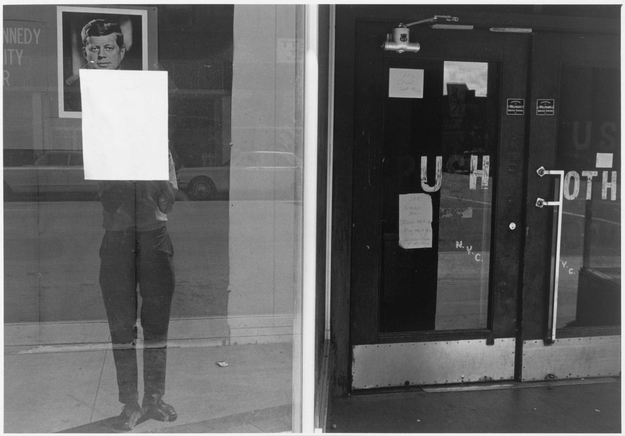
At 74, the famous photographer continues to frame the world with a distinctive eye for composition or structure. Themes remain largely urban, yet desolate, means traffic in pictorial coherence, stick to black and white in establishing scale, depth and proportion for the familiar, careless and overlooked. Yet the approach now carries a certain smooth routine, almost nostalgia. Composition on these terms seems to belong to an earlier era for photography, or perhaps signals a decisive swing in fashion. Friedlander’s show at the Fraenkel Gallery, SF, furthers his car-bound views of recent years, reminds us of photography’s history and contested resources (see also Posts 12, 21 and 27).
Friedlander belongs to a generation inspired by photo-journalism, typified by Life magazine and the Magnum agency of the 40s and 50s. This approach placed a premium on spontaneous engagement with the subject (or strictly, object); with inventive and unexpected angles and circumstances. Photography’s formal properties, the picture planes available to lens, exposure, focus, film and print options, were all to be demonstrated by urgent and interesting situations, by a contest with motion and opportunity. The emphasis on fleeting gesture or atmosphere, understandably earns the name The Decisive Moment, or ‘the art of waiting’, pointedly underlines the difference between stills and movies.
It is not the only approach in the period, of course, but through popular publication becomes the dominant one. For followers like Friedlander the challenge arises in the kinds of events recorded, the means these allow. In particular, Friedlander is notable for the absence of people or figures, apart from the photographer’s shadow or reflection, and so largely motion and sense of moment. Then there is the level, frontal angle of his pictures, the deadpan or prosaic attitude this creates. The photographer’s shadow or reflection reinforces this flatfooted presence. There is none of W. Eugene Smith’s economy of volume and tone, or surprise in expression, for instance. Instead Friedlander relies upon reflections, pictures and text within the frame and deep shadows to create spatial ambiguities or to abstract the picture. Often his photographs appear almost as collages or a layout, to defy a unified picture plane, all the more striking since this is rarely a question of camera angle or darkroom manipulation.
The pictures in this sense are intensely formal, concerned less with freezing motion at a fascinating point than with freezing perspective or orientation from a fascinating point, with testing expectations for picture and object. Photographic means here are less a question of timing than of lens length and focus. This would be unremarkable were it not that the photographer remains dedicated to the quotidian, to urban and familiar settings. He rarely shares any of the exoticism or eccentric flair of precursors such as Henri Cartier-Bresson or Brassai for example. Rather, he uses the everyday to underline his formalism, uses his abstraction to affirm the everyday.
Friedlander is grouped with fellow NY-based photographers such as Garry Winogrand, Diane Arbus and Joel Meyerorwitz, following his inclusion in MOMA’s 1967 survey New Documents by distinguished curator, John Szarkowski. Yet, there too, Friedlander shares little of their interest in sudden behaviour or anecdote, extreme specimens or outsiders. Actually the show’s true theme was the steady dissolution of the photo-journalistic project, of the way The Decisive Moment inevitably turned into other things. Spontaneity was pursued to the trivial and chaotic, reporting on circumstance ended up with the marginal and freakish. The Decisive Moment slowed to the indecisive prospect.
What seemed like the salient characteristics of photography finally invite revision, but developments there are the work of another post. Here it is enough to see Friedlander’s part in this history. However, his methods are not quite neutral or strictly distinct from material, either. In giving greater emphasis to reflection, to ambiguities and pattern that defy consistent depth, Friedlander eventually builds a world for himself. The things that once tried his photography are now the material that sustain it.
In recent years, as he once more drifts around America, his wide-angle lens maintaining perfect focus from foregrounds of new car interiors to distant architecture and display; framing has become all. The stoic confrontation with the pictorial quirks of the everyday has been streamlined to a drive-by. Rejecting motion to The Decisive Moment ironically ends up depending on the photographer’s mobility. At the same time, the confidence in the status quo, in the little things, regional difference and character, has gone. America under this view becomes simply so many rival frames or windows, reflections and refractions, an elaborate pageant or charade, only to be appreciated in transit.
Tuesday, 8 April 2008
(82)
An exhibition at the Donald Young Gallery, Chicago, occasions a review of this distinguished German artist. Like many contemporary Rhineland artists, Trockel favours a diversity of materials, divides her attention between two and three dimensions, found and made work, installation and video. Moreover, such artists are often happy to collaborate, to assist or contribute to collective works, to further disperse individual and medium-specific meaning. This versatility presents special problems for interpretation, makes it difficult to give work a focus or priority, to relate themes along such variation. In much criticism, themes are typically identified without compelling explanation of how they arise from materials; seek the benefits of style without the obligations. Trockel was among the first to adopt this distinctly open approach in the late 80s and has influenced following artists, such as Cosima von Bonin. She provides a good example by which to survey the trend.
Trockel began as a Neo-Expressionist in the late 70s, a contemporary of the Mulheimer Freiheit Group in Cologne, but soon looked beyond painting for her pictures, soon looked beyond pictures for her samples. A pervasive influence to the region and era is Sigmar Polke. In particular, Trockel’s presentation of knitted patterns and pictures as ‘paintings’ and similar use of printed fabrics owes much to Polke’s use of such printing as support to paintings. Polke, perhaps more than even Richter, exploits painting as a demonstration of print properties, as a critique of depiction and the role of painting. Print is pursued from photographic processes to looser tracing and stencil, easily accommodates found textiles as a further step. Polke is rarely drawn to three-dimensional work, but the example of treating painting as the means to display or sample a wider category of picture, is a crucial prededent to Trockel’s collection and presentation of other materials.
The shift is not simply to ready-mades and installation. Ready-made material is displayed within an explicitly pictorial, ostensibly painterly category. Yet the category in turn, is obviously relaxed by such accommodation, becomes pictorial on broader terms, can be abstract or figurative, a work of sole instance, such as painting, or multiple instances, such as print or pattern, temporary or permanent. It is this two-way adjustment to category and elements that soon gives the project multiple but equal options, a strikingly unified field of activity that proves so attractive to Trockel, her contemporaries and followers, so confusing for others.
For, painting and two-dimensional work are not simply absorbed into three-dimensional concerns; ready-made material does not simply replace traditional or plain-made work. Each now serves as a phase or facet to a larger project under which categories are assessed, meaning revised. It is as easy and useful to make paintings of such material, as to make material from such paintings, to import to paintings or to export from them. The difference lies only in emphasis upon category or elements. Both are needed. This greater flexibility owes much to Conceptual Art and its attention to stages to a work (see also Posts 8, 17, 22 and 33) and performance, events and recordings or documentation to a work are similarly embraced, grant the work further stages and greater integration, as does participation of others or their work.
Beneath the themes of feminism, modesty or understatement and discursiveness, commonly detected in her work, it is important to grasp this more comprehensive framework. It accounts for the diversity to her material, urges a more expansive view of such themes, while affording comparison with similar approaches. However the jack-of-all-trades notoriously pays a price in expertise; and too many cooks tend to spoil taste. While Trockel can sustain impressive integrity across videos, installation, sculpture and pictures of various kinds, can include museum or scientific samples and sampling, furnishings, costume and prints - painting remains understandably cursory, often indifferent. The abstract motifs, for example, remain hostage to a by-gone Minimalism, in spite of importing domestic hotplates or flattened food graters, while kitchenware can seem a clichéd overture to female identity.
Yet beyond that, the person dwindles, threatens to dissolve. The theme of constraint or conformity to person – and usually woman – is common enough, but in the current show, a series of collages present a further and moving predicament. In works titled She Is Dead (2008) only a woman’s clothes remain, the rest of the picture a wooden panel scrubbed with thin colour, in others, swirling amorphous spray paint picture a person so vague or abstract, without clothes or role, she is the work of the instant, no more than seething atmosphere. In these works Trockel confronts a new paucity to painting, a more personal and disturbing one.
Tuesday, 1 April 2008
(81)
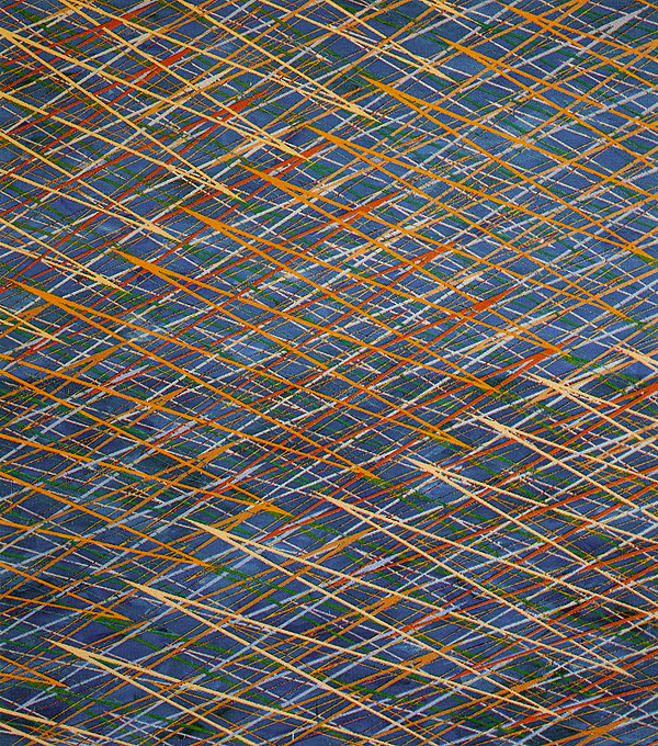
In her current show at Von Lintel, NY, the artist turns to more complex permutations on the essentially linear motifs that have sustained her long career. The new work renounces colour to concentrate on a dense combination of short lines, set curves, with variously angled ends. The system or pattern displayed, occasionally allows a grid to the overall picture, but pattern beyond that is actually non-repeating, in configuration of distinct elements, not unlike aperiodic tiling in mathematics, where limited modules are combined without repetition.
Interestingly, such tiling has recently been detected in traditional Islamic decoration, an initial source of inspiration for Jaudon. But her project has hardly been directed to such obscure geometry; on the contrary, it has largely been concerned with obvious and familiar pattern, with their entrenched associations and symbols. Jaudon emerged in the early 70s, and is usually linked with the Pattern and Decoration movement, concerned with the acceptance of a wider range of folk and traditional motifs in painting. Jaudon is positioned at the Minimalist end of such an undertaking, with her interlaced stripes taking their cue from the work of Frank Stella, as well as in use of Asian or Islamic titles, metallic pigments and the pale outlines or rims to stripes.
Under Minimalism, basic pattern in stripes, grids or monochrome, were matched or tested against striking application of materials, scale and situation. It defined painting on those terms, yet quickly appealed to sculptural and architectural considerations (see also Post 28). Just what pattern supported such extension to painting, just what painting allowed such pattern, essentially measures the course of Minimalism, its steady acquisition of maximising attributes (see also Post 10 and 79). Pattern and Decoration (P&D) pursued more elaborate motifs, soon arrived at the figurative or repeating pictures, and is instead drawn to prints, textiles and other craft; similarly disperses the project for painting. Jaudon’s interlaced stripes are thus cautious by P&D goals. She resists both more figurative motifs and shaped canvas, or more architectural projection. Her civic commissions are duly competent but unexceptional as design or technique. Her painting constrains vigorous surface or facture by intricate pattern rather than threatening pattern with less compliant surface, although this aspect is all but invisible in reproduction, due to the large scale of works. One perceives the pattern at a distance (and in reproduction), the painting up close, so that the two need hardly fight over middle ground.
Interweaving stripes and the implied depth to Minimalist pattern are pursued in angled grids in the 70s, by artists such as Sean Scully and the largely forgotten Don Sorenson. But Jaudon has no interest in even this much depth or relaxation to painting. Her patterns can accommodate Gothic arches and arcs of various span and intersection, but the ‘background’ to such stripes or bands is rarely greater than the width of a band. Depth, or more picture cannot test her painting either, and her range to pattern and painting emerges as rather conservative in comparison with rivals, perhaps classical in its restraint. By the 80s the range of abstract and figurative motifs used in painting all but dissolves ‘pure’ abstraction (see also Posts 24 and 53) and attention shifts from obvious pattern to something like problematic relations between motifs (see Posts 32 and 78). Here too, Jaudon’s work looks diligent but dull however she soon rises to the challenge. She allows motifs more background, stretches the interval between interweaving bands and introduces softened or blurred vertical bands that compete with more regular and symmetrical motifs. The effect is not unlike the illusion of draped fabric. At any rate, interest lies in distinguishing such disruptions to pure pattern, as a more insistent measure of surface or ‘background’.
Jaudon then develops two further strategies to test integrity of pattern. The first is with greater colour and definition to stripes in the ‘background’, the second is with greater variety of colour and shape within the ‘foreground’ pattern, although she maintains hard edges and even curves. For all its severity, the work finally makes room for more painting, for greater incident and interest. In the latest work, this relaxation surprisingly does without the tension between ‘background’ and ‘foreground’, pattern and painting, instead focuses on variations to motif, and motif reduced to relatively short, broad white lines in close relations. In some ways the work harks back to the early 70s in the density and intricacy of elements, but pattern has now gained a deeper, more sophisticated project, for the moment demands less of painting.
