The present show at Regen Projects, LA - Energetic Accumulators and Token Exchanges – continues to adapt furniture to precise tasks of day to day living; in this case mainly desk spaces for stacking small, miscellaneous items, in satisfying arrangements. Of course, the artist’s tasks seem mainly the adaptation of her day to day surroundings, giving the project a certain circular logic, but her concerns are really hypothetical rather than practical.
Zittel’s work is often comic, exaggerating the reductive functions supposed by domestic design, the life confined to such minimal terms, simple needs and rigid organisation. An intense conformity is partly the point. The absurd dictates of ‘form follows function’ or ‘a machine for living’ results only in life becoming more formalised, more machine-like. But beyond her demonstrations of simple (self) construction from inexpensive materials, there is also a strangely alienated, behaviouristic view of life, a need to define activities so concretely, in terms of objects to hand, for lack of any larger – especially interactive or interpersonal – ambit. It is design that fusses over the details to domestic order to allay more central concerns; that plays at a self-containment and isolation there rather than work at more testing circumstances. It is design for the person without purpose.
Alternatively, the work allows such items to be taken on sculptural or formal terms, as an arrangement of materials, irrespective of function, and to demonstrate underlying links between fine and applied art, to urge a broader definition of ‘function’. Zittel is one of a number of artists, including Carsten Höller, Jorge Pardo, Tobias Rehberger (see also Post 8) and Franz West, that use furniture, fixtures and architectural features to broaden sculpture thus, to anchor installation to explicit design issues.
Such work relies less upon judicious display of found items – the ‘ready-made’ – than on commissioned fabrication – as the ‘readily-made’ and in this participates in a wider trend (see also Posts 25 and 49). However for Zittel, fabrication is mostly concerned with simplified and D-I-Y steps, modest and common materials, so this aspect is less pronounced than for example in a Koons or Rehberger. Furthermore, the design is sometimes so general that its realisation takes on more of a collaboration with particular builders, whom Zittel duly credits. This gives the work a less certain trajectory, undercuts the crucial distinction between design and function and means that it is not always clear in what sense the work stands as a model – how literal or hypothetical its application might be.
Her early work presented schemes for mating pigeons, as both elegant wooden abstraction – in particular recalling the Minimalist modules of Donald Judd – and practical models for avian breeding. The stark contrast between dedicated function and formal beauty is part of a steady challenge to formal properties in sculpture, following Minimalism. ‘Materials’ then gradually include uses and methods – ‘maximise’ properties – while abstraction subtly inherits connotations of authority and control. But it is when Zittel exchanges birds for humans, switches from breeding to isolating specimens, that her work gains greater complexity. As noted, the concentration on the individual and the isolation of (usually) her needs, takes on a whimsical quality as activities are arbitrarily assigned cubicles, costumes, localities and furnishings. Zittel’s work ranges from painting and prints to sculptures, installations, with lighting fixtures, storage units, carpet and shelving, demonstrating the phases to planning, promotion and merchandising, inevitably including a website.
The emphasis upon self-containment reaches its peak in Prototype for a Pocket Property (1999) literally a small island built for one, from concrete, apparently free-floating and located somewhere off the coast of Denmark. Typically the model is, in some respects, literally a small island, in others no more than a pretence or metaphor for profound withdrawal or abandon. A later project in the high desert of California provides a permanent location for equally remote or far-fetched abodes. It too has a website.
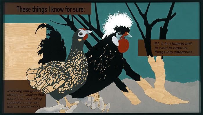
But increasingly, Zittel’s attention seems to lie with the association or combination of possessions, with fundamental questions of affinities and categories. Her Prototype for a Billboard (2005) confidently announces their crucial yet illusory role. Significantly, the billboard features a pair of birds, held in disembodied hands, beside barren bushes, the lower portions of which are left unpainted, along with a square – presumably for text – to the left of the birds. The unpainted timber may be part of the design, may simply be that for which the artist as yet can find no plan or category, may be illusion or ‘the way the world works’ in spite of all plans. Either way, the artist finally does not hold with certainty of function.
Tuesday, 24 June 2008
(93)
Tuesday, 17 June 2008
(92)
A series of paintings, mainly of outdoor sculpture, saw the artist vary his usual concern with architecture and surrounding garden in a recent show at Thomas Dane, London. Kürten has for some time contrasted and stylised differences between man’s design and nature, sometimes extending this to pictorial structures that assert or deny perspective, elsewhere displaying uncanny echoes and expressive aspects to both. The work is unassuming yet deceptively complex and Kürten’s love of linear precision tends to give the work a patient, cautious quality. The pictures of sculpture extend these concerns with appearance and function and where the sculptures are figurative introduce a new, more directly human note. Sadly, the Dane gallery’s web pages for the show are now reduced to installation views. However other web resources allow illustration of underlying elements to his style.
Kürten’s choice of architecture sometimes coincides with that of Peter Doig and the comparison is instructive. Doig also stylises surrounding nature in ways that highlight architectural and spatial qualities, often excludes figures and emphasises a linear rhythm even tracing. But Doig’s sources are casual or private, snapshots of places in passing, where detachment or estrangement are paramount. In Kürten line rarely signals tracing and subjects recall standard domestic models, the genre of home and garden, the carefully planned and preserved abode. Kürten’s attention to detail and pattern often compound the viewing angle with linear and planar aspects to the architecture, sometimes colour and light, so that what is pictured and how it is pictured are fused, present an array from flat pattern elements, either in foreground or background, to perspective and complex volumes. The feeling is of a profound but reluctant, almost furtive attachment across the spectrum.
The emphasis upon architecture in recent German painting is pervasive, quite distinct from mere urban landscape, the work of Christian Hellmich, Martin Kobe, Susanne Kühn, Ulf Puder, Neo Rauch, Thomas Scheibitz, David Schnell, Dirk Skreber and Matthias Weischer, for example, all feature building as a crucial building-block for depiction. It is tempting to suppose this reflects older Bauhaus teachings (see also Post 8) but space here prevents closer analysis.
Kürten’s training at the Düsseldorf Academy surely inclines him to studies in architecture, but while the influence of Bernd and Hilla Becher and their students such as Thomas Struth (see also Post 41) Thomas Ruff (see also Post 66) and Andreas Gursky all concentrate on documentary standards for photography and unusual classes of architecture, painting frames architecture somewhat differently. In any case Kürten has no interest in grand symmetries or panoramas, in imposing scale or wider civic design. Nevertheless he arrives at just as much abstraction. He is interested in looking through surroundings to the architecture, at how these modify or inflect the integrity of planes, such as walls or windows, roofs or paving, at how they build other, larger designs from the state of gardens, the layers of posts, fences, railings, lattices etc.
This glimpsed unity is underscored in the continuous, if somewhat faltering outline, that allows in-filled or coloured areas, especially skies or shadow, foliage or greenery, greater latitude, further flattening the picture, reinforcing the linear cohesion. These are qualities that build upon photographic composition, particularly in attention to precise tonalities, yet when transferred to outline and freer colouring, point to more fundamental issues – to perspective’s preference for architecture, its dependence upon framing in perceiving additional and unexpected aspects.
Occasionally the artist dispenses with a coherent perspective to build from collage-like fragments that hover between pattern and picture. He sometimes uses metallic paints as grounds to further animate outlined areas, so that they reflect differently depending upon light and position of spectator. At other times this in-filling takes the form of roughly repeating motifs, depending upon intensity or complexity of colour and this deft shift from outline to pattern – from continuous line to short, broken ones – is prominent in the treatment of greenery, goes toward a stylistic distinction between nature and culture. The technique also allows a further level of pattern – usually circular shapes of varying colour that appear to float before the scenes, as if an optical distraction. In all three ways, Kürten carries architectural and pictorial qualities through to painting and samples not only a genre of depicted domestic architecture, but expresses an attitude, in the quiet meeting of chance and design, nature and culture.
The paintings of outdoor sculpture also stress placement in parks and gardens, and in more figurative cases, signal a similar approach to person, as circumspect and circumstantial, as architecture or place.
Tuesday, 10 June 2008
(91)
With current shows at White Cube, London, and L&M Arts, NY, the Chapman brothers once more claim attention with their winning brand of ferocious sadism, furious mayhem and free ranging contempt. Yet it would be wrong to see their work driven solely by controversy or provocation. More precisely, their concerns lie firstly with limitations to sculpture or modelling; with the way mode of reference can render outrages unconvincing or comic rather than a failure of reference scheme; how literally the scale and scope of 3-D modelling, implicitly assigns a level of detachment or simplification. Secondly, throughout their work the relentless hostility is often directed to tradition and established norms, for example, in re-creating works by Goya using Plasticine or retail mannequins, in painting upon discarded 18th century portraits or satirical carvings of ‘primitive’ idols. All attack received categories for materials, source and sentiment. Yet where the protest is so loud, the agenda shifts closer to home. Accumulatively, the protests point to an underlying discomfort with identity or integrity, issues with special weight in a partnership. In this sense, the work attacks in order to allay threat at a more basic level. Righteous vigour here flags a private anxiety.
The Chapmans belong to the wave of British artists that emerged in the early 90s under the patronage of Charles Saatchi. But their approach finds scarce precedent or parallel in British art. Their use of toy or hobby figurines in early works is closer to the use of children’s dolls by Mike Kelley, in adopting standard figures or models to unlikely tasks (see also Post 20) as well as Charles Ray’s use of fabricated retail mannequins to perverse ends. Indeed, The Chapmans soon turn to similar mannequins but supply far freer modifications, although with a similar focus upon sexuality. Tony Matelli is another kindred spirit, but his development is slightly later.
The Chapmans’ figurines are initially used to re-create scenes from Goya’s etchings The Disasters of War (1993). The curious conjunction of children’s modelling medium and renowned record of Napoleonic atrocity immediately gives the work an uneasy ambivalence. Goya seems trivialised, toy figurines given impossible gravity, so that atrocities are either distanced or rendered child’s play, while models struggle for a verisimilitude atrocity simply cannot accommodate. The works are really at war with themselves; suggest a war in their making.
Subsequent work vastly extends the tableau. Hell (1999) – sadly lost in a fire in 2004 – contained over 30.000 figures and dwelt upon Nazi atrocities. Larger figures, based on retail mannequins also echo Goya, while others trade in bizarre sexual fictions (these also echoed in recent works by Paul McCarthy, an older, kindred spirit, possible influence). Such figures are often joined at the waist and elsewhere, defying easy reference beyond siblings and sexuality, while steadily advancing the claim for an identity of more than one body, a person of parts scattered or shared; partnership beyond the practical or permanent. The balance of these two themes goes to the heart of their work.
Given the impetus to transgress or surpass, it is perhaps inevitable that their work embraces installation, prints and painting as well as sculpture. Their series of reworked 18th century portraits predictably visits fantastic disfigurements upon subjects; renders them absurd fictions that tellingly deny any stylistic coherence, any historical identity. Portraits are a particularly sore point, here.
But their targets are not always or only art history. In Übermensch (1995) they ridicule the achievements of physicist Stephan Hawking, as the cult of the hero, the supremely gifted and dedicated individual, overcoming enormous adversity. The title links such veneration to fascism. Conversely, Hawking’s example stands as either an overwhelming threat to those committed to collective identities, or endorsement for the mechanically or artificially extended individual.
In the series The Chapman Family Collection works such as Unholy McTrinity (2002) and Grimace (2002) conflate ‘primitive’ idols with toys and Christianity, global marketing, consumerism and faith. These are amongst their more appealing works. Essentially they extend religious imagery, much as they have treated Goya or retail mannequins. But the test remains how true such works remain to their sources, how effectively they direct reference elsewhere.
In the current work, ‘Little Death Machines’, the violence has become more abstract or remote, the models less directly derived from past or present. In fact works now flourish a kind of ramshackle obscurity to their torture; a more confined or rarefied model. The works hint at the machinations of industry, but also allow a more relaxed, whimsical side. The reference now is more diffuse, the violence subtler, more insidious.
Tuesday, 3 June 2008
(90)
Both photographers downplay particular camera features or distinctive printing options, instead concentrate on manipulation and classification of subject for rather than by the camera. In other words, what characterises their work is less a matter of how than what, strictly, of the informal over the formal. In this they conform to a wider trend (see also Posts 12 and 27). For Crewdson, elaborate theatrical tableaux steadily expand to engage realism and cinematic anecdote, while for Schorr the quality sought from her young male subjects grows more elusive or fleeting, and most recently is pursued in drawing.
Both photographers stress fiction or artifice. But while Crewdson often uses theatrical lighting and framing from a conveniently empty foreground to reveal fixed poses and stereotypical figures, Schorr confines fiction to a few military props for some of her young men, to role-reversed poses from pin-ups or traditional poses, to modest still lives as a metaphor for place or belonging.
Thirdly, both photographers deal in a marked estrangement or alienation from the presentational norms upon which they draw. For Crewdson, the broader more elaborate views of Middle American life are deliberately hollow projections from some grander vantage point that finally register something like fear or contempt through ostentatious displays of logistics or pyrotechnics. For Schorr, young men are documented as wrestlers, soldiers – even Nazis – and pin-ups, yet the theme remains male youth in roles that require no female counterpart, that if not overtly hostile, then fail as a measure of the feminine, for the feminine. But the threat is not in the roles assigned, nor their indifference to them, but at a much more basic level, where Schorr cannot identify.
Crewdson’s work first gained attention in the early 90s, with intimate tableau of birds and insects, significantly, of collective behaviour in ‘nature’; both viewed at some remove. However, in subsequent works, such as the Twilight series (1998) the artist shifts attention to episodes in the American heartland, often literally dark and disturbing, as much for the intense artifice as errant behaviour. Here the connection is often made to David Lynch’s film Blue Velvet (1986) with its opening and closing scenes of high artifice, bracketing a tale of terror and crime. Crewdson’s earlier works are seen as announcing similar revelations, but his clever play on nature and naturalism through models, does more than frame scenes of disruption and dysfunction. They render them disturbingly restrained and distant, as if no more than models in some higher scheme.
Indeed as the scenes become more expansive, there are works dedicated to the production values, to the extent of manipulation and artifice engaged; that are literally more revealing of the work’s tenor and priorities. And as whole neighbourhoods appear to fall under such schemes, they too are seen as just a more elaborate model or staging, not quite real, or perhaps worth greater effort. Either way, the uneasiness with the extent of artifice leaves the fiction of too much. It becomes forced projection of squalor or desolation, from a distance that ultimately lacks engagement or conviction. They are visions of something hardly known, largely denied. This is quite different from Lynch’s Expressionism or the paintings of Edward Hopper, another frequent comparison that misses the stylistic differences available and necessary to still photography.
Schorr’s work arrives a little later in the 90s, and while there are early works concerned with aspects of student life, her themes are usually young American wrestlers and a family of German youths at leisure. With each, Schorr isolates a peer group, deals less in interaction than individuality illuminated by role and circumstance. But while the wrestlers are factual and the soldiers fictional, neither quite confines young men to such roles nor convinces that such roles are only for young men. And where other work substitutes young men for women, as pin-ups and artist’s models, noted above, the interest in young men clearly points to an absence of options, a frustration with roles. The agenda appears to have only one gender and it is a hostile one.
As in Crewdson’s work, this grants the work a curious distance, and while Schorr is happy to also place men against a backdrop of nature, even camouflaged by it, their nature is no more forthright for it, her photography no closer to identification. Interestingly, her recent work uses drawing to bring figures together, to transcend the iconography of roles, to avoid the isolation of her photography. But both artists bring new expressive dimensions to familiar iconography, even though the expressions may be troubling or unwelcome.
