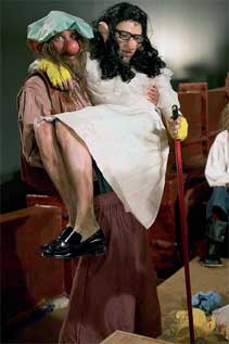
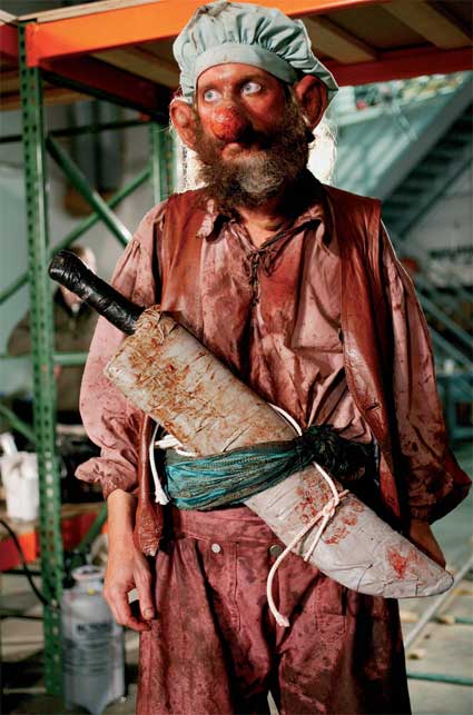
The artist’s large survey show, including new work, presently at S.M.A.K. Ghent (Belgium) and his well publicised merchandising over Christmas prompt this post. McCarthy emerged in the late 60s as a performance artist and his project has steadily spread from recording performance and displaying props and sets, to sculpture involving fabrication, even manufacture – hence the Christmas chocolates. Yet McCarthy’s concerns remain consistent and while hardly subtle, illustrate the changes to Performance Art over the period, their impact on Conceptual Art more generally and some severe limitations to project and artist.
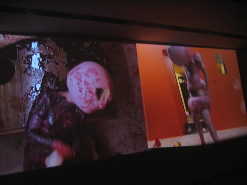
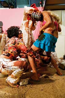
McCarthy’s early performances achieved prominence for their pantomime-like outrages, explicit sexuality and violence in an uneasy black humour. Performance Art initially concerned itself with performance as no more than automatic or involuntary responses from a person to variously challenging situations or tasks (see also Post 22). However as the project gains momentum, more elaborate tasks and responses beckon. For McCarthy this involved masks, utterances and rudimentary props for body parts and fake blood. The artist assumed stock or stereotypical characters, required rudimentary sets, additional cast, but resisted plot or story for largely unmotivated or incoherent carnage, often accompanied by incessant babbling. Performance Art is clearly drawn closer to theatre by these concessions, in part signals the eventual dissipation of the project, but importantly, here performance and props are not just crude or hokey, but concerned with the destruction or damage to their very function, ultimately to performance. The emphasis is really upon the literal dispersal of person across a performance.
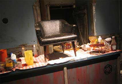
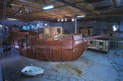
In this sense McCarthy reduces Performance Art’s minimal person to extreme bodily terms; the task to spreading its contents violently across stage or occasion. The work stakes out possession of stage or event by bodily fluid or waste, even as the person is mutilated or destroyed. And material expelled from the body, quickly invites material consumed, foods and liquids such as ketchup and chocolate that pointedly resemble bodily equivalents. All are freely scattered throughout a performance, drench increasingly elaborate sets, from Hot Dog (1974) to Bossy Burger (1991) using part of an actual TV Sitcom set to The Hogan Family, to the massive frigate constructed for the Caribbean Pirates performances (2001-5). The use of readymade sets reinforces the rage directed against popular or established norms. Yet this is balanced by the profound impoverishment to person, the meagre resources allowed performer. The performer in his work is not just challenged by occasion or stage, but must resort to sexual and other bodily engagement in order to meet it, often ‘leaves his mark’ only as the departed. This is pointedly continued even in later work using mechanised mannequins, such as Garden (2001) with its set salvaged from the 60s TV Series, Bonanza. Other works surrender more by this sophistication.
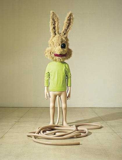
The sheer messiness and excess however, is typically compared with the precedent of Herman Nitsch or even Joseph Beuys. But McCarthy is not drawn to Christian or arcane ritual, tellingly, characters are inspired by children’s fiction and cartoons, from safely (and sadly) two-dimensional models. For the hostility directed toward them also reflects a dearth of options, they are models thrust into more full-bodied situations, clearly beyond their domains. Ultimately the theme shapes as one of inadequacy or over-ambition. In this respect, it is interesting that McCarthy remains acutely alert to contemporary developments and is occasionally drawn to parody and satire. With the acclaim of Jeff Koons’ sculptures for example, McCarthy then devotes more attention to sculpture, similarly adopting children’s toys as models, but only to introduce disturbing modifications as in Spaghetti Man (1993), the work thus neatly pacing, if not stalking, the interests of someone like Charles Ray as well.
Other works combine mask or cartoon-like heads with penis and testicles, returning to the crude equation between person and sexuality, while the recent shift to enormous inflatables projects his cartoon characters and props to the realms of popular marketing, (see also Post 49) much like his chocolate Santas. Contrast is sometimes made between the rough and ready nature of McCarthy’s performances and recordings and later, more focussed and sophisticated productions, by say Matthew Barney. For Barney the recording then requires elaborate presentation, while McCarthy remains content with a large screen in a darkened gallery. Each must maintain a delicate relation with gallery context and fine art. For McCarthy the transfer of his themes to sculpture to some extent tethers performance and recording this way, but must then divide his attention between them, court other compromise.
Tuesday, 29 January 2008
(72)
Tuesday, 22 January 2008
(71)
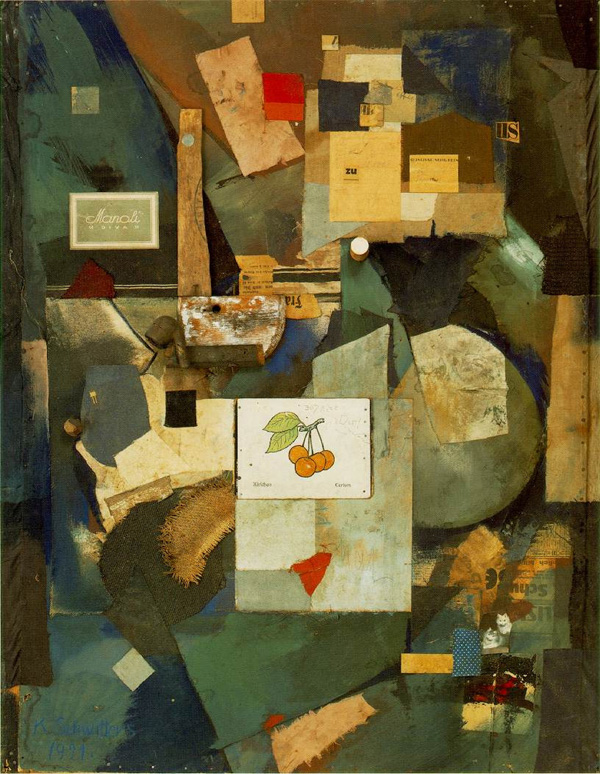
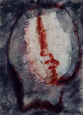
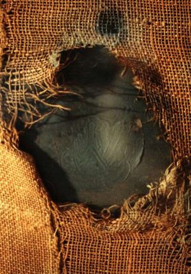
Another of the quiet revivals at Mitchell-Innes & Nash, New York, provided an opportunity to briefly review this key figure to mid-20th century painting. The work of Alberto Burri (1915-1995) is noted for the introduction of unusual materials and techniques, their use in abstraction. Earlier use of novel materials focussed on recycling and surprising juxtaposition, particularly of printed matter: striking three-dimensional elements (as in the work of Kurt Schwitters (1887-1949), for example). But by mid-century the kind of materials adopted emphasise the imposition of two-dimensional reference upon them. They provide an unconventional base or support that draws attention to the effort or resistance to ascribed pattern, picture or notation. This aspect of painting is often called materiality, the particular phase considered is here termed Traction.
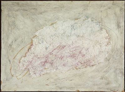
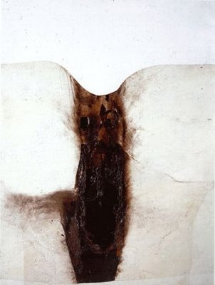
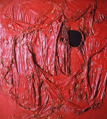
Traction has more figurative use in the work of Jean Dubuffet (1901-1985) and Jean Fautrier (1889-1964), where basic picture planes (technically, orthogonal projections) are engraved or carved into a pigment augmented by plaster, glues, shellac, shoe polish and varnishes, amongst others things. The work of Antoni Tàpies offers similar strange pastes, and occasional notation, later allowing the figurative. Burri is noted firstly for his distressed and patched burlap or sacking, restricted colour in compositions that otherwise continue the biomorphic or organic abstraction of earlier artists. Yet ‘line’ is now coarse seams or patches, the colour harmonies, shapes and edges emphatically determined by the material. Burri subsequently turns to heated plastics to determine shape or ‘drawing’ from a chemical exchange with the supporting material. The work is literally about what makes a line or shape, colour or pattern from the support. Metaphorically, the organic shapes can suggest wounds, stained dressings, swelling, blistering and inflamed skins, an unnerving close-up of human distress or resilience.
Traction is largely a European trend and is sometimes contrasted with The New York School’s use of imposing scale to induce new techniques to abstraction. The difference is famously seen as cooking with rich pastes in modest servings as opposed to a stark smorgasbord, conducted over vast expanses. But there are crucial exceptions. The work of Robert Rauschenberg takes up traction with his black paintings, is possibly influenced by Burri after a trip to Italy in 1951. His subsequent work reflects a new and enduring attention to fabrics. Coincidentally, Burri, who began as a medical student, only took up painting while a prisoner of war in Texas in 1944. Rauschenberg, a native of Texas, spent much of his military service as a hospital orderly.
Rauschenberg’s interest in traction is rarely confined to one material and not always foremost as a compositional strategy, however his taste for shredded newsprint is passed to his colleague at the time, Jasper Johns, whose work incorporates it in a heavy encaustic and applies it to distinctly two-dimensional designs such as flags, targets, text and maps. Traction by this route is eventually inherited by New Image Painting, in mostly subdued form, but re-emerges more vigorously in the work of Joe Zucker in the 70s and then Julian Schnabel.
Burri’s influence upon abstraction is soon overwhelmed by Minimalism’s stricter symmetries, architectural ambitions. He also uses wood in veneer-like slices, although wood-grain is a somewhat familiar pattern, after Picasso and Braque, lacks a certain friction. He tries thin metal sheeting, again worked by heat and inevitably turns to sculpture, of welded steel sheets. Later works concoct vivid cracking or crackle, but again the clarity or ease of pattern rob materials of much traction. Yet, to ask more of materials can easily obscure a two-dimensional aspect, stress other, occasionally surprising qualities, brittleness or pungency, coarseness or crumpling, appeal to senses other than the visual. In this respect Burri’s work perhaps prepares the way for Arte Povera, with its diverse materials in surprising combination, including motion, sound and smell, site specific and temporary installations; that extend the visual and tactile with the transient. A current show at Luring Augustine New York includes many of these artists. Joseph Beuys is commonly associated with this group and his student Anselm Kiefer returns to traction in a more elaborate and figurative form in the 70s. The tendency continues to attract occasional exponents, such as Alexis Harding (see also Post 3).
For Burri its application was strictly abstract, although abstraction then remained a relaxed geometry or ‘organic’ sense of pattern. Ultimately his materials and techniques seem too loaded, not simply alternatives to paint, but redolent in other, extraneous associations that restrict their use in further abstraction. Minimalism took a purer view of chemistry and geometry (see also Post 52) but could not sustain it, even on the grandest scale. This is partly why work such as Burri’s continues to attract interest.
Tuesday, 15 January 2008
(70)
They studied together in Dresden and now work in Berlin. Nitsche is the slightly older (b. 1964), Scheibitz (b. 1968) achieved international recognition slightly sooner. Both deal in abstraction in painting in terms of plans or designs for common objects (see also Post 14). Both stress the linear over the tonal. But where Nitsche’s work remains focussed on the curves, rigour and colour of industrial design and graphics, Scheibitz’s work has straddled issues of scale, level or degree of abstraction and 3-D modelling, encompassing maps, charts and the legibility of icons or symbols. One encounters technical difficulties for painting, the other encounters difficulties in category of picture. Both demonstrate the renewed vitality and scope of painting (see also Post 15).
Nitsche’s recent show in Dresden consolidated rather than extended his project. From around 2000 the work tended to feature a central motif on a surrounding ground while later work offers more complex, integrated relations. But often there is little to distinguish work over the period. Line and shape are precise, often derived through successive layers or pentimenti. The measured, streamlined curves and uniformity of line suggest industrial or engineering design, the arrival at ergonomic or aerodynamic solutions; at mechanical rather than organic objects. Range of mostly subdued colours adds to the allusion. Variety to width of line and parallels, add to the sense of accuracy and where intersections of lines of different widths occur they build overlapping planes, so that the work then toys with depth or volume, reinforced by colours assigned to adjacent shapes. In a work such as MDX 12 (2000) this arises around the central intersection of the broad, roughly horizontal line and intersecting points. But colour there is notably cursory or incomplete and the work really showcases process, the design method, at its most general or abstract.
Nitsche’s work is about the assumptions to these elements, for material and use, the world implied in the smooth assimilation of necessities. Abstraction in painting, of course, rarely confines itself to these means so the contrast is particularly effective. Yet such line, colour and their revision cannot be quite the same in a painting either, especially on a large scale. Nitsche maintains the ruled lines and smooth curves but allows colour a more relaxed application and this, if anything is accentuated in more recent work. The effect is curiously jarring. To maintain an immaculate finish would be to risk leaving the painting as only a further step to the design, while to emphasise painterly qualities is to risk the painting not strictly addressing such design. So the work seesaws – line is about a certain kind of design but colouring is partly about painting. Yet painting has its own lines as well as facture; colour is as important to design as line. What might balance the equation is a distinct means of making lines, that would allow the precision while still asserting an obvious painterly attribute. Nitsche has yet to introduce such a technique, but is perhaps aware of the problem.
Scheibitz, on the other hand, is not hampered by such a narrow sense of design. His work emerged in the late 90s, dealing with a broad, somewhat mechanical stylisation for a variety of objects, but then is drawn to architectural themes, to 3-D models or sculpture, to more schematic or metaphorical reference. Temperamentally, Scheibitz has less discipline or focus than Nitsche, although his use of outline, carefully ruled segments and paint drips, all exhibit close affinities. He even has a small work titled Franky (1998).
Scheibitz also favours incomplete elements and ambiguity, the sense of process and reworking. A work such as Anlage (2000) has many of the ingredients of a Nitsche, yet toys with both larger architecture and greater abstraction. The work angles planes for perspective, builds windows and shelves, a neighbourhood in progress. For Scheibitz the variety of meaning to a painting, the levels of representation are carried through to sculpture, where different angles suggest different readings, reveal different colours. In works like Table with Tray (2006) function is actual as well as representational. Elsewhere, what counts as a literal flower or symbol, a model or aspect of the actual, a sufficient or effective stylisation, stretch the artist’s project, allow his line greater latitude than Nitsche’s, but then diffuse the reference, stall its impact. His work struggles to maintain a design or object, not from lack of painterly resources, but rather a surfeit.
Both artists thus encounter problems with their projects, but this only to confirm the role of painting in picturing and remodelling the world.
Tuesday, 8 January 2008
(69)
A well-publicised survey of the paintings of Mary Heilmann recently ended its run at Houston. Heilmann has been a quiet but persistent presence and the retrospective was perhaps overdue. Then again, there is the suspicion that some quarters resort to her work at this point simply to prolong a fading glory.
Heilmann’s work emerged in the early 70s, marked by casual facture and colour relations measured against stripes, a grid or shaped canvas. Her work is often small scale, at a time when such work commands whole walls, but remains firmly in the wake of Minimalism in its focus upon paint technique, geometry (or symmetry) and colour differences (see also Posts 14, 18, 33, and 52). Minimalism quickly shapes as a matter of how much or which system (or pattern) to allow geometry, what additional properties to colour to allow paint and application. Work may promptly resolve to monochromes (acute symmetry) or assume specially shaped canvases in reconciling pattern to support, in appealing to the surrounding wall as a determining factor. Frequently the project turns to three dimensions, looks to architectural considerations to set standards and sometimes departs to temporary and hypothetical stages and the realm of Conceptual Art.
Pattern, on the other hand, cautiously concedes overlapping or interweaving stripes, attendant shapes and soon slender tone and volume, arrives at traditional motifs to ornamentation, even repeating figuration with Pattern and Decoration. These two strands, colour/material and pattern, in various combination, pretty much set the course for Minimalism throughout the 70s, chart its gradual dissipation, public indifference.
For Heilmann, however, neither option holds much attraction, which is largely why her work has not achieved greater prominence. Her interests remain with broadly brushed modulation to colour and precision of basic geometry. But once the equation is grasped between colour definition to a given shape – conversely, shape to a given colour - and pattern to picture frame, then choice of brushstroke or application, colour combination or rigour to pattern all begin to look increasingly arbitrary or trivial. Heilmann can play off the austerity of work by forerunners and urge a greater relaxation to pattern and facture, but this only places greater scrutiny on her dogged allegiance to stripes or grids in the first place. The work often feels like a tired or strained comic routine, relying on a ‘straight man’ as stripes or grids, in order to burlesque his role with relaxed facture, exuberant colour.
A work such as Surfing on Acid (2005) and similar, allow the horizontal bands variety in edge, width and length which in turn influence area and intensity of colour, contrasts with neighbours and consistency of technique. One ‘surfs’ the bands, aware that their identity as stripes, edges or colours is tenuous to the point of hallucinatory. Occasionally Heilmann stretches stripes into more figurative readings, as in Capistrano (1994). In Go Ask Alice (2006) she adopts a perspective to the grid and similarly overruns it with extravagant variation. Colour is again vivid, not so much to demonstrate a theory of harmonies or contrasts, but to add to the overall brightness of spirit, the relentlessly upbeat mood. Actually, variations on monochrome would serve her colour interests just as well, but this is perhaps to accept a rigour the work is now intent on dispersing.
Two later developments have been the introduction of line, in the late 90s, and curved or biomorphic shapes, early in the new century. Works such as 21st Century Fox (1998) and Chemical Tune (1999) use diagonal straight lines across a field of subtle rectangles and scattered circles of contrasting colours. The angles and intersections to the lines deftly coincide with background shapes and so build a tentative volume or projection upon them. Line is thus contrasted with colour as two dimensions are contrasted with three. Line here is also surprisingly uniform and straight, given the artist’s resistance to such rigour in many other respects. But it remains a striking formulation, if only as a prelude to more elaborate depth and objects.
Heilmann’s biomorphic shapes grew out of an interest in curves measured against the picture frame and especially with shaped canvases. But now regularity or familiarity of shape do not influence perception of colour much beyond vague proportions and placements. The works take on a different kind of approximated balance or pattern, size, placement and colour all sharing only a family of curves. This is hardly new territory for abstraction though. While a survey of her career can mark these changes, dwell on her compliance or complacency, it is hard to see what relevance it might hold beyond that.
Tuesday, 1 January 2008
(68)
The current show at the Lisson Gallery, London, features large rectangular blocks of aged and compressed human excrement, that have their origin in India and a practice of waste collection apparently enforced by religion and a caste system. The gallery web site is typically unhelpful but clearly the artist again courts controversy with the introduction of such materials. For some, Sierra’s entire career is dedicated to just pranks and scandal, since sculptural properties are surely mocked by such material and process, while as reference to the obscure and unhappy practice at hand, the objects seem obtuse or ineffective. Objections to Sierra’s work fall into two categories, rejecting his means and his ends; the politics that generate his projects, and the politics generated by his projects. This post looks at the development of these means.
Sierra’s work has its origins in Minimalism and the primary forms and construction that quickly turn to industrial standards; look to modules or unitary components in simple alignment and stacking. Works make competent – but by the 90s – unremarkable contributions to the project pioneered by Donald Judd and Carl Andre, advanced by Tony Cragg and others. However Sierra also attends to related industrial practices, in works such as 20 Pieces of Road, Madrid (1992) in which a road surface is removed in given squares, as an example of road maintenance as well as its literal displacement, its redefinition as squares of bitumen. The work does not disrupt an actual road (although later Sierra does this as well) but extends a routine process to obtain unitary materials, still in step with Minimalism. Less tidy objects, similarly targeting waste, bundle or coat waste material into less regular (and to some extent, less successful) modules.
The growing co-operation with civic bodies and commissioning of labour signals a subtle shift of emphasis. Sierra is increasingly concerned with duration for works, as an index to the labour involved. A work such as 24 Blocks of Concrete Constantly Moved for a Day by Paid Workers (1999) simply manoeuvres blocks of concrete within the exhibition space according to basic tools and cheap labour. The work is less a record of the actual movement of the blocks than the trail of damage and debris accumulated. It samples or displays these additional properties to the blocks, gives a somewhat grim social dimension to their Minimalist austerity.
As Sierra’s attention turns to hired labour as a material, the pretext of a Minimalist object, a nondescript module, shifts to the terms of the exhibition site itself, to architectural features or standard functioning for a building. Sierra can then simply fill a site with a prescribed (and often, proscribed) labour sample, as in 450 Paid People in the Museo Rufino Tamayo (1999) or Congregation of Illegal Workers at the International Fair of Contemporary Art, Paris (1999) or allot them nominal modules as in People Paid to Remain inside Cardboard Boxes, Guatemala (1999). A more radical departure is to simply tag and identify a labour source by tattoo or later dyeing, where conditions are desperate enough to allow such measures. These works, understandably, exist mainly as documentation rather than performance. There was even a work where workers masturbated at a given address.
The point is not simply that anything is for sale when and where the chips are down far enough, but that art is now drawn inexorably to these ‘market forces’ as surely as it is to life or nature (see also Posts 8, 25 and 49). Sierra starts from the Minimalism of primary units but steadily discovers their wider use entails delegation and subordination, that the work is animated by its interaction with conflicting demands and conditions, with an increasingly globalised and ruthless economy. Obviously Sierra is not the only artist drawn to these means or issues; Vanessa Beecroft and others adopt similar strategies.
245 M3 (2006) and Submission (2007) draw attention to crucial features of their respective locations through temporary adaptation and modification, involve less performance. Both works proved highly controversial and were prematurely halted. Here the respective issues – Jewish persecution and illegal immigration – were so sensitive that even the most imaginative or experimental treatments were not permitted to interfere with orthodox message or prevailing identity for the sites. Even where the artist patiently negotiates all regulations and proprieties, these may yet prove so various and unreliable that the work no more than records the politics encountered. So, are the means then too political? Does the work thereby cease to be art? The answer will depend upon how lively one allows art, how cultivated one prefers politics.
