Both photographers downplay particular camera features or distinctive printing options, instead concentrate on manipulation and classification of subject for rather than by the camera. In other words, what characterises their work is less a matter of how than what, strictly, of the informal over the formal. In this they conform to a wider trend (see also Posts 12 and 27). For Crewdson, elaborate theatrical tableaux steadily expand to engage realism and cinematic anecdote, while for Schorr the quality sought from her young male subjects grows more elusive or fleeting, and most recently is pursued in drawing.
Both photographers stress fiction or artifice. But while Crewdson often uses theatrical lighting and framing from a conveniently empty foreground to reveal fixed poses and stereotypical figures, Schorr confines fiction to a few military props for some of her young men, to role-reversed poses from pin-ups or traditional poses, to modest still lives as a metaphor for place or belonging.
Thirdly, both photographers deal in a marked estrangement or alienation from the presentational norms upon which they draw. For Crewdson, the broader more elaborate views of Middle American life are deliberately hollow projections from some grander vantage point that finally register something like fear or contempt through ostentatious displays of logistics or pyrotechnics. For Schorr, young men are documented as wrestlers, soldiers – even Nazis – and pin-ups, yet the theme remains male youth in roles that require no female counterpart, that if not overtly hostile, then fail as a measure of the feminine, for the feminine. But the threat is not in the roles assigned, nor their indifference to them, but at a much more basic level, where Schorr cannot identify.
Crewdson’s work first gained attention in the early 90s, with intimate tableau of birds and insects, significantly, of collective behaviour in ‘nature’; both viewed at some remove. However, in subsequent works, such as the Twilight series (1998) the artist shifts attention to episodes in the American heartland, often literally dark and disturbing, as much for the intense artifice as errant behaviour. Here the connection is often made to David Lynch’s film Blue Velvet (1986) with its opening and closing scenes of high artifice, bracketing a tale of terror and crime. Crewdson’s earlier works are seen as announcing similar revelations, but his clever play on nature and naturalism through models, does more than frame scenes of disruption and dysfunction. They render them disturbingly restrained and distant, as if no more than models in some higher scheme.
Indeed as the scenes become more expansive, there are works dedicated to the production values, to the extent of manipulation and artifice engaged; that are literally more revealing of the work’s tenor and priorities. And as whole neighbourhoods appear to fall under such schemes, they too are seen as just a more elaborate model or staging, not quite real, or perhaps worth greater effort. Either way, the uneasiness with the extent of artifice leaves the fiction of too much. It becomes forced projection of squalor or desolation, from a distance that ultimately lacks engagement or conviction. They are visions of something hardly known, largely denied. This is quite different from Lynch’s Expressionism or the paintings of Edward Hopper, another frequent comparison that misses the stylistic differences available and necessary to still photography.
Schorr’s work arrives a little later in the 90s, and while there are early works concerned with aspects of student life, her themes are usually young American wrestlers and a family of German youths at leisure. With each, Schorr isolates a peer group, deals less in interaction than individuality illuminated by role and circumstance. But while the wrestlers are factual and the soldiers fictional, neither quite confines young men to such roles nor convinces that such roles are only for young men. And where other work substitutes young men for women, as pin-ups and artist’s models, noted above, the interest in young men clearly points to an absence of options, a frustration with roles. The agenda appears to have only one gender and it is a hostile one.
As in Crewdson’s work, this grants the work a curious distance, and while Schorr is happy to also place men against a backdrop of nature, even camouflaged by it, their nature is no more forthright for it, her photography no closer to identification. Interestingly, her recent work uses drawing to bring figures together, to transcend the iconography of roles, to avoid the isolation of her photography. But both artists bring new expressive dimensions to familiar iconography, even though the expressions may be troubling or unwelcome.
Tuesday, 3 June 2008
(90)


Tuesday, 27 May 2008
(89)
A selection of works from the early 60s by Roy Lichtenstein (1923 – 97) at Gagosian N.Y. inspires a post on a pivotal moment in twentieth century painting. Typically, the gallery’s website offers little in the way of reproductions, happily resources at the Lichtenstein Foundation compensate.
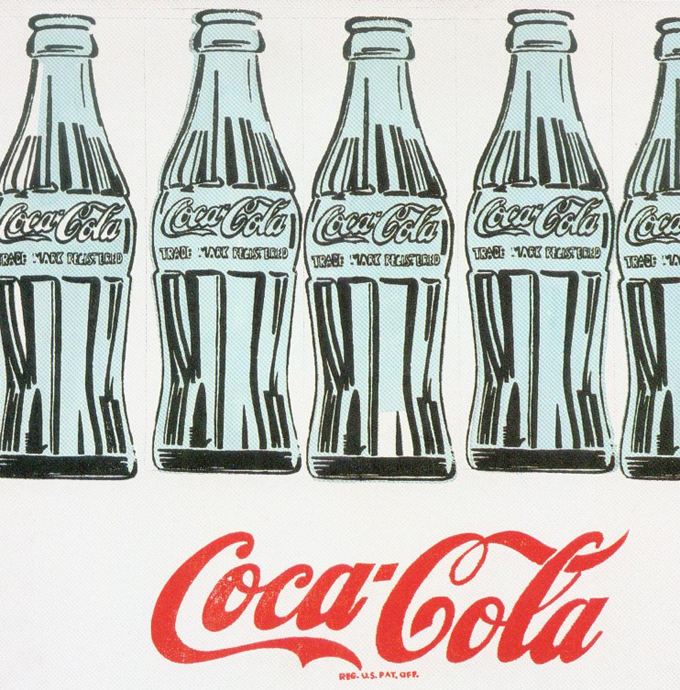
Lichtenstein’s development throughout the 50s essentially matches standard and familiar subjects against strict and abstract treatments, increasingly looks to clichéd iconography balanced against vigorous painterly means. Much like Willem de Kooning’s treatment of Woman or Larry Rivers’ version of Washington Crossing The Delaware, Lichtenstein is drawn to an interruption or incompleteness in treatment, an equivocation to clichés thereby, a composition at once abstract and figurative. Yet what would happen if the subject were as humble or trivial as a comic strip character? Would strenuous painting be mocked or Donald Duck accorded new dignity?
The disparity perhaps ultimately proved too great for the artist, subsequent works turn to more confirmed abstraction. But Lichtenstein was equally dissatisfied there, and out of idle curiosity decided to paint a ‘straight’ version of a single comic strip frame. The result revealed an unsuspected expressive dimension, devoid of painterly ‘interruption’ – the doubts, mistakes and confusions of his 50s approach. Quite the opposite attitudes were now suggested. The ‘straight’ treatment assumes a kind of deadpan reserve, akin to the flâneur’s insolence or hipster’s cool. The isolation of a single frame and dramatic enlargement magnify narrative into amusing oversimplifications, abstract pictorial or formal values by this, yet threaten to cheapen or trivialise these into the bargain.
Coincidentally, Andy Warhol (1928 – 87) arrives at virtually the same style at the same time, but by a slightly different route. He is inspired by the templates and designs given rugged treatment by Jasper Johns. Warhol makes the leap to using stock graphics to much the same ends, to then also abandon painterly treatment for the ‘straight’ copy. Upon seeing Lichtenstein’s work, Warhol shrewdly dropped comic strips and soon addresses print sources more directly through silkscreen, and later, photo-silkscreens.
Such painting now starkly defines itself in relation to styles of printing, looks to highlight crucial differences to the work of multiple instances. Painting does not, of course, immediately look to etchings or woodcuts, or forms of printing usually associated with art. On the contrary, it looks to the commonest and most efficient forms of line illustration. The objective is not so much the popular (despite the label ‘Pop Art’) the revered or preferred, but the pedestrian and mundane, against which to measure overlooked or unexpected qualities of printing through painting, and vice versa.
For even if painting were to do no more than enlarge such prints (which it cannot do, without begging questions of context or framing) the enlargement does not preserve all the qualities of the print, such as the resolution of the inking, or support texture, colour or ageing of support or ink, much less accident, staining, creasing or other typical distress, although conceivably, it might. The ‘straight’ copy is actually very selective. In fact it samples just the lines and colours, perhaps the tonal dot screens, in Lichtenstein’s case, as removed design. And Lichtenstein actually adjusts compositions to heighten this aspect. The absence of these other qualities then point to the supporting canvas in a special way, emphasising its weight, scale or weave, just as the absence of obvious brushwork also exemplify a certain self-effacement or reticence on the part of painting, a literal flatness to its materials, an expressive or metaphorical wryness.
Such work is often still greeted with a mixture of amusement and disappointment, since painting seems at once denuded or debased by the encounter, modest print sources absurdly exalted. But formal values are returned to depiction more generally, rather than just painting, and painting’s role as a work of sole instance, or a one-off, is given new and potent impetus. Unfortunately space here does not permit an explanation of why the resources to painting are greater for being spared the need of strict duplication. However print sampling by painting is further pursued to text (see also Post 67) to layouts (see also Post 61) and obviously to photography (see also Posts 35 and 87) this, generating the sub-style of Photo-realism.
For Lichtenstein the options quickly run to parody of famous works and established styles in painting, to dramatic brushwork, stock treatments of light, reflectance and transparency, to text and obviously the melodrama this allows to comic strips. The focus upon romance is particularly striking, and while his choice of comic strips soon looks old-fashioned, the added distance only strengthens the cliché, the elegantly composed picture and persons that life abandons upon completion, that we uphold out of discretion.
Tuesday, 20 May 2008
(88)
Daniel Buren began as a painter, was soon drawn to abstraction and Minimalism and with that gradually exchanged canvas and independent surfaces for temporary murals, for site-specific and architectural construction. The drive outward; from self-contained two-dimensional works is typical of Minimalism and as works engage surroundings through more striking bases and supports, the emphasis upon strict pattern and colour by pigment or coating also changes. The work applied to wider grounds is no longer about painting, but pattern belonging to other materials and three dimensional structures and on a scale and integration that soon belongs to architecture.
The temporary, repeated or repeatable nature of many of Buren’s works also coincide with Conceptual Art, with the emphasis upon the work as an event or performance, record or plan, upon the terms of the pattern as something like a script or score (see also Posts 33 and 62). Buren’s work is a key part of the French Supports/Surfaces group of the late 60s. As the name suggests, the group was intent upon spelling out the relation between the work and the surface or support upon which it appeared. But this concern was shared with many Minimalists, if less explicitly, and the trajectory of such work demonstrates an important consequence of the broader style. This post traces Buren’s career as a prime example.
The artist’s development was rapid. From initial works in 1964, reflecting an acquaintance with CoBrA, the artist steadily abstracts his pictures to approximate symmetries and a strong linear bias. By 1966 parallel lines or stripes establish an area or fill for looser shapes, are strict, for masking tape, straight and vertical. The additional boundaries then fall away, leaving the work nothing but stripes, of an impressive scale and colour uniformity.
Painting can project such patterns to novel scale, materials and situation, but under Minimalism, it no longer seeks to invent them, but rather re-deploy them. Basic symmetries in stripes, grids, and less obviously, monochromes, are tested against novel materials and technique. But which patterns allow more radical applications, which techniques preserve such patterns (see also Posts 24, 47, 52 and 81), essentially establishes the scope of the project, the ambition of the artist. Differences within the style are sometimes divided between artists dedicated to process, as opposed to system (or pattern).
In Buren’s case he is content to let stripes drive applications, rather than consider the inverse. He occasionally resorts to grids or monochromes, but is not attracted to more elaborate recognised pattern, even of the kind used by colleague Claude Viallat, much less the radical pigments and techniques of contemporaries such as Linda Benglis, Larry Poons or Jules Olitski. Neither more adventurous pattern nor pigment recipe tempts. Instead stripes and flat colours acquire architectural fixture and efficient duplication, yet by this, also lose some of their reference to painting. The project is smoothly exchanged for an interest in three-dimensional qualities, in lighting, transparencies, reflectance and events.
Stripes and grids still recur, but their significance has less to do with pigment, more with other materials and situation. It is this dissipation to one arm of abstraction that occasionally led critics to suppose painting had been replaced by the 80s, or that abstraction no longer needed painting. But this is to exaggerate the impact and impetus of the project, to ignore rival developments in abstraction and painting.
Buren can preserve an interest in colour definition, but that does not necessarily make the works about painting or abstraction. Typically, his work has been applied to public thoroughfares, to paths, gateways, stairs and viewing points, and these situations influence the meaning to the colour. Not that colour ultimately resides in architecture, of course, but such work underlines the surfaces and supports to areas of herding or channelling the public. Egress colours the colour. They signal not just an abstract sense of motion and masses, but also an anonymous conformity or compliance, perhaps alienation. Indeed, the all-encompassing integration of many of his works can feel either stifling and almost coercive, or so subtly pervasive as to hardly register as more than the trivial, to sense the work all but dissolving into mere formula. At times, Buren’s work recalls that of Christo and Jeanne-Claude, in this respect.
These are the standards against which to measure the site-specific and work of temporary or multiple instances. While they might commence as a projection from painting or sculpture, the impetus to counter projects, not least from architecture, ultimately stalls or traduces them, absorbs them into larger civic concerns. It leaves painting and abstraction other routes, ultimately leaves Minimalism exhausted.
Tuesday, 13 May 2008
(87)
The artist first rose to prominence with paintings conspicuously based on black and white photography, obliquely positioned between Pop Art and Photo-realism (see also Posts 16, 61 and 67). He soon expanded on the kinds of photography painted, including other forms of print, then onto more literal samples of frames and mirrors. At the same time he drastically loosened the treatment of photography, eventually arriving at a distinctive version of abstraction. Richter’s project is remarkable for the consistency or rigour of his interests, for his methodical – if not always successful - explorations and willingness to alternate between branches, to pursue them simultaneously and include unexpected combination.
However this project has not always been obvious. Richter’s treatment of photography literally blurs lens and print or publication attributes, makes for uncertain categories of picture and a somewhat evasive role for painting. To some extent this obscured the point of his colour charts and mirrors for some time, seemed a wayward point from which to approach abstraction. It is only in the 80s, where his large gestural abstractions alternate with blurred still lives of traditional iconography, such as skulls and candles; that a more confident sense of his scope emerges.
The blurring and wiping to painting exemplify a sense of motion, of moving on, disengaging or discovering. In early works, photographic sources are stressed through the use of black and white and blurring that would seem to belong camera process, a loss of focus or a slow shutter’s registration of motion, as if things were glimpsed from a speeding vantage point. In subsequent paintings the blurring becomes more ambiguous. Static objects such as a kitchen chair neither register the directional sweep of movement, nor a consistent depth of field for focus, much less a certain genre of photograph. At the same time, stock publication formats such as postcards, wildlife close-ups, pornography and the obligatory old master reproduction grant the blurring a degraded or coarsened quality, a kind of summary of lowered half-tone screen rulings, exploited at the time by Sigmar Polke, Gerald Laing and Alain Jacquet, amongst others.
Moreover the blurring can be quite painterly, so that the dragged brushstrokes are an obvious extension to the blurring, perhaps also suggest scan lines to a television screen. ‘Blurred brushing’ in this way risks lapsing into traditional facture at a certain point, but this too is tested against the notably photographic genres of aerial views of cities and mountains by the late 60s, arrives at something more like ‘brushy blurrings’. The blurrings next apply to just the mixing or combination of colours, firstly in masses of writhing brushstrokes, their direction measured only against smeared colour differences and then to their obliteration in fields of grey by the mid 70s. Later he uses soft-focus close-ups of brushstrokes to amplify the abstraction, and these soon allow more vigorous technique and introduce a set of layers, blurring, revising and concealing a preceding image.
What starts as blurring in standard figurative photography thus ends in massive wiping, abstraction and painting. Equally and elegantly, what is sampled throughout is not just a loss of focus, motion or print degradation, but reciprocally, the way they constitute a version of painting, its tasks and means. Accordingly, abstract works retain a vestige of photography in the broad wipes of unpredictable colour and shape, while more figurative works resist resolution as just focus, motion or publication.
Yet Richter also pursues abstraction to single colours in a grid or chart, as noted, a print format although not strictly photography. Indeed this aspect to his work is given new interest with the completion last year of the enormous stained glass window for Cologne Cathedral. Pointedly, no blurring or mixing occurs in such works. However, the random ordering is expanded across saturation and luminosity to a formidable range, inevitably rendered imperceptible by complementary contrasts at points, and accommodated only by diminishing size of samples or distance needed to survey them. Colour abstraction is thus rendered elusive to grids, much as in blurring or wiping.
Richter’s impressive system and samples nonetheless make sacrifices. While dragging and wiping can include shifts in direction, tool, colour and consistency, it cannot allow further drawing or more elaborate line, the styles and print layouts available there, the function and cues for local colour. In this respect Richter, remains a prisoner to the photograph and print paradigms for painting. Understandably, it is just these aspects to depiction that attract a younger generation. Richter’s contribution lies in their platform, in demonstrating how photography, paradoxically, revitalises abstraction in painting, how painting continues to provide the principal means of reviewing depiction.
Tuesday, 6 May 2008
(86)
The paintings of Daniel Richter flirt with grand themes and myth for groups of schematic figures, display a relaxed sense of design and finish. They offer a shrewd balance of concerns that run through much of contemporary German painting, if not contemporary painting in general. His work has steadily drawn greater approval from the turn of the century and with shows this year at Regen Projects, LA and David Zwirner, NY, a museum survey at Hamburg, The Hague, Malaga and later Denver, his reputation is secured and a sterner review perhaps in order.
Significantly, the artist’s early work, from the mid 90s, was dedicated to abstraction, to the combination of techniques and ‘maximised’ composition pursued by Albert Oehlen for example, to the graphic and diagrammatic compositions of Franz Ackermann, for instance. Richter drew on graffiti and cartoons, a spectrum of gesture and shapes to chart a territory between the two, between a youth subculture and its stylistic inheritance. However, by the late 90s, the combinations encompass more figurative elements and are no longer content with hard edges, the psychedelic and notational. In 2000 Richter began to use the broadly traced outlines from projected photographs that have pretty much become a staple.
This distinctive outline ostensibly transfers contours from the photograph, but Richter instead assigns them various colours and widths, so that they read as more remote scans, more like an infrared or heat register, and crucially flatten and mask the figure, stress a generic and design aspect. This, together with a loose and scattered facture, and more collage-like placements, essentially preserves the artist’s interest in abstraction. Sources for the figures are by no means obvious, but tend to be drawn from publications on radical politics and youth or counter culture (see also Post 63). The actions pictured are usually public, group gestures, often suggesting confrontation or defiance, public disturbance or unease.
Other works offer more rustic settings, more mythical figures, but both kinds firmly return painting to grand themes and literary resources, effectively to traditional history painting. It is no co-incidence that Richter should assimilate this just when the New Leipzig School and Neo Rauch in particular, achieve wider recognition for similar goals. It is entirely consistent with Richter’s ambition. Yet the differences are stark. Neo Rauch’s work revels in cautious character, perspective and volume, yet deliberately corrupts wider design, a pictorial integrity or composition. Richter, on the other hand, celebrates mere outline and atmosphere, favours the anonymous, frontal and flattened, gladly sacrifices depth, volume and personality for veils of drips and dashes, the deliberate grounds that hold a greater design, a further abstraction.
Neo Rauch’s work is deeply pessimistic, even nihilistic, yet often wildly funny. Richter’s work is idly mannered, perhaps naïve, often pretentious. Where Neo Rauch cannot escape his figures without wrecking the picture, Richter cannot get closer to his, without spoiling line and design. Critics are quick to explain Neo Rauch’s attitude as a symptom of East Germany and ingrained disillusionment, but so far none have cared to do the same for Richter and the new united Germany. Richter is, of course, based in Berlin.
Richter’s use of traced outlines and diffuse, casual facture, does however, draw predictable comparison with the work of Peter Doig. But where the distancing that this technique brings, reflects upon exotic but brief locations for Doig, for Richter, this sense of holiday or detachment is usually directed to more urgent and serious matters, and seems all the more dubious for it. The effect is of a Peter Doig, wistful for a social conscience or peer group pressure. Richter’s figures are never quite real or realised in this sense; their circumstances, accordingly, seem more decorative or dilatory.
Appropriately, Richter’s show at Zwirner was titled The Idealists, and featured air-guitarists in a grim urban setting. It is not surprising that these musical enthusiasts should appeal to the artist, since popular music is often alluded to in his abstract work, but there is also an explicit pretence to the miming that takes on a greater resonance here. Elsewhere in the show, an actual guitarist parades before a crowd in an open-air venue, looking around warily, whilst in others the guitarist is rhymed with an armed guard or soldier; the task, by extension, is one of claiming a new frontier. But this is not just idealism, or deriving a vicarious glory from music or participation. It is to deliberately distract from more immediate failures, to look beyond bleak designs for some greater substance, and to confuse tracing with discovery, following with leading. They are, in all respects, a barren experience.