By the artist’s standards, Runts is a modest series, presently showing at Pace Wildenstein, NY. They continue the restrained photo-montages the 82 year-old has favoured of late. Subdued or de-saturated colour, subtle cropping of edges to the photographs, and with greater prominence, a play with spatial continuity, all gently restate longstanding concerns. Composition in the photographs themselves; with their emphasis on frontality, strong graphic or two-dimensional elements, text and depiction in graffiti and folk art, are familiar Modernist concerns. All distil the artist’s taste for ambiguity and disparity, his much quoted “gap between art and life” where he remains comfortable with hybrids, misfits and half measures.
Rauschenberg’s interest in blending photography with painting reached a turning point with his illustrations to Dante’s Inferno in 1959. There, the technique of photo-release allowed close integration with pencil and watercolour. The text is storyboarded from top to bottom, left to right, with images from the popular press serving as metaphors. The layout linked images to the text but also contrasted them with each other; drew abstract or formal qualities between them into the interpretation. Temporal and spatial continuities are juggled with stylistic ones and soon suggested a more general project.
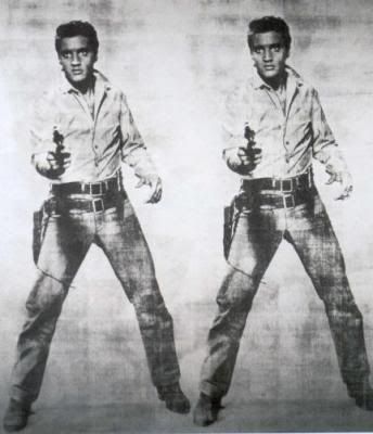
In 1962 the artist turned to photo-silkscreens combined with painting on a grander scale and by engaging with printing more directly, coincides with Pop Art (see also Posts 16 and 61). But while his choice of photographs overlaps with Andy Warhol in the use of topical figures, such as President Kennedy (while Warhol adopts Jackie) sporting events, the Statue of Liberty and reproductions of the old masters, Rauschenberg also included photographs of technical diagrams, ornithological charts, the NASA space programme, military craft, close-ups of a mosquito, heavy seas, a glass of milk and his own photographs of the urban landscape. His layouts share with Warhol the repeated silkscreen, overlaps, changes of colour to a given screen and irregular inking, but also use colour separations, segments and objects to a photograph carefully or roughly painted around and over in same or other colours. Warhol samples icons of detachment, of glamour or gloom, Rauschenberg the range in between. His pictures balance the abstract and figurative, print and painting; are always more and less than Pop.
Figures and objects hover between literal depiction and more symbolic roles and placement; are fragmentary, obscure, only glimpsed. The feeling is variously of tremendous freedom or disengagement, versatility or indifference, confusion or contempt, doubt or disdain. The richness to the work of the early 60s remains a pinnacle in his career. Rauschenberg melodramatically dispensed with photo-silkscreens upon receiving The Grand Prize at the 1964 Venice Biennale and eventually returned to photo-release, applied now to fine fabrics (see also Post 71). Painting has almost no role here and layouts trade in formal links between photographs, in repetitions, rotations and approximate symmetry. The work is pointedly restrained, strives for a lighter, slighter note.
Later, other techniques allow photographic printing to metallic surfaces and extravagant if decorative painterly gesture. The tracing and cropping of edges or parts of the photograph return, enriching the layouts, but tracing seems as far as Rauschenberg allows drawing. The ground upon which the photographs are placed increasingly shapes as a puzzling, even disturbing void. He continues more ambitious works throughout the 90s, now using greater resources to colour printing and more exotic, international content. The work to some extent recaptures some of the scope and vigour of the early 60s, but the greater technical finesse also distances. Moreover, the project by this time seems remote by other trends. The print paradigm for painting has long since dissipated, the interest in intermediates, in formal diversity within a picture, has given way to more and stricter categories, to degrees of abstraction (see Posts 24 and 53) rather than a grand spectrum.
Runts reflects this shift. The photographs now cluster squarely around a location or landscape, where in earlier times they would have been at pains to remain open to more categories. The photographs do not provide compelling continuity, yet differences often hinge on the familiarity or identity of objects, so for example, in Little Egypt (2007) where the sky stops at an immense white wall or lack of picture, while the lawn continues, aligned with the edge between details of a mural to the left, the top of which then appears upon ‘the white wall’. Similarly, Lighthouse Wall (2007) offers perhaps two levels of car park as well as two pictures, and the equipment to the foreground shares perspective with the figures behind. The famous gap now confined to no more than a matter of continuity against contiguity.
Tuesday, 5 February 2008
(73)
Subscribe to:
Post Comments (Atom)

2 comments:
Apologies for some failed links in this post. For some reason some links to Artnet get re-routed - although the urls embedded were accurate.
I'll try and sort it out...
OK problem sorted.
The Artnet examples I linked are no longer there, so obviously the turnover in Rauschenbergs is still pretty brisk.
So I've replaced the examples on links from 'cropping of edges or parts of the photograph' and 'enriching the layouts'. The new links still illustrate the points about Rauschenberg's development, but hopefully they'll remain available a bit longer...
Post a Comment