Both artists have a peculiarly fragmented body of work; present troubling inconsistencies of style. Both artists resort to text in painting and comic content. Both flirt with various contemporary styles only to reveal their own weaknesses. By the same token, each is victim of the stylistic momentum of rivals that undercuts their own impact. For all that, the difference between them is between an artist adept at pictorial forms, but bereft of an ambition to harness them, and one convinced of ambition, but ultimately prepared to compromise it for the sake of pictorial forms.
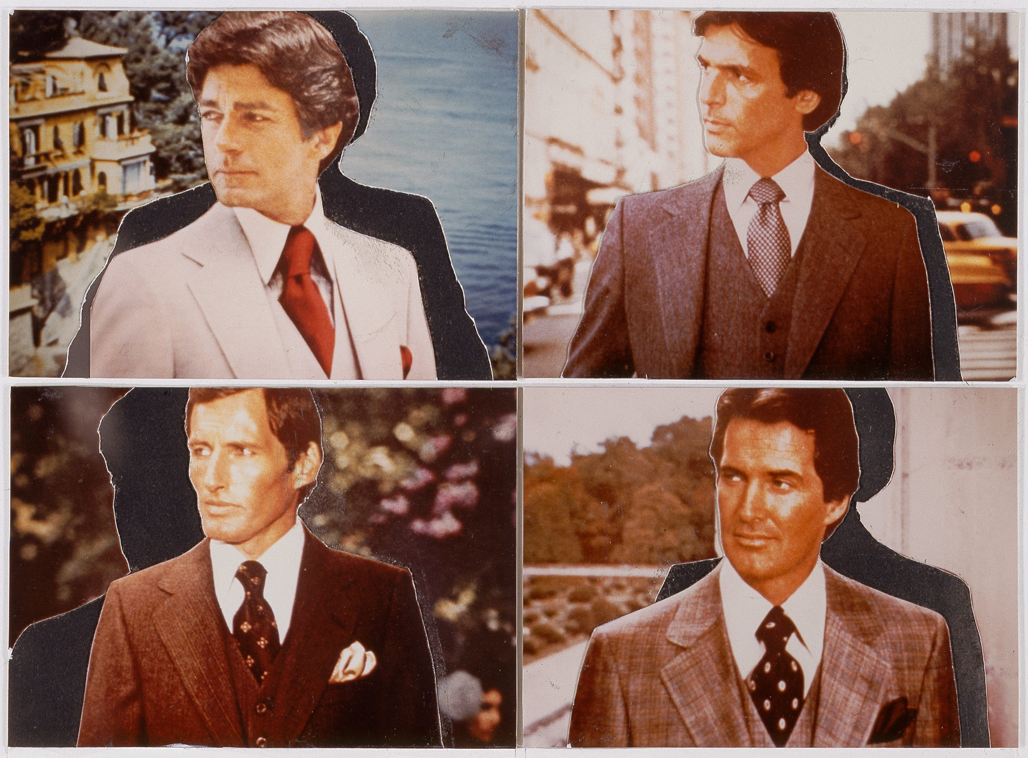
Prince (b. 1949) is the older and more circumspect. His career was launched in the late 70s with cropped and re-photographed details of advertisements, highlighting settings for luxury goods. The work is firstly about commercial iconography; secondly, the camera’s closer framing gives them a slightly different meaning from simply cropping the originals, accentuates qualities of print and links these to the re-framed composition. Formal qualities to the composition are perhaps debased or obscured by attention to print surface, alternatively, commercial print qualities are elevated by the comparison with entrenched formal qualities. Either way, re-photographing stresses differences between camera and print properties, announces a project of iconography, albeit detached by such differences.
Unfortunately, re-photographing photographs at that time is swept up with notions of ‘Appropriation’ and ‘Simulacra’ and on those terms Prince’s work looks somewhat cautious. Throughout the 80s he takes up the theme of cowboys and the open range, used as a setting for Marlboro ads. He later switches to less polished sources for the frank, perhaps folksy sexism of biker’s girls and similar pairings of women with heavy vehicles in specialist journals. Here photography is deliberately casual and re-photographing can do little more than coarsen print characteristics, often given the work a Warhol-like tonality. While modesty of technical resources here work against the iconography, up to a point, re-framing the composition can do little and around this time Prince begins to look to other avenues. He turns to silk-screened cartoons and jokes that carry much the same sexual attitudes.
Yet graphic and text sources require other kinds of re-framing to properly identify such features, and their placement upon vast canvases quickly immerses them in acute stylistic problems, that again traduce Prince’s project. The works lack Ruscha’s graphic expertise, for example, (see also Post 67) or Warhol’s bolder approach to silk-screening, finally feel like late and lame Pop Art. Prince can labour the surface, but only to the cost of typeface and layout and the project steadily loses focus. He soon alternates between his own (direct) photography, Neo-Expressionism, other remote print-sourced work, sculpture and installations. Each only confirms his limited engagement, dissipation of concerns. Iconography divorced from photography, it seems, soon finds Prince out of picture, but anxious to paint.
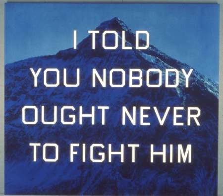
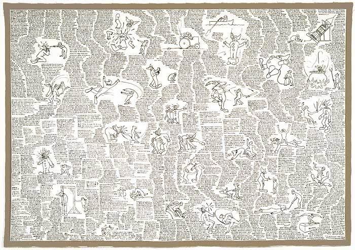
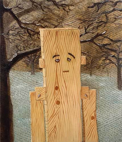
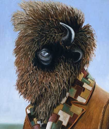
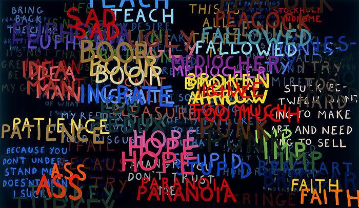
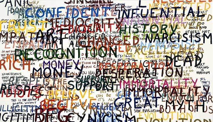
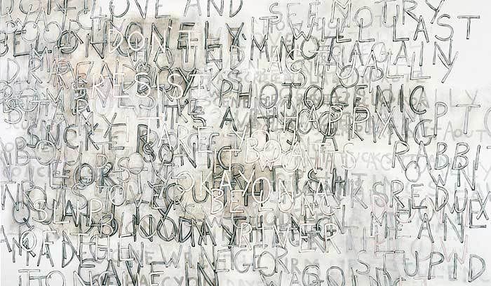
By contrast, Landers’ (b.1962) first allegiance is to Conceptual Art, to performance and installation and his interest in text proceeds from documentation. Text is applied to painting presumably from dissatisfaction with the scope and impact it has had on such events. Landers uses painting to extend his utterances in this sense, augmenting performance, to give them a graphic or pictorial dimension rather than gauge norms of print or publication. The work is hardly a foray into calligraphy or script though, and content is largely satirical and self-deprecating. The artist ‘writes’ paintings, or paints ‘writings’, but the results initially are somewhat crabbed and turgid, notably mostly for the arrangement of text into loose blocks or shapes.
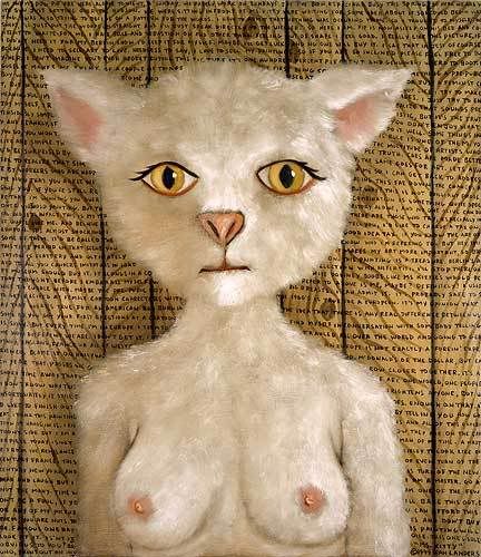
As Landers seeks greater pictorial resources, relations between text and imagery take more concrete form, and gradually image rivals text. The artist’s comic discourse finds equivalents or suggests a more exclusive approach. But Landers is never quite able to make the comic picture funny enough, or his own. Not because he lacks expertise, since competence is often part of the joke, not because so much of the silly imagery and treatment reveal the overwhelming influence of his associate, John Currin, and not even because Landers persists with more elaborate parody and pastiche, only to reveal surprising ambition; but because Landers’ commitment is firstly to the verbal and so a temporal rather than spatial domain. Pictures, in this respect, strictly exceed Lander’s needs.
Significantly, Landers returns to texts, at least intermittently, giving greater emphasis to overlaying and intersecting comment; uses colour rather than shape to particular comments and enlarges lettering, in a step toward more concerted calligraphy. The works grow in depth, visually, jettison much anecdote, verbally. The artist can now write paintings with more fluency, paint writing with less flippancy, but not before disclosing severe shortcomings to the project.
Tuesday, 25 March 2008
(80)
Subscribe to:
Post Comments (Atom)

(0).jpg)
3 comments:
The Rosen Gallery website has very recently removed enlargements of the reproductions placed in their modest slide shows along the top of each artist’s page, making it difficult to link to particular works. This renders most of the links to Landers' work in this post invalid.
This is obviously disappointing but I am trying to find a way around this, for the various examples.
It's difficult to see how this economy improves the appreciation of the artist’s work, or shows any more respect for its presentation by the gallery.
I've now replaced most of the Landers links.
Post a Comment