At Jack Shainman, NY, the artist presents a series of symbolic portraits of the black artist shielded by enormous palettes or perhaps supporting greatly increased means of painting. Other works provide idyllic scenes of seaside retreat, where figures feature the Afro hairstyle and fashions of the 60s, give the ideals of Black Power a mocking sentimentality or remoteness, much as some recent works hint at a desperate escapism there.
Marshall’s work is noted for its Black or Afro-American themes, a dedication to their roles and standing and the compelling means by which he assimilates these to contemporary painting. The concern with schematic or symbolic arrangements of pictorial space (see also Posts 53 and 57) is foremost and traits drawn from folk and commercial depiction (print and not) reinforce the status of common content as genre, through more concerted or accentuated painting (see also Posts 5, 11, 16 and 43).
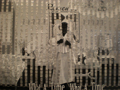
The work achieved wider recognition in the early 90s, developing from a Neo-Expressionism with African roots, toward more complex themes; more refined drawing. Figures are now resolutely black, given little or no modelling and approach silhouettes (see also Post 13). They take on an elegant, if anonymous or generic quality, recall commercial illustration, while scrolled captions and large, un-stretched canvas supports recall public banners. The artist also includes stencilled floral motifs, often clogged or dripping with vigorous application, photo-collage or imagery denoting a coarse print source, sentimental and decorative motifs alternated with bold, graffiti-like or abstract gestures that further stretch the array of treatments, compound layout and dense surface.
This ‘maximising’ of techniques also has potent resonance in abstract painting at the time (see Posts 10 and 79) and for Marshall forges a crucial integrity not only across painting and print sources, symbolic and literal settings, but positions ‘black’ figures between a racial identity and a wider, pictorial one. In this, he anticipates the work of Kara Walker, but where Walker anchors her milieu in the ante bellum, in vivid folk and children’s tales, Marshall’s genre is more diffuse, contemporary. His figures are also ‘blacked out’ pictorially, but signal a deeply formal, self-conscious presence, occasionally giving sexual episodes a touching, comic aspect; frequently accompanying scenes of loss or neglect. The ‘black’ figure stares back, out of the picture, wary or resigned with childhood or civic ideals, with the gestures and roles available, the sentiments and tokens expected. The ‘black’ figure is as much a blank figure, the role denied or ignored, supplied for the sake of custom, obscured by a welter of formality.
There is often a wistful, elegiac tone, sometimes explicitly historical, but initially loss or departure is also through the accretion of embellishment or correction, the steady corruption of picture and person, often symbolised by the abuse of floral motifs. These tend to pale colours or white, granting the picture deeper symbolic meaning as it obscures or confines figures, amplifies the sense of lack to ‘black’.
Marshall has been prolific and his work subsequently includes more abstract forays, photography, installation, text-only prints and comic strips. The concern with Black Americans has remained, for the most part, but in painting, sources have thinned, technique narrowed. Tone is decidedly lighter. His interest in text in pictures is predictably drawn to comic strips, but the results are somewhat inert, for the injection of ‘black’ content into a stricter form, for the overpowering precedent of Pop Art and his own, more adventurous use of text and picture in earlier work. The shift gives his Black Power slogans a more nostalgic, wry quality, the stern font recalling banal public instruction or faith. As noted, figures featuring the Afro hairstyle also associated with the era, now take on greater modelling, a more rounded, if slighter picture, when not simply comic for conviction or fashions. The lighter tone and iconography seem almost in counterpoint to Walker’s mythic slavery. The ideals of the 60s now deflated proportionate to her excesses. But Marshall has yet to hit upon a style quite as elegant and provocative as Walkers’. That may lie closer to the work of Chris Ofili.
Similarly, in the series of romantic vignettes included in the current show, the pictures are restricted to a range of greys relieved only by saccharine valentines. Again the illustrational style cannot bring the same weight or wealth of meaning to romance or ‘black’ lovers. Marshall’s figures have become more rounded, more comfortable, less ‘black’ or blank, but are more confined for the maturity.
Tuesday, 8 July 2008
(95)
Subscribe to:
Post Comments (Atom)

4 comments:
Wow, CAP! Nice words - there is something really unique about these highlighted descriptions, and then clicking on the image to see how the words stick to it.
I plan and wait for image permissions, it takes a week to pull all of it together, and for maybe 8. You spend all of that time pulling together a full monograph - I'm too lazy to count them all!
Something I have been thinking about is how images appear in a blog format. I have found myself using art works as illustration - I think I'm doing this with Jennifer Reeves in the current post, for ex.(although it does feel appropriate to her work) - in a way I've been reluctant to do before, for ex.
In your own mind, do you have categories for the kind of "link" that you are making? I see things like anecdote, description, art history, etc., but what have you seen yourself doing?
What I am noticing and having real appreciation for here is to bracket this essay with "shielded by enormous palettes" at the beginning and "but are more confined" at the end. You've achieved quite a bit from one to the next.
Thanks for the feedback CS. The somewhat oblique links to illustrations are really the result of trying to keep the posts brief. Reading text on screen is less comfortable for most than hard copy, so I wanted to keep my posts ‘readable-on-screen’ and originally aimed for around 500 words per post and that illustrations would be indicated traditionally, with a ‘for example, TITLE (DATE) MEDIUM, SIZE’ and a link from that to a jpeg. But I quickly found I couldn’t say much of interest in 500 words and my post length gradually crept out to 750 words. Battling even to remain at that, I jettisoned ‘medium and size’ and soon even ‘for example, title (date)’ - settling for simply placing links at appropriate points in the text and hoping readers would take ‘for example…etc’ as understood.
I try to link to pages that give particulars for the works, but this is not always possible. So my art history ideals are compromised a little, but the aim is only to give a basic profile of an artist’s style, changes or developments within that and its relation to surrounding trends. Many of these traits can be illustrated without titles. Approximate dates are often implied in the text, as are medium and size. Obviously, knowing that some of the text will provide links, I try to make them as enticing and applicable as possible.
The first drafts are written long hand (I’m old school, practically retired school) so my first concern is how the text reads by itself. I don’t expect readers to use every link – it depends how they find the text. But making illustrations available in art writing I regard as paramount.
One of the other advantages to using links, is the size of the illustrations is not compromised by the blog or web page template. Most blogs use a template that only allows a post in a narrow column down the middle of the screen. I always look for the largest illustrations available. In this post, the PBS – Art 21 links are virtually full screen! And the works look drop dead gorgeous for it! Not only are links quicker, cheaper and more plentiful, but they’re often larger than a blog template allows.
Can you imagine going to a hard copy journal with an article and saying “Oh and I’ll need 20 – 30 full colour, full or half page illustrations to accompany the text.” I don’t think so. This is the realm of strictly on-line art writing. I’m puzzled why sites like Artnet and Art Critical don’t use links instead of thumbnails or the odd, smallish illustration, but to some extent it depends on the kind of writing.
What I really see in your writing is a style that has evolved out of this very specific practice of "linking." You have done it for such a while that the way your words relate to one's index finger and the image it brings is quite pleasurable, it has its own sense of touch and meaning.
Thanks, it’s nice to be appreciated. The blog was always pretty specialized (the whole point) and it has a tiny but fairly consistent readership.
It’s actually quite a lot of work – quite apart from the availability of jpegs – there’s a fair bit of research and analysis every week - a lot more as I’ve gone along and grown more ambitious. I plan to take a break at 100 posts as I’m a bit jaded these days.
Post a Comment